

In the beginning, there were black and white photos. And later came color. But black and white endured – it did not disappear. Black and white is the foundation of the art of photography. Even in this digital era, understanding how to take good grayscale images can be a cornerstone to our photography experience.
One of the keys to producing strong monochrome photos is to think and see in black and white. The concept may appear rather abstract. How can we see no colors? Using your imagination and thinking about how a composition would look in black and white is something you can learn to do. This is fundamental to consistently producing quality black and white photos, so in this guide, I’ll give you some tips to inspire you.
Recommended Reading: If you’d like to learn how to create amazing black and white images, grab a copy of Photzy’s best-selling premium guide: Better Black and White.
Enchanting Black and White
Kodak introduced its Kodachrome slide film to the world in the mid-1930s, but color photography did not become popular until the 1970s. At this time, color-negative films and cheaper printing made color photography accessible.
Until then most people only saw black and white photos. This seems strange to us now in a digital age as we see color photos everywhere we look. It’s not so common to see monochrome images as it used to be. They are more distinguished nowadays.
Photograph by Kevin Landwer-Johan
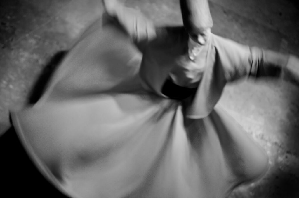
Loading a black and white film into a camera was always a more intentional choice than creating monochromatic digital images. Now, there’s no need to think or see in black and white before you press the shutter button, but, when you do, you will almost certainly make more compelling black and white images.
The enchantment of black and white has never diminished. Right from the beginnings of capturing reflected light that created a permanent image on film and paper, well-crafted monochrome photos can captivate people’s attention and imagination.
Key Lesson: The more deliberate you are when taking digital photos for black and white reproduction, the more powerful your images will be.
We See Everything in Color
We see everything, all around us, every day, in color. We take a color for granted. We expect to see color. Our brains anticipate this. So, when we see life represented in black and white photos, we are forced to think differently.
We see everything, all around us, every day, in color... So, when we see life represented in black and white photos, we are forced to think differently.
Much of our brain function is centered around expectations based on our experiences. When we walk, we expect that as we place our foot on the floor it will be solid, as it was the last time we stepped on it. We breathe in the air expecting to stay alive. We smell the coffee and expect how it will taste. If it tastes different, our thoughts are jolted. We can be pleasantly surprised by a superior blend and brew, or we might react with a “YUK” if it’s poor quality.

Photograph by Kevin Landwer-Johan
Our expectation to see color in a photo is jolted by the black and white rendering of images. This immediately triggers our attention. Depending on the quality of the image, this could be like a sweet perfume or maybe like the smell of sweaty socks. Either way, our attention is piqued.
Simple desaturation of a color image will not render it a compelling monochrome. Monochrome, yes, but there’s far more to producing black and white photos that make you want to look at them intently.
Key Lesson: Think of black and white photography as going far beyond the simple desaturation of color. Train your mind to imagine how everything looks in grayscale.
Learn to Visualize Tone
The tone is the lightness or darkness of something, regardless of what color it is. Black and white photographs are pure tone. Each color becomes a tone when the hue is removed. Cooler colors (blues, greens, and purples) render as darker tones. Warmer colors (reds, oranges, and yellows) render as lighter tones. Remembering these basics is the first step to learning to see in color.
Texture, light, and exposure choices also influence the tone in black and white photos. I’ll get into more detail about these aspects further into this guide.
Beginning to think about how different colors will look in your black and white photos will help you build better compositions. The tone is used to create the following:
- Contrast
- An illusion of form
- A sense of depth
- Atmosphere


Photographs by Kevin Landwer-Johan
Visualize how colors will appear as tones in your photos and you can compose with confidence. Yellow and blue butted against each other in an image will contrast in grayscale. Orange and red will be a smoother transition. Putting this knowledge into practice before you take a photo enables you to better manage your compositions. This is easier when you have control over elements in your frame, but also helps when you are not able to manipulate them.


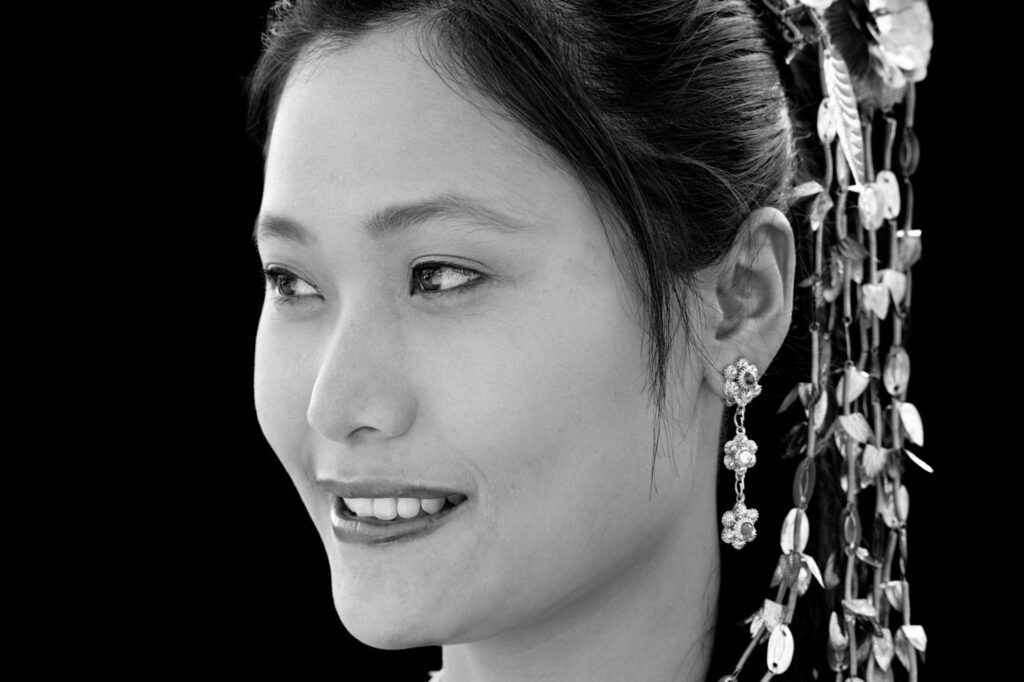
Photograph by Kevin Landwer-Johan
When the color has a strong impact on the mood of an image, rendering in black and white gives you creative license to sway that feeling. A rather melancholy color photo composed with blues and greens can become much less gloomy when rendered as a monochrome image. For example, in the image above, her smile becomes more alive.
Key Lesson: Thinking about how the colors you see will appear as tones when rendered as black and white help you make more interesting compositions.
Seeing the Light in Monochrome
The angle at which light reflects off surfaces determines much about how we perceive the color and how our cameras record it. This translates directly into how colors look as tones in grayscale images. Surface texture and your choice of exposure settings also affect what things look like in photos.
A bright light reflecting off a dark-colored shiny surface can appear as white. An underexposed light-colored surface might render as pure black. The point of view from where you take a photo and how you set the exposure to determine what tones result in your photos.
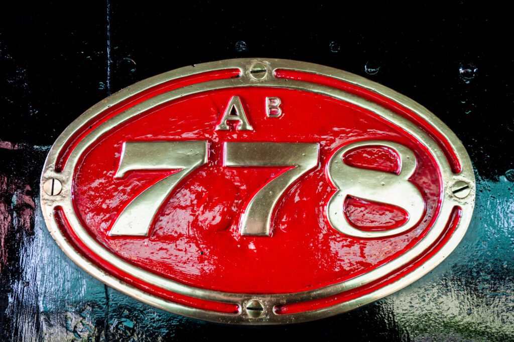
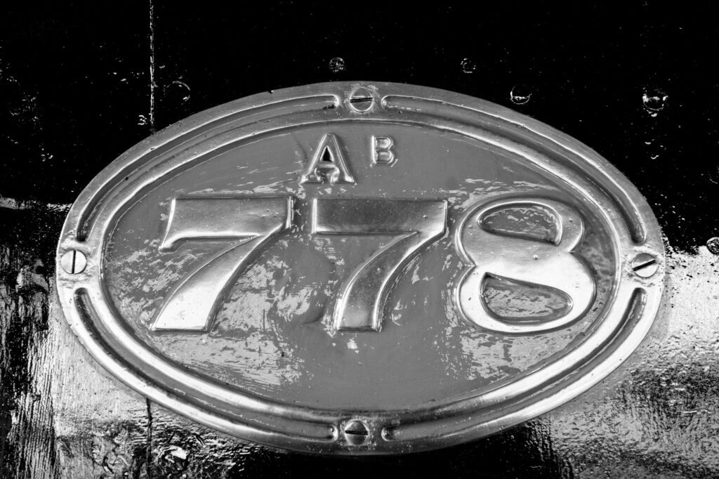
Photograph by Kevin Landwer-Johan
Even a relatively flat light reflecting off the shiny surfaces in this image results in the black, gold, and red colors appearing white. This is true in both the color and the monochrome versions. Some of the intensity is lost when it’s converted because the red color renders as a mid-gray. A dark blue will render much darker. (Apologies to train enthusiasts, as I guess these numbers would never be blue!)


Photograph by Kevin Landwer-Johan
So, regardless of the color or tone of a surface, how the light reflects off it into your camera lens has a strong influence on how it appears. Flat and curved surfaces, shiny and dull surfaces, and textured surfaces all reflect light in different ways. You can use this to your advantage when thinking in black and white.
Three-dimensional qualities are created in photographs using tone. Much of how this works is dictated by how light creates these tones. The more you can see the variance in tones, the more you can manage the appearance of depth in your images.
Control Your Exposure Settings for the Best Black and White
Exposure meters are calibrated to read the light as though it’s all reflecting off 18% gray. This is also called middle gray. It’s the tone halfway between white and black. Adjusting your settings for this reading will often give you an acceptable exposure. You will have detail in both shadows and highlights unless the tone range in your composition is extreme.
You might also choose to adjust your settings to expose more for the shadows or the highlights. These settings will result in very different-looking photos. Some detail may be lost in the dark or the light areas, but your photos can have more visual impact.
Photograph by Kevin Landwer-Johan
Learn to pre-visualize how your camera will record the light reflecting off a surface. This allows you to make more precise choices in how you set your exposure. Think about how your exposure will alter the tones when you render an image in black and white. This helps you make choices about your aperture, shutter speed, and ISO settings.
Learn to pre-visualize how your camera will record the light reflecting off a surface. This allows you to make more precise choices in how you set your exposure.
Your intent for a photo is also an important consideration when making exposure choices. What mood will you convey if you expose the highlights? Will your subject look better in black and white if you expose the shadows? When you can ‘see’ your subject in black and white, you are more likely to make better choices.
Seeing in Black and White Made Easy
A great way to learn to previsualize your photos in black and white is to make use of your camera’s technology. Most cameras have a setting that allows you to view the monitor in grayscale. Mirrorless cameras also allow you to set the viewfinder to show a black and white image.
Looking at your composition in black and white before taking your photo shows you how the colors and light will appear in monochrome. This makes previsualization so easy.
When you’re using manual mode and live view together, you can also see how your exposure settings affect the way your photos will look. Using this method, you can see how light or dark any part of your image will be.
Photograph by Kevin Landwer-Johan
Key Lesson: If you are just beginning to explore black and white digital photography let me encourage you to use this method. But please don’t get lazy and rely on it. Use it for a while until you have a pretty good idea of how things will look in grayscale. Then begin to imagine the same without relying on the technology. This will help you become a more creative photographer as you begin to see the world around you in black and white.
Recommended Reading: If you’d like to learn how to create amazing black and white images, grab a copy of Photzy’s best-selling premium guide: Better Black and White.
Conclusion

Photograph by Kevin Landwer-Johan
Imagine seeing the world in black and white. This used to be much easier when most photographs and even television were all presented in monochrome. The more you can visualize how colors appear in grayscale, the more effective you will be in creating great black and white photographs.
Think about cool colors rendering darker and warm colors appearing lighter in black and white photos. Study light and how it reflects off surfaces differently. Move around as you begin to compose your photos and watch as the way light reflects into your lens changes depending on your angle of view. And of course, be in control of your exposure settings to make the type of images you love the most.
Self-Check Quiz:
- What is one of the key ways to produce strong monochrome photos?
- When was Kodachrome film introduced?
- When did color photography become popular?
- Which colors usually look darker when rendered in black and white?
- Which colors usually look lighter when rendered in black and white?
- Do flat and curved surfaces, shiny and dull surfaces, and textured surfaces all reflect light in different ways?
- What’s the easiest way to learn to see in grayscale?