

Why is high contrast so darn appealing?
Contrast, both tonal and color, conveys an intense sensation of mood and emotion. These images often feel fresh, dramatic, and edgy. They are high energy and appeal to all individuals across all age groups.
Conversely, low-contrast images tend to be dreamy and ethereal. But that’s a discussion for another guide.
I have always been drawn to high contrast in my photography efforts. As a teenager with a darkroom in the basement of my parent’s home, I often experimented with high-contrast techniques, including the use of lithographic film.
In this guide, we will examine images that use high contrast and then decide what we think about them. We also highlight contrast techniques.
Here is what is covered:
- What is tonal contrast?
- What is color contrast?
- Black and white is the ultimate high-contrast tool
- Extremely high tonal contrast
- Combining tonal and color contrast in a single image
- The difference between color contrast, color separation, and monochromatic color
- Subjects that work well with high contrast
- Planning a high-contrast photoshoot
- Color contrast is not dependent upon the saturation level
- Using still life to learn about contrast
- Mixing high contrast and low contrast in a single image
Recommended Reading: If you’d like to learn how to create amazing black and white images, grab a copy of Photzy’s best-selling premium guide: Better Black and White.
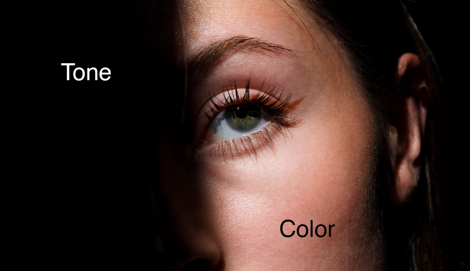
What Is Tonal Contrast?
Tonal contrast is the difference in tonal density from the brightest to the darkest tone as measured on the histogram scale.

Contrast is represented on a scale known as a histogram. In the example on the left, the gray section depicts the tonal contrast. The left side of the histogram graphs the darkest tones, and the right side graphs the lightest tones. The chart is spread evenly from left to right when an image has normal tonal contrast.
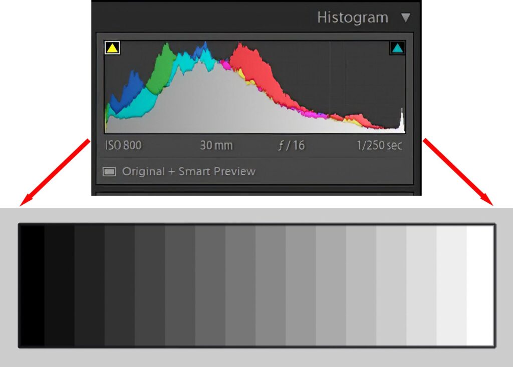
Graphics by Kent DuFault
When a photograph has high tonal contrast, the histogram will show higher peaks on the far left and the far right. The middle section will be lower on the scale.
Photograph by Pexels and Screenshot by Kent DuFault
What Is Color Contrast?
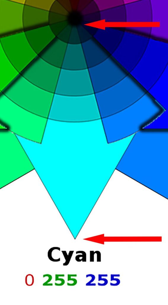
Color contrast is measured by where the colors in a photo fall onto a measuring scale known as a color wheel.
Key Lesson: Tonal contrast is measured with a histogram, and color contrast is measured by a color wheel.
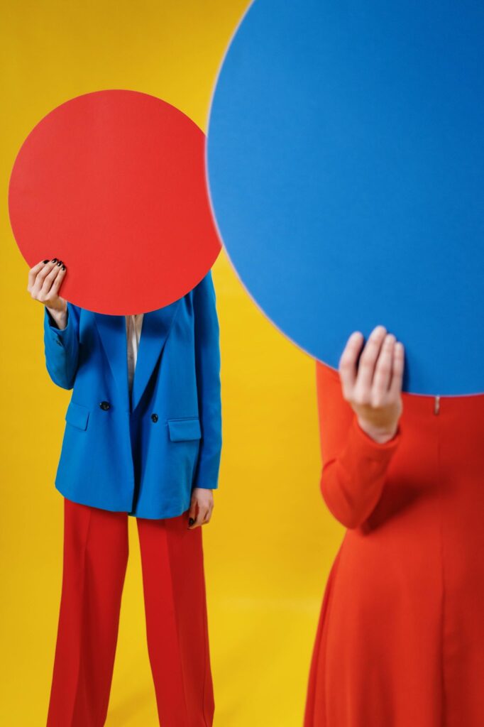
The image above represents high color contrast, and let’s look at a color wheel to see why.
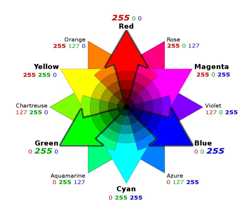
RGB Color Wheel by Kent DuFault
Half the color wheel is cool colors, and the other half is warm colors. There are different types of color wheels, but the most widely used in digital photography is the RGB Color Wheel.
Key Lesson: Any color that opposes another color on the color wheel is a contrasting color. The ultimate color contrast is when they are directly opposite on the color wheel. For example, blue and yellow are the highest contrast, but blue and red are contrasting colors.
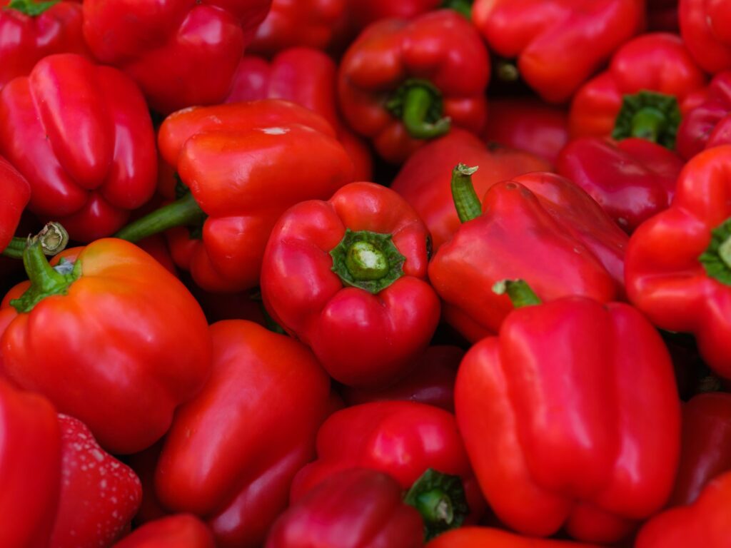
The previous image sample has high color contrast because the dominant colors are red, yellow, and blue.
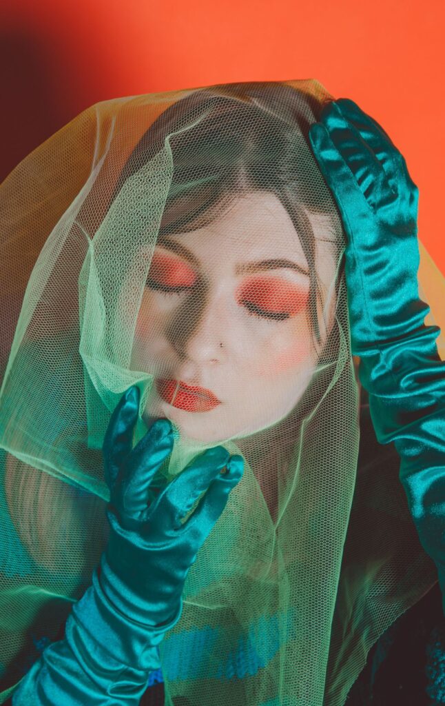
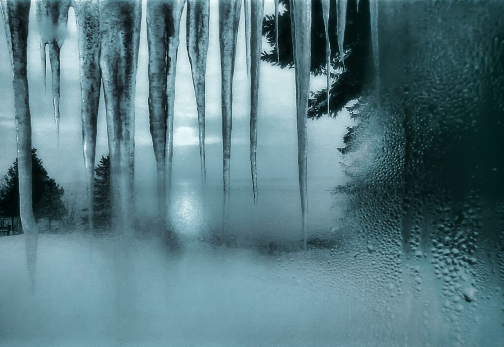
Does the image above have high color contrast? It sure does! Cyan, red, and orange are opposites on the color wheel.
Key Lesson: The colors black and white are the ultimate contrasting colors because they contrast with every other color and offer tonal extremes.
Extreme Tonal Contrast
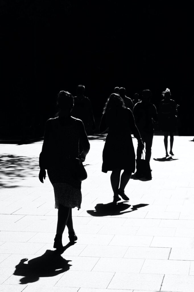
The image above depicts an example of extreme tonal contrast. The photo includes black and white tones with nothing in between.
This type of effect is accomplished with a specialized film known as lithographic film, or in digital photography there are many apps, presets, and actions to create this style of image.
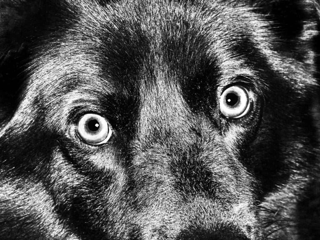
I created this extremely high tonal contrast image of my dog using the app Snapseed. I chose this treatment to make his intense eyes stand out even more. Photograph by Kent DuFault
Combining Tonal Contrast and Color Contrast in the Same Image

What is your contrast evaluation of the image above? Does it have high tonal contrast? Does it have high color contrast?
The image above has used both very carefully. The high contrast of any type often doesn’t look appealing in food photography.
The inclusion of the shadowed area below the table adds a pleasant tonal contrast that makes the image pop from the background.
That shaded area also adds color contrast to the food without affecting the appeal of the food. Remember, the colors black and white add color contrast to any other color.

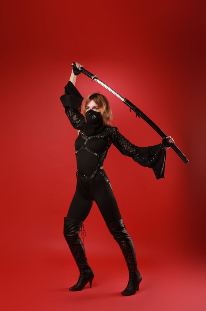
How about the example image above? Does it have high contrast, and if so, what type?
Correct! It has both! Do you understand why? If not, re-read the previous sections of this guide.
Recommended Reading: If you’d like to learn how to create amazing black and white images, grab a copy of Photzy’s best-selling premium guide: Better Black and White.
The Difference Between Color Contrast, Color Separation, and Monochromatic Color
Does the image above exhibit color contrast? It does, but it doesn’t really qualify as a high-contrast photograph.
Why?
Key Lesson: There is an artistic term known as ‘color relativity.’ Color relativity places the composition weight based on the relative quantity of the various colors represented in a picture. Even though green and red are high in color contrast, the abundance of the color red versus the amount of the color green removes this from a high color contrast situation and becomes a color separation composition.
Color separation occurs when one color dominates the others and separates opposing colors from the rest of the frame.

Does the image above qualify as either high tonal or color contrast?
This is a tricky one, and here’s why.
The background is dark but not black. The highlight in the eye is light but not white. The rest of the represented color is very similar. So, no color contrast. The rest of the defined tones are very much middle tones. So, no high tonal contrast.
Key Lesson: This is an excellent example of a technique known as monochromatic color. With monochromatic color, the entire image is represented within the same slice of the color wheel. In image 013, it would be within the orange slice.
Here is a photo of mine where I created a monochromatic color effect. The original was black and white and low in tonal contrast. By adding a blue-cyan overlay in Photoshop, I added a lot of mood and interest through monochromatic color. Photograph by Kent DuFault
What Type of Subjects Work Well With High Contrast?
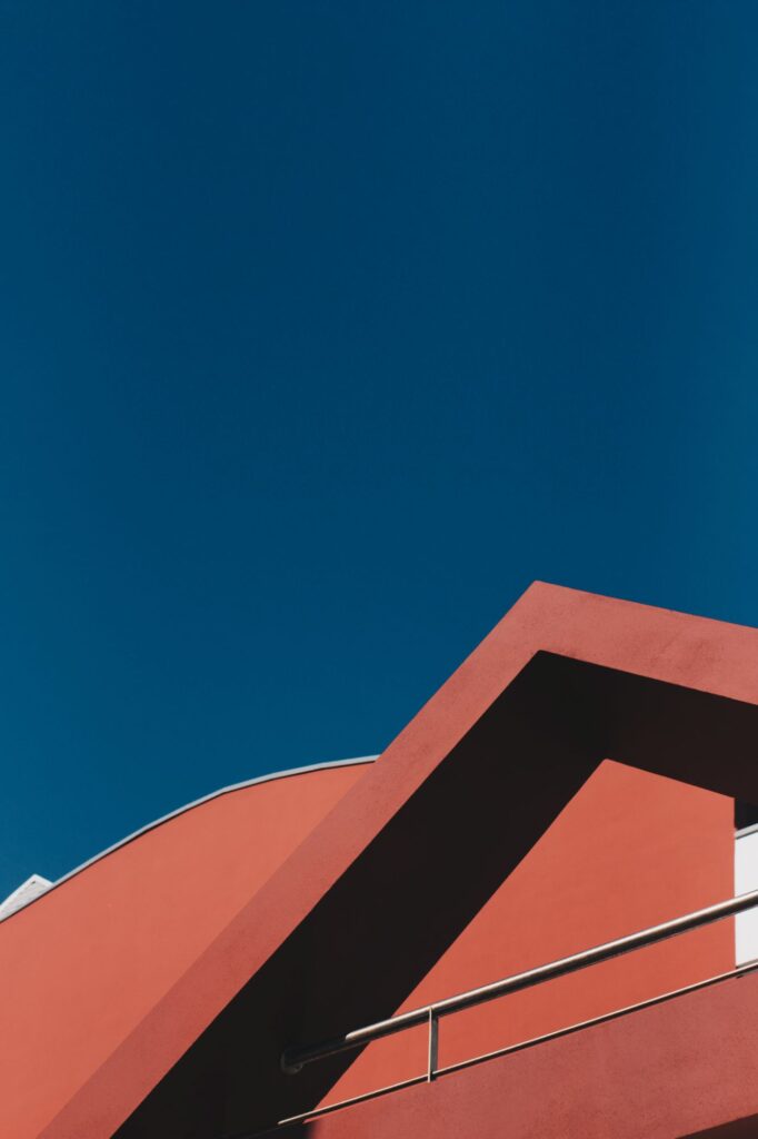
If you’re new to working with high contrast, an easy subject to start looking at is architecture. Architecture is appealing both with high tonal and color contrast
If you’re new to working with high contrast, an easy subject to start looking at is architecture.
Other subjects that work well with high contrast include:
- Street photography
- Still life
- Abstract
- Landscape
- Nature
- Specialized portraiture
Planning a High-Contrast Photoshoot
Here’s an Idea!
Create your own self-assigned high-color contrast photo shoot. It doesn’t have to be complicated; be sure to experiment with different color combinations.

Key Lesson: Color contrast does not require heavy color saturation to work. The image above is low tonal contrast, low color saturation, and high color contrast photo.
Create your own self-assigned high-color contrast photo shoot. It doesn’t have to be complicated.
Graphic by Kent DuFault
Key Lesson: Color saturation is represented on a color wheel by the distance from the center of the wheel. A color hue close to the center of the wheel is highly saturated. A color hue more proximate to the edge of the wheel has low color saturation.
Does it make sense to you now why you can have low tonal contrast and low color saturation images that are still presenting high color contrast?
Using Still Life to Learn About Contrast
When teaching my students about contrast, I often give them the assignment to explore tonal and color contrast using the still life genre.
Key Lesson: Still life creates an excellent environment to learn about contrast because you can control every aspect of the photo being created.
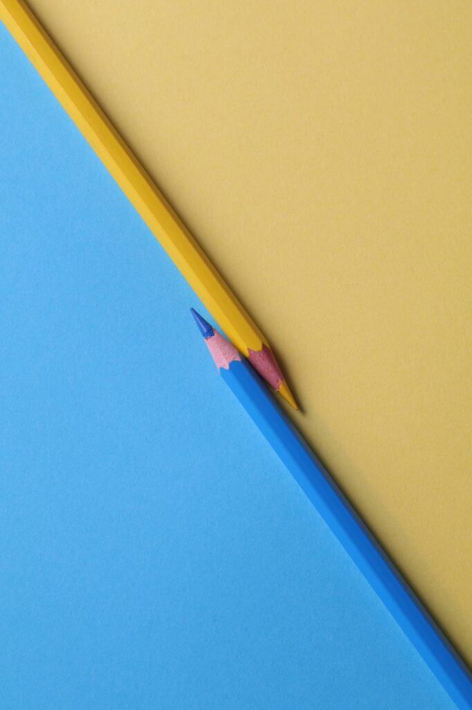
The image above is an excellent example of using still life to explore contrast. It is visually exciting and was created using the simple props of pencils and paper.
Why don’t you give this a try yourself?
Mixing High Contrast and Low Contrast Within the Same Image
Pro Tip: Mixing high and low contrast within the same image can be stunning. In addition, it is rarely tried. Put together a portfolio using this concept to create interest in your photographic work.

This image uses low tonal contrast and high color contrast to make a stunning and unusual photo dripping with mood and storytelling. Photograph by Alotrobo
Key Lesson: By mixing high and low contrast in either tone or color, you can create visually stunning photos that no one else is producing.
Recommended Reading: If you’d like to learn how to create amazing black and white images, grab a copy of Photzy’s best-selling premium guide: Better Black and White.
Conclusion
The human mind is trained from birth to look for and evaluate contrast. It is a survival instinct, and that makes it a mega-powerful composition tool for you. Mix and match contrast to create special effects and unusual scenes that are sure to be liked online.

- Why is high contrast so appealing?
- What is tonal contrast?
- What tone does the far-right side of a histogram scale represent?
- What does the histogram scale look like if an image displays low contrast?
- How is color contrast determined?
- What is the color wheel most used for in digital photography?
- What color is the opposite of blue on an RGB color wheel?
- What is the difference between color contrast, color separation, and monochromatic color?
- What is color relativity in photo composition?
- Name three genres of photography that work well with high contrast.
- True or False: Color contrast is dependent upon color saturation.


