
Shape, structure, and tone are the backbone of black and white photography. Without good composition that incorporates shape, structure, and tone, monochrome photos will appear weak. They will not engage viewers.
With color photography, you can use different hues to help build your pictures. Creating photos in black and white requires greater attention to how light reflects off shapes. This determines the tones rendered in grayscale. How you combine these to help add structure to your composition will mean it holds together well or it falls apart.
In this guide, I’ll discuss how learning to ‘see’ in black and white will help you make more compelling monochrome images. I’ll also take a look at discerning how hues translate to grayscale tones is essential to building strong compositions in black and white.
Lastly, I’ll cover how making use of the shapes and lines, either real or implied, create structure in a photo.
If you’ve not experimented much with black and white, you might think it’s very simplistic or even easy. Seasoned photographers who love black and white can make it look easy. But without some knowledge and practical experience, black and white photos can be mere snapshots.
Recommended Reading: If you’d like to learn how to create amazing black and white images, grab a copy of Photzy’s best-selling premium guide: Better Black and White.
Learning to ‘See’ in Black and White
We see everything in color and three dimensions. When we photograph in black and white, we render the world around us in two-dimensional grayscale. This immediately removes our photos from reality. Or does it give reality more impact somehow?
Stripping away color to create an interesting monochrome image requires more than using the desaturate function when editing your digital photos. Before you bring your camera to your eye and press the shutter button is where a black and white photo begins.
Before you bring your camera to your eye and press the shutter button is where a black and white photo begins.
The more you can imagine how your subject will look without color, the stronger it can be. Discern how the light reflects off what you are framing and how your camera captures this. Think about what areas of the photo will be bright and which will be dark. Look at the highlights and shadows. How will these affect the photo you are making?
Look at the shapes and what tones they are. How do they connect and relate to each other in your frame? Where are the lines? Are there some shapes of contrasting tones coming together to form lines you can use in your composition?
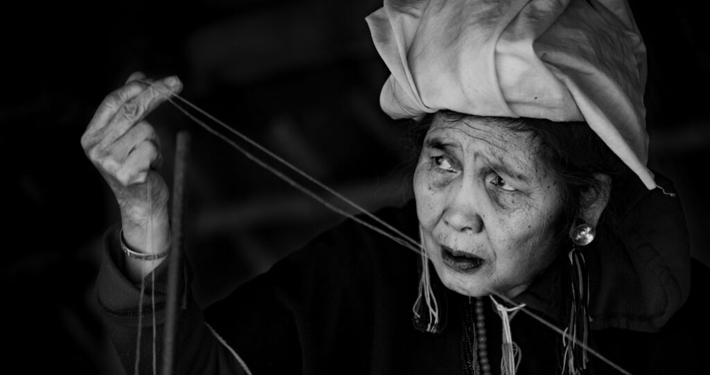
Photograph by Kevin Landwer-Johan
In soft light, a scene looks very different than it does in hard light. Smooth gradients from light to dark translate into soft light grays into charcoal blacks. The shadows merge into the brighter areas gracefully. There’s no color to interrupt this flow.
Black and white photos made in hard light express a more emphatic mood. The harsh contrasts produce tension. Dark shadows provide a sense of mystery. Shape and line are more prominent building blocks in the composition.
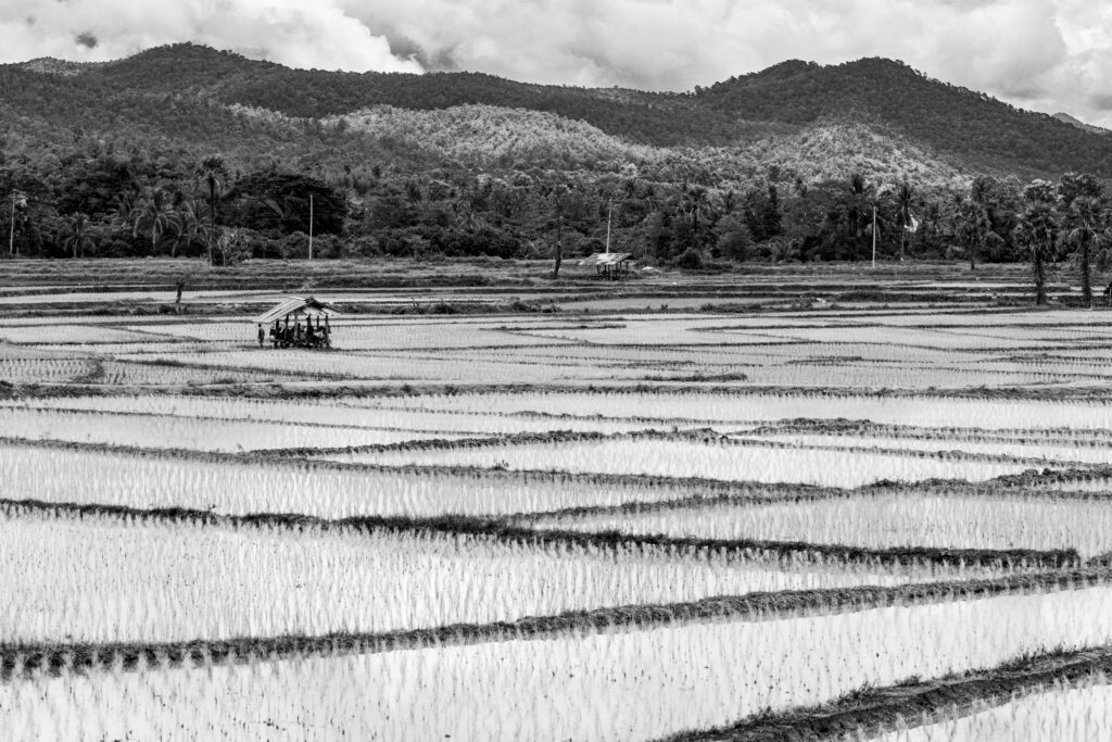
Photograph by Kevin Landwer-Johan
How you convert what you see requires more than focusing and setting your exposure well. Whether you’re using film or a digital camera to take black and white photos, you need to edit them well. What you ‘see’ in black and white before you press the shutter release will not appear on your film or in your RAW file unless you edit it well.
By taking control of the editing process of a digital photo, you can produce a monochrome image the way you previsualized it. Or you can make it look entirely different. But, if you know how you want a photo to look, then by using modern editing tools, you can achieve what you want.
Key Lesson: Photographers who are familiar with the whole black and white film process have an advantage. We understand the nature of capturing light on monochrome film. We understand what the perceived limitations are compared to digital black and white photography.
Working within these restrictions, I believe, helps a photographer to appreciate what they have in their digital RAW files. It also helps us understand how to process them. More than thinking and seeing in black and white, using film helps you understand the nature of a more limited grayscale palette.
Seeing Colors as Grayscale Tones
Without color, the shapes in your photos look different. Seeing shapes as flat graduated tones helps you arrange them in more interesting ways. No longer are yellow, red, blue, or any other color relevant, except for the gray tone left when color is removed. It’s the relationships between these tones that create structure in black and white images.
Warm colors generally appear as lighter gray tones than cool colors. Some reds and greens are the main exceptions. These can appear as very similar grays. Yellow and violet have the greatest contrast when converted to monochrome. How these colors are arranged in a composition and the relationships between them define the structure of the image.
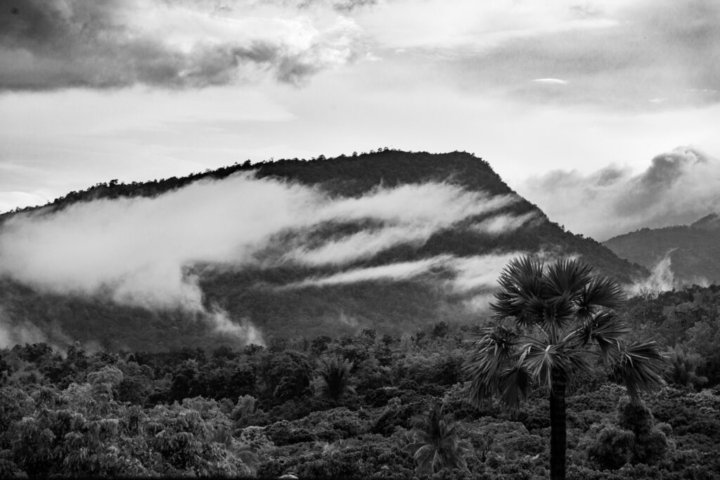
Photograph by Kevin Landwer-Johan
A skilled photographer creates the right balance of light and dark gray tones too:
- guide a viewer’s eye through an image,
- provide structure,
- create mood and atmosphere, and
- invoke a sense of mystery.

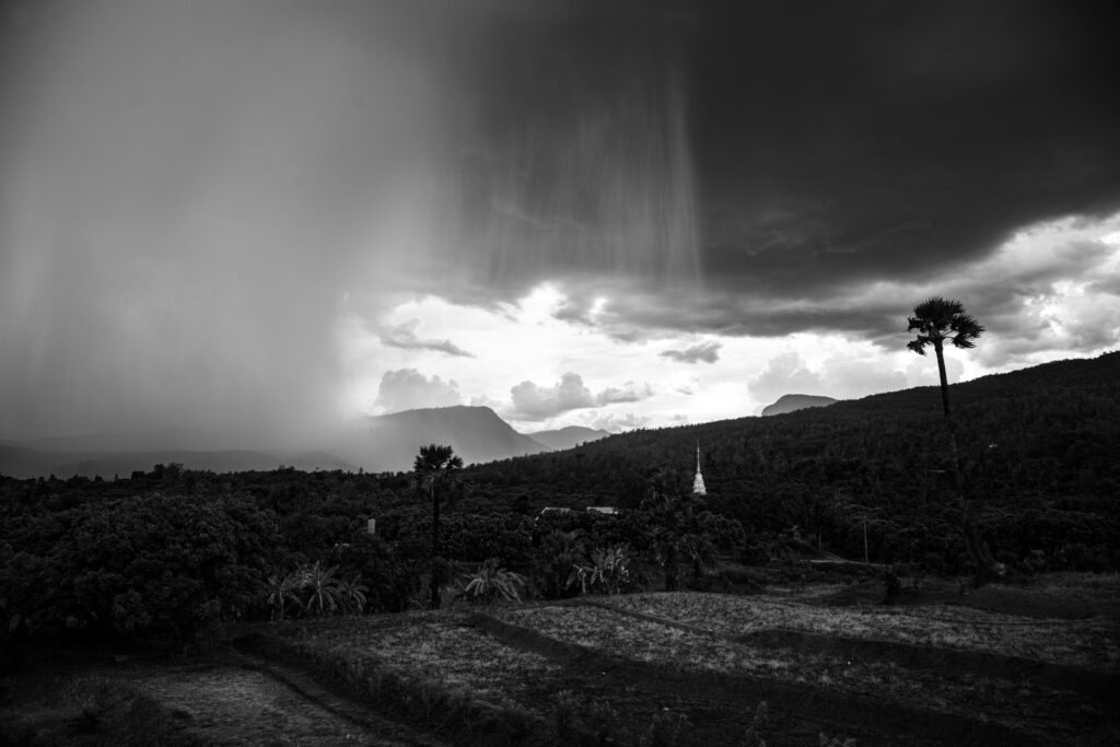
Photograph by Kevin Landwer-Johan
How the various toned shapes relate to each other has a significant impact on the structure of a photograph, whether you are photographing in the street, making landscapes, or any other situation where you do not influence arranging what’s in your photo, or if you’re composing a still life photo or a posed portrait, where you do have some control over the elements in your picture.
A combination of light and dark bold shapes in a photo can create an image of strength. Arranging only mid and light gray-toned shapes will produce a gentler photograph. Having a firm intent for the style of photograph you want to make will help. This can guide your choice in how you arrange the various toned shapes in your frame. The more aware you are of the range of gray tones in your composition, the more creatively you can manage them.
Key Lesson: Learn to see different colors as they will appear in grayscale. Take notice of colors that contrast and are adjoining in your compositions.
How Light Affects Tone and Contrast
Light-reflecting off a shiny surface and a dull or textured surface looks different in a photograph. The position of the light about your camera and subject also influences how the subject looks. This often has more impact on the structure of a black and white photo.
A shiny dark surface can appear white or near white when there is a direct reflection of light into your camera lens. If the light is very strong, even when you underexpose, you may not be able to render the shiny surface black.

Photograph by Kevin Landwer-Johan
Similarly, you may not be able to make a white surface look white, depending on the light and the exposure you choose. By underexposing a flat white surface in dull lighting, you can make it appear black. This is not something you’re likely to want to do often, but being aware that you can control it is helpful.
The position of the light about your camera and subject also influences how the subject looks. This often has more impact on the structure of a black and white photo.
Your point of view concerning the angle that light reflects off a subject determines much of the tone value it has in a black and white image. Knowing how to control your exposure settings to make any surface the tone you want affords you greater creative freedoms.
Key Lesson: Seeing how light reflects off the surfaces you photograph can help you decide what angle to take your pictures from. Do you want a strong reflection of light, or will you minimize it? How light or dark do you want any particular shape to appear? Will you set your exposure normally? Or will you underexpose or overexpose certain areas of your composition?
When you are aware of these choices, you have more control over how shape, structure, and tone appear within your photographs. This is not exclusive to working in monochrome, but it’s generally more pronounced.
Work With Your Aperture and Shutter Speed
Work with your aperture and shutter speed to control more than the exposure. How sharp or blurred any element in a composition has affected the structure of an image. It can also influence the shape of objects.
You can use aperture settings to help control how sharp or blurred things are in your photos. This changes them concerning your main subject, which is usually sharp. You can render recognizable elements as blobs of tone in black and white, or you can have them appear sharp, detailed, and recognizable. When things are very out of focus, their original shape may be unrecognizable.
Photograph by Kevin Landwer-Johan
By using slow or fast shutter speeds, you can also manipulate how moving elements appear. A slow enough shutter speed will render a moving object a blur or make it invisible. Fast shutter speeds freeze motion. You have the choice of how moving elements help structure your compositions.
Key Lesson: Make good use of areas in compositions that are not sharp. Be aware of the shapes they make and their tonal values. Think about how they affect the structure of your photos.
Post-process - Create Tone in Shapes and Manage Structure
Digital post-processing of RAW files gives you an incredible amount of control over how a well-exposed image looks. You can manipulate tonal range and therefore influence the overall structure of a composition.
You can make a scene look completely different than how you saw it. I’m not suggesting this approach is necessary, but again, when you are aware of the possibilities, you have more creative freedom.
Photograph by Kevin Landwer-Johan
With a well-exposed photo, you can work with the tones to increase or decrease contrast levels. It’s possible to change a light tone to a dark tone and vice versa. Knowing what you want is essential unless you have all the time in the world. Then you can experiment until your heart’s content.
Some photographers prefer to capture their images, so very little post-processing is necessary. Others think about how they will edit a photo before they press the shutter release. With either approach, it pays to aim for well-exposed images and control how the camera will capture the scene before you.
Key Lesson: Learn to post-process grayscale images well. Take time to experiment and practice how to develop an editing style that best suits the type of photos you take.
Recommended Reading: If you’d like to learn how to create amazing black and white images, grab a copy of Photzy’s best-selling premium guide: Better Black and White.
Conclusion

Photograph by Kevin Landwer-Johan
Learning to ‘see’ in black and white helps you to make more informed choices about the shapes, structure, and tone of your photographs. Developing this skill will help form the style of the black and white photos you take.
By understanding how colors appear in grayscale, you can structure your compositions well. The study which colors will appear lighter or darker than the ones next to them. This helps you see the character of how your photo will look in black and white before you take it.

Photograph by Kevin Landwer-Johan
Seeing light and appreciating how it reflects off different surfaces and colors also helps you better manage the structure of your photos. Managing your aperture and shutter speed not only affects exposure values; they also influence the appearance of a blur, and therefore the shape of elements in your photos.
There’s a lot more to black and white photography than the absence of color. Practice only photographing for black and white pictures. This will help build the skills you need to manage the shape, structure, and tone of your monochrome images.
Self-Check Quiz:
- Name one thing that determines how tones are rendered in grayscale.
- Is using the ‘desaturate’ option when editing the best way to render an image in grayscale?
- How can understanding black and white film photography make you a better photographer?
- What’s the difference between warm and cool colors when they convert to monochrome?
- Name two things that creating a good balance of light and dark tones in a black and white photo can do.
- How does the angle of reflection of light off a subject affect tone?
- What two camera settings can you control to help make blurred shapes?
- Why is learning to post-process black and white images so important?