

Your street and documentary photography can often benefit when you convert your photos to black and white.
In this article, I’ll walk you through some of the techniques you can use in Adobe Lightroom. These will help you to bring out the best in your street and documentary photos when you convert them to black and white.
Often, you’ll have no control over the lighting or the colors in your compositions. Converting to black and white can often serve to enhance your main subject. By post-processing your photos using Adobe Lightroom, you can create wonderful black and white images.
Key Lesson: As with all things Lightroom, there are many ways to achieve a similar result. There is no right or wrong way of doing things. Experimentation is important and having a little guidance can save you some time.
Recommended Reading: If you’d like to learn how to create amazing black and white images, grab a copy of Photzy’s best-selling premium guide: Better Black and White.
In this article, I’ll go through some of the techniques I use when converting to black and white using Lightroom. My focus is on street and documentary style photography because these types of photos are made using available light.
Starting Well Means Converting Well
Converting to black and white in Lightroom all hinges on the image you start with.
Saving your photos as RAW files is always the best option when you want to apply any postprocessing techniques. RAW files contain all the data your camera’s sensor records when you take a photo. You have so much more depth of information to manipulate with a RAW file than you do with a jpg file.
Converting to black and white in Lightroom all hinges on the image you start with.
Thinking in black and white when you take your photos will also help you get better results when you convert your photos in Lightroom. Look at the light and tone range in your compositions as you make them. Think about how they will look in black and white. This can guide you to better conversions.
Key Lesson: Some subjects and lighting situations lend themselves better to black and white photography. Look for contrast and texture when you’re composing. Think about how the light affects the tones you’re seeing. Will the mood of the image be enhanced by converting to black and white?
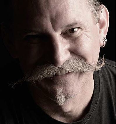
Photograph by Kevin Landwer-Johan
Converting to Black and White Using Lightroom
Lightroom is a great tool for postprocessing your color photos and converting them to black and white.
The immediate reflex many people have the first time they try converting photos to black and white is to simply remove the color. This is most commonly done using the Saturation slider that’s found in the Basic panel when in the Develop Module. This will strip the color from your photo, but it’s not the best option.
Simply desaturating your photo gives you no control of how the colors in it will look in the resulting grayscale image.
Following the process outlined below will give you more options for controlling how your black and white photos will look.
Select the Black and White Treatment
In the Basic Panel, at the top, there’s an option to select the Treatment. By default, it is set to Color. You can change this to Black and White. When you do this, you may notice the HSL/ Color Panel lower down then becomes the B&W Panel.
My original color version. Photograph by Kevin Landwer-Johan
Adjust the Image Tone
Below the Temp and Tint sliders, you will find six sliders that control adjustments for the Tone of your image. With these sliders, you can manipulate how the black, white, and gray tones look in your photo.
Key Lesson: As with any postprocessing, it’s best to have an intent for how you want your photo to look. Controlling the tones in different ways will alter the mood of a photo. Light, low-contrast images generally give off a happier feeling. Dark shadows and high contrast in a photo can convey a more foreboding mood.
I start with the Blacks slider and drag it to the left. I like dense blacks in my monochrome photos. I often follow this by bumping up the shadows. Dragging the Shadows slider to the right will bring back some detail in the darker areas without losing the solid blacks.
I have darkened the image and boosted the contrast. Photograph by Kevin Landwer-Johan
Depending on the mood I want, I will work the Contrast slider to add contrast or reduce it. Then I’ll pay some attention to the highlights and whites, so they balance well and work towards the overall feel I am creating.
Bring Some Presence to Your Pictures
Next, I’ll work with the sliders under the Presence heading. Clarity and Dehaze can make dramatic changes to your black and white photos. The Texture slider can enhance detail but doesn’t alter the black and white tone of an image.
Dehaze works a little like the Contrast slider when used with a grayscale photo. You can lighten or darken the overall feel. The Clarity slider also processes contrast levels, but in a different way than the Contrast slider does. Experiment carefully with both these sliders.
It’s always good practice not to push any slider to the extreme. Doing that can cause your images to break down and lose quality. Using a combination of two or more sliders that perform similar changes is a safer way to work.
Check Your Exposure
Once you’re happy with the way your black and white conversion is looking, go back up to the Exposure slider.
Increase and decrease the exposure to check how it looks. I often find I have made my photos too dark and they benefit from a slight movement of the Exposure slider to the right.
Temp and Tint Can Affect Black and White Photos
It may seem odd, but the sliders for color temperature and tint can alter how your black and white image looks.
It’s always good practice not to push any slider to the extreme.
These are located near the top of the Basic Panel. Even though you are looking at a black and white version of your photo, it still contains the color information. The Temp and Tint sliders alter the color balance of your original image.
Experiment with these two sliders to see if you can improve the look of your photo. Or you can use the eyedropper to select an area of your photo. I will often test the eyedropper on the skin tone of a person.

I darkened this photo more using the Dehaze slider. Photograph by Kevin Landwer-Johan
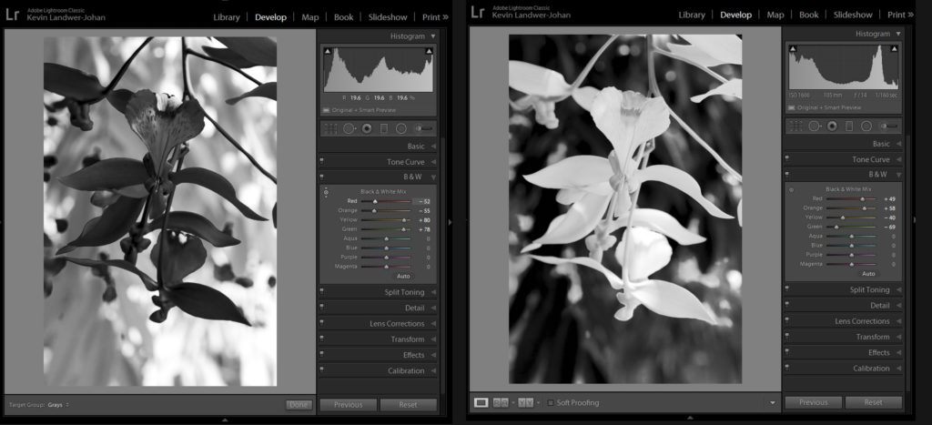
For Greater Control Use the B&W Panel
In the B&W Panel you have more options to control the tones in your grayscale images.
This panel has eight sliders. Each of them controls the tone of a color. When your original image has bold colors and you don’t like how they appear in black and white, you can alter them.
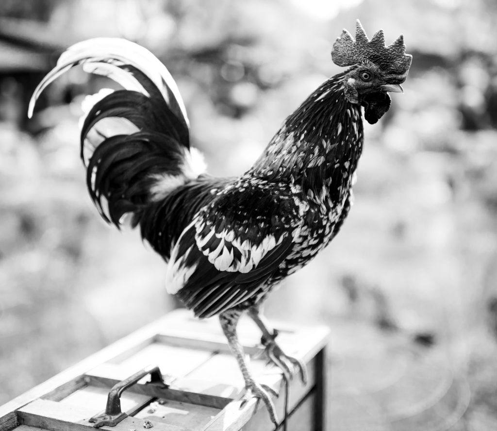
Photograph by Kevin Landwer-Johan
Warm colors often appear light when converted to black and white. Cooler colors are darker. I have processed this image in two different ways using the color sliders in the B&W Panel.
In the first, I have darkened the red and orange tones and lightened the greens and yellows. In the second photo, I have done the opposite. I took the red and orange sliders to the right and the green and yellow to the left.
Dodge and Burn Your Black and White Photos
Back in the days before digital photography and Lightroom, I used to process my black and white photos in a darkroom. Here, the tools were simple. The amount of manipulation was far more limited. Two things I did back then and still do now are dodging and burning.
Dodging lightens areas of a photo. Burning darkens.
In a darkroom, I used a small circle of card taped to a wire handle to reduce the amount of time light from the enlarge affected the print. These areas would be lightened. To darken portions of a photo, I’d use a card with a hole in it or block most of the light by holding my hands in front of the light. This allowed more light to affect some parts of the print than others.
With Lightroom, the process is much easier and far more controllable.
Use the Adjustment Brush. Set the Exposure slider to one extreme or the other. This will mean that when you paint over an area, it will appear black or white.
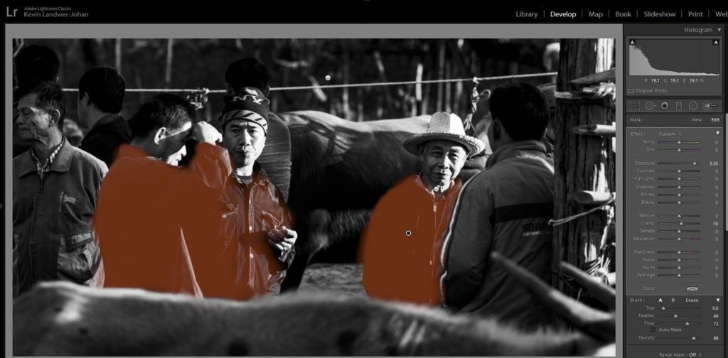
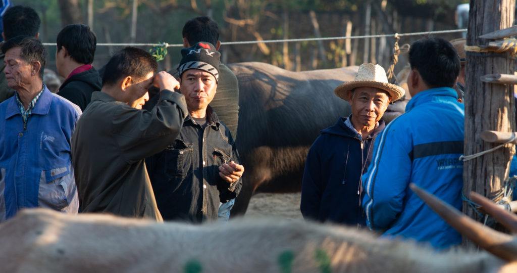
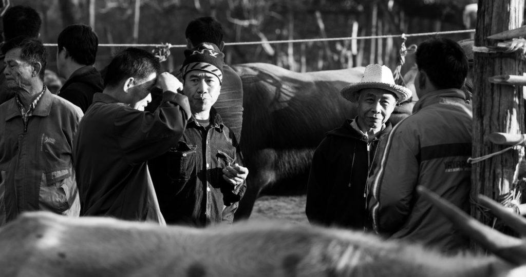
I darkened the top and bottom using one brush and then used another to lighten some of the men’s jackets. I’ve highlighted them to make it easier to see the affected area. Photograph by Kevin Landwer-Johan
This makes it easy to see what parts of the photo are going to be affected. Don’t worry if this makes parts of your image look terrible. You can change this.
Once you’ve painted over a dark or light area you want to alter, drag the exposure slider so the density suits the way you want it to look.
The same goes for dark areas with no detail. These will also render a poor quality if you push the limits. You’re best off in both cases to make only minor adjustments, if any.
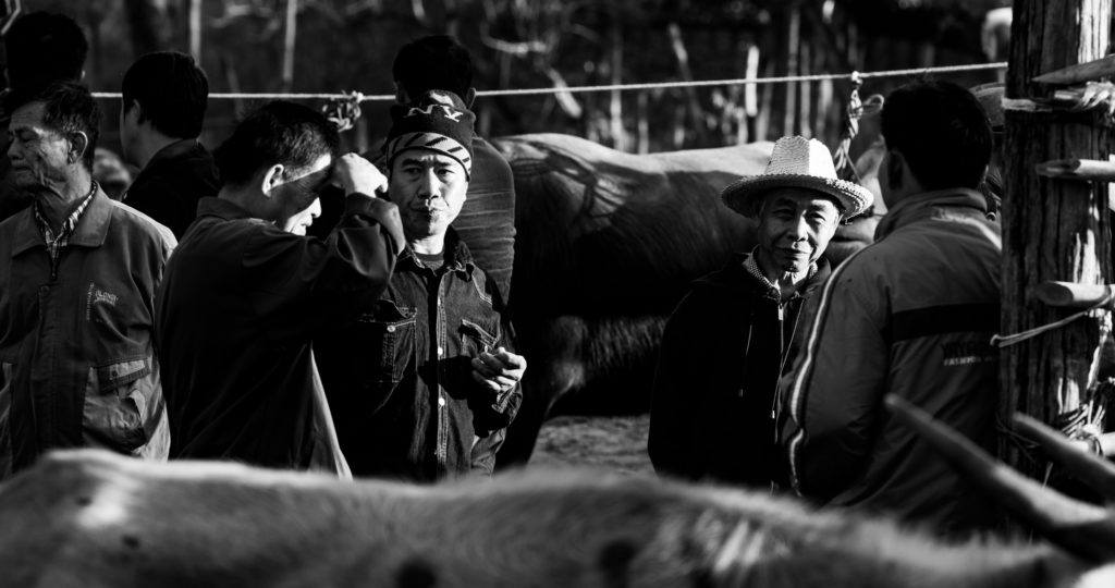
The finished edit. Photograph by Kevin Landwer-Johan
Key Lesson: Be careful not to degrade the quality of the image when you use this technique. When you burn in an area that has no detail, when it’s very overexposed, you run the risk of creating a murky gray mess. This never looks great.
Recommended Reading: If you’d like to learn how to create amazing black and white images, grab a copy of Photzy’s best-selling premium guide: Better Black and White.
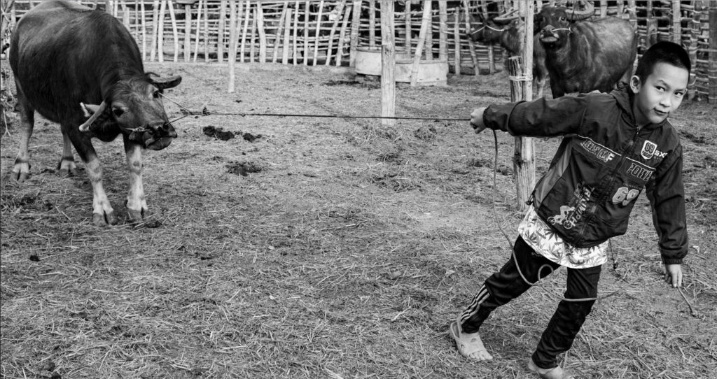
Photograph by Kevin Landwer-Johan
Experiment When Converting to Black and White
Experiment with making all or any of these adjustments. As I stated earlier, there is no right or wrong way to do this. Your intent will guide you.
If you start out not knowing what you want, this will be a hindrance to you. If you’re not sure, look at the work of some master photographers who work predominantly in black and white. See how they manage the tone range in their photos. Get some ideas of how you can make your street and documentary photos pop by converting them to black and white.
Self-Check Quiz:
- Is there a right way and a wrong way to convert your photos to black and white?
- What’s the best file type to start with when converting photos to black and white?
- What can you think about when you’re taking photos that will help you take better images for converting?
- Is it best to use the Saturation slider to convert your photos?
- What does controlling the tones in a black and white image alter?
- What two sliders might seem like odd ones to use to alter the gray tones in a photo?
- What old-school techniques do I still like to use?


