How White is White and How Black is Black in Your Photos

New / Noteworthy
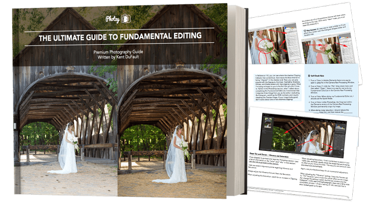
This Quick Tip comes to you from our premium guide, Better Black and White
The most common problems with black and white photography that originates from a color digital file include:
- A lack of contrast
- Too much contrast
- Important white areas that have no detail at all
- Important shadow areas that have no detail at all
These four points can, and will, kill your best efforts for creating outstanding black and white photography.
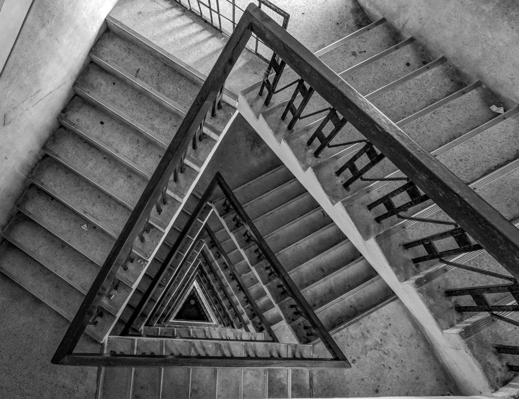
Today, I want to show you some poor quality black and white photography.
My reason for doing this?
In order to recognize the good, you have to know what the bad looks like!
I’m sure some of you will look at these images and think, “Well, it’s a creative statement! The photographer was just being creative.” I’m not going to argue with you on that point.
Sometimes, it’s good to go outside the boundaries of normal to stretch our creative muscles.
However, you should put this into your mind:
You need to know when you are stepping outside the boundaries and why. Also, if you enter your black and white photography into an exhibition or a contest, and your photographs exhibit the qualities of the photos that I’m about to show you… your chances are zero.
Let’s look at the bad, and then talk about how to make your photos better!

Too much contrast. Both the whites, and the blacks, are “blocked”. They have lost important detail!
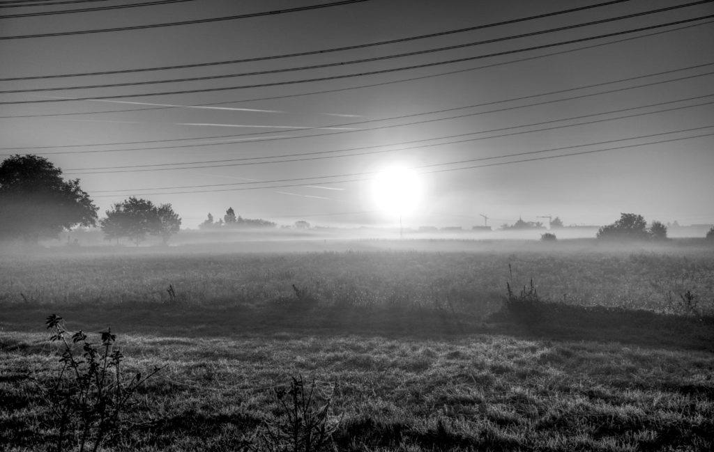
Too little contrast. In effort to control the dynamic range of highlight to black, this photographer has created an image that simply looks grey and mushy.

Too much contrast. This photographer resorted to post-production trickery to try and compensate for a bad original file. This image may fool amateurs. However, it will never fool a seasoned professional or an art expert that is judging a contest.

Not enough contrast results in a flat and lifeless shot.

Too much contrast and poorly set black point. When a photograph looks too dark, you can bet that it is too dark. Humans do not see this way. We see into shadows with our eyes.
Here is the key quick tip for today:
The “brightest highlight” in a photograph should register at 255 on the Histogram.
This area should be a small non-important highlight to the composition.
The “brightest white” area in a photograph – meaning the brightest white that is important to the composition – should be no brighter than 248 on the histogram.
For example, the brightest white on a bride’s dress, in a bridal portrait, should be no brighter than 248 on the Histogram. However, a small insignificant area of the sky behind the bride can be set at 255 on the Histogram.
In general, it’s important to have some small, insignificant area of the shot at 255 on the Histogram, or you risk the possibility of creating an image that looks “flat in contrast”. That’s evident in the second example above.

Look at the diagram above. Do you see how the far right panel is “disappearing” onto the page? There is no detail there. The center panel displays how you want to set the brightest white in your image that will hold detail. The left panel shows you that if you set your white point too low, your highlights will begin to look grey and mushy.
Now, let’s look at the other end of the Histogram.
The “darkest black” in a photograph should register at 0 on the Histogram.
This area should be a small, unimportant, black area within the composition.
The “darkest shadow” area in a photograph – meaning the darkest shadow (black area) that is important to the composition (showing detail) – should be no darker than 12 on the histogram.
For example, the darkest shadow (black area) on the fur of a black cat, in a portrait, should be no blacker than 12 on the Histogram.
A small unimportant area within the frame (perhaps the cat’s pupil) can, and should be, set to 0 on the Histogram.
In general, it’s important to have some small, insignificant area of the shot at 0 on the Histogram, or you risk the possibility of creating an image that looks “flat in contrast”. That’s also evident in the second example photograph above.
Go back to the photograph of the dog. All detail has been lost in the ears, and in the chest below the color. The black point was set too low.

Look at the diagram above. Do you see how the far right panel is absolute black? There is no detail there. The center panel displays how you want to set the darkest black (shadow) in your image that will hold detail. The left panel shows you that if you set your black point too low, your blacks (shadows) will begin to look grey and mushy.
BONUS– I've got something special for you on the next page...
If you’d like to learn exactly how to create the best black and white photography this weekend. Go here to check out our premium guide, Better Black and White now »
Click below now, to read about it on the next page…
About Kent DuFault
Kent DuFault became a photographer in September of 1974. He took a “Basic Photography” class in high school and was hooked for life. His best-selling guide, Better Black and White has helped thousands of photographers worldwide learn and master the art of black and white photography!