


Every photographer has experienced the frustration of photographing some magnificent scene, only to be disappointed when they view their final results.
There are a number of technical, and aesthetic, reasons that a photograph might fail, even if the photo is as dramatic as two gigantic brown bears clawing away at each other.
Sometimes, the bones for a great shot are there, but a newer photographer might not recognize that.
This was the case for Mark Gromko. Mark had captured a pretty amazing shot of two brown bears grappling with each other in a stream.
He posted that shot in the Shark Tank over on Lightstalking.com.
These were his own words, as he asked fellow Lightstalking photographers for some advice:
“This picture of two brown bears was taken on Admiralty Island in Alaska. I have submitted it to camera club competitions, and it has gotten responses roughly the equivalent to “meh”. I don’t understand why. Perhaps I am confusing the excitement of the experience with the quality of the photo.”
When I read his statement and saw his photograph, it brought to mind a common occurrence that I see with many photographers.
Photographers will create an image without a lot of consideration as to what they’re trying to say and how they’re going to say it.
The result is that even an exciting moment (well captured by the way, Mark) can become bland and uninteresting.
Here is Mark’s photograph as he was submitting it to his camera clubs:
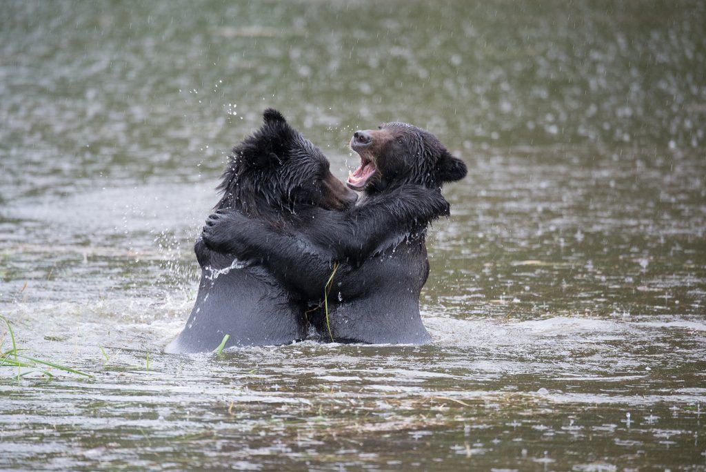
Photo by Mark Gromko
Mark knew that he had witnessed something special. He also knew that he had captured the image as technically well as he possibly could. He had a decent exposure, his lens focal length was long enough to fill a reasonable amount of the frame, and the image was sharp. He composed the image as best as he could, given the moment and the type of day.
In Mark’s mind, he couldn’t understand why this exciting moment was receiving such a blasé response.
Analyzing a photograph is a skill we should all be continually working on. We should be asking ourselves, “What is the purpose of this photograph?” and “How is that story best told?”
Analyzing a photograph is a skill we should all be continually working on. We should be asking ourselves, “What is the purpose of this photograph?” and “How is that story best told?”
I talked to Mark, and I told him that I thought he had a great shot—it just needed some finessing to bring that story to the front. In other words, the story needed to be clear and concise, and it currently wasn’t.
The way to do that was through post-processing.
Mark gave me permission to work on his photograph and to share my procedure with you.
We are going to take his picture from “Meh” to “Wowzer!”
When you’re finished with this Quick Guide, you should have developed some skills in identifying the important aspects of an image (to tell a story).
Having that knowledge will give you a guideline—a plan—on how to accentuate the “story” of an image through post-processing. You should also have developed some beginning skills in how to use Photoshop to highlight or hide parts of an image, and thus create a better photograph.
Step One: Develop a Plan
Let’s talk about the “story” of Mark’s bear photograph.
After analyzing the picture, I believe the entire story is centrally located around the two bears. The background, and foreground, adds minimally to the story. The splashing water is nice and adds to the action, which is important to the story.
I think the bulk of the story is the bear on the right. We can see his face clearly, which gives him more ‘visual weight’ as a subject than the bear on the left. The bear on the left is important because she provides context and adds to the action. However, in my post-processing plan, I am going to concentrate on making the bear on the right my subject, and the clear purpose of my story.
Next, in an overall judgment of the image, several things come to mind. The lighting was poor. As a result, the color is flat and uninteresting. The various textures are carrying far more visual weight than the colors. In my mind, because of that, this image would be far more dramatic as a monochrome image: either a true black and white, or a toned image.
My post-processing plan includes:
- Crop the frame to bring the two bears to the forefront. We don’t need much
background or foreground. - Eliminate distracting elements that carry visual weight and will draw a viewer’s eyes away from the face of the bear on the right.
- Using various Photoshop tools, adjust tone, shape, and texture to push the
viewer to the story—the bear on the right. - Convert the image to monochrome.
Step Two: Crop the Image to Accentuate the “Story” (Subject)
I like to crop in the Camera Raw Window. This allows me to crop without altering the original file in case I should change my mind about the cropping at a later date. If you look carefully, you will notice a “Rule of Thirds” grid inside the crop box. This is turned on in the preferences. I always leave this on, and I often re-check my crop within Photoshop. I’ll tell you why in a moment.
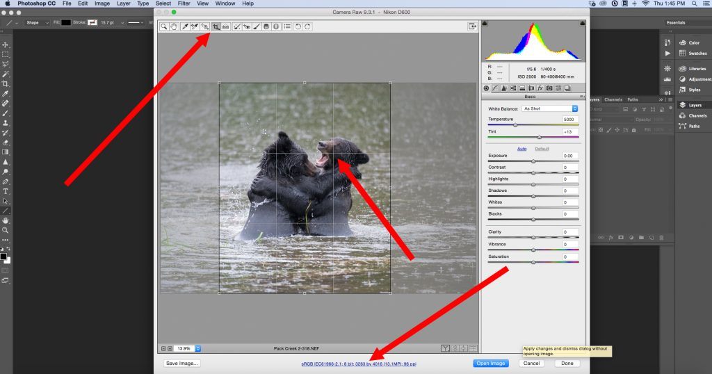
Screenshot by Kent DuFault
Some things to consider when you’re cropping:
- The Crop Tool is located where the upper red arrow is pointing. It can be set to freeform or to a specific ratio, such as 8×10 or 2×3. In this case, I’m using it as a freeform crop, meaning I can set the ratio any way I want.
- Will you have enough resolution left to use the photograph, as you would like to? The bottom red arrow shows you where this information is located. In this case, Mark’s original file was quite large. Even with the vertical crop from the horizontal frame there is enough resolution to print this cropped file into a very large wall print for display.
Screenshot by Kent DuFault
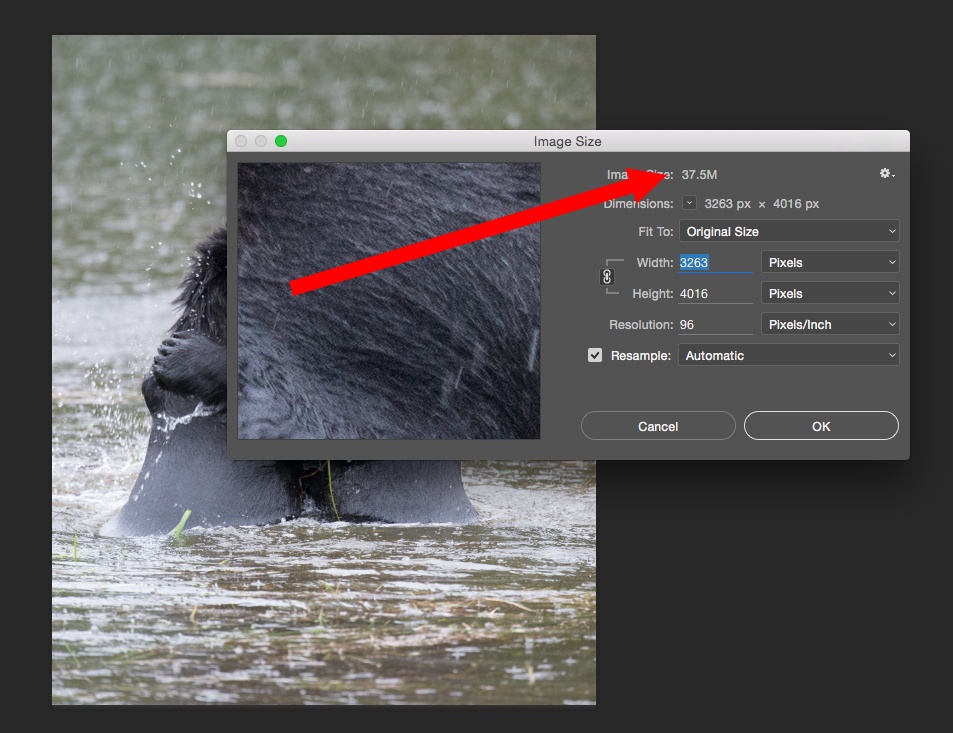
You can also check the image size within Photoshop to double check that your
resolution meets your needs.

Screenshot by Kent DuFault
This is a close-up view of the crop box within the Camera Raw Window. Take notice that I have placed my subject (my “story”) at one of the cross-points for the Rule of Thirds.
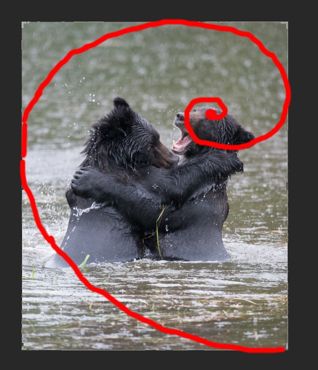
Let me show you why I like to check the crop again within Photoshop.
Screenshot by Kent DuFault
The Crop Tool within Photoshop allows you to apply several different overlays that depict different rules of composition. This screenshot depicts the Golden Spiral. I drew over the overlay in red because it was hard to see from a screenshot.

Screenshot by Kent DuFault
This screenshot depicts yet another overlay option, the Golden Triangle. Note that our subject, our “story”, falls exactly into the “sweet spot” for all three overlays. I feel that our composition is solid.
We have achieved a major step in our post-processing plan.
Step Three: Convert the Image to Monochrome

Screenshot by Kent DuFault
Important Point: When I know that I am planning on a monochrome image for my final product, I like to do the conversion immediately following the cropping stage. I do this because some of the other adjustments that we are going to make will react differently to a color file versus a monochrome file.
There are so many ways to convert a file from color to monochrome, so I’m not going to discuss that. I’ll simply show you the method that I used along with a few tricks that improved the final photograph.
There are many programs and plug-ins for converting a color image to monochrome. I actually have three plugins on my computer that can convert an image. You can also accomplish the task within Photoshop or within the Camera Raw Window. If you look at the previous screenshot I’m going to use Silver Efex Pro 2 by Nik. I like this particular program, especially when I’m trying to create the most natural looking black and white conversion possible.

Screenshot by Kent DuFault
This screenshot depicts the workspace window within Silver Efex Pro 2. Most conversion programs will have something similar to this. On the left are a series of presets. The one that I’ll be using, where the arrow points, is called “Natural.” It gives the cleanest conversion without any funky effects added. I want you to pay special attention to the red arrow on the right that is pointing to the colored dots. Those are “filters”. When a photographer shoots black and white film, they can put a filter on the lens and it will alter the tones of the image. In this case, the “Blue Filter” darkened the water as well as the wet areas of the fur. Below the dots is a strength slider. This is adjusts the density of the Blue Filter from dark blue to light blue. For this particular photograph, a strength setting of 80% looked good.
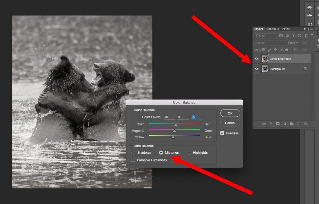
Screenshot by Kent DuFault
Silver Efex Pro has a cool option. When it creates the conversion to monochrome, it places it on a separate layer. This allows you to keep working, while knowing that your color layer is still there, unaltered. With certain monochrome images, I like to add a very slight sepia tone. This is personal taste and probably goes back to the many years that I spent in a darkroom. There are many sepia tone programs and presets out there. I don’t care for most of them. They seem to take the effect too far. My preferred method is to open the Color Balance Adjustment window. In this case, I’m going to add a sepia tint to the midtones. I’m going to do a +5 Red and a -5 Yellow. As you can see, our subject (story) is beginning to emerge, even with just these few changes that we’ve made. The viewer’s eyes are already being directed to that bear’s face on the right!
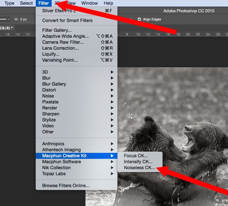
Step Four: Apply Noise Reduction as Necessary
All photographers have different workflow suggestions. I like to do noise reduction early in the process. Noise reduction, by the very nature of how it works, reduces clarity and sharpness in an image. By employing my noise reduction early, I can then go back and tighten up the clarity and sharpness in areas that I think are important. You’ll see this in a minute. Again, there are many programs and ways to reduce noise. I’m just going to cover my method. I’m going to my Filter menu and selecting the Noiseless CK Noise Reduction Program.
Screenshot by Kent DuFault
Important Note: Photzy recently published a very thorough review of the Noiseless CK software app. It only works with Apple Computers. But, it is a wonderful program. If you missed the review, check the Photzy blog post from February 3, 2016.

Screenshot by Kent DuFault
When doing noise reduction it’s important to view the image at 100%, as shown here. Under the weather conditions that Mark was forced to shoot this picture, he had to use an ISO of 2500. This left some minor noise on the image as indicated in the circle.
Each noise reduction program will work slightly differently. The important point in Reference 011 is that you always want to use the lightest noise reduction possible. For this photograph, I’ll be using the “Light” preset and reducing the strength to +95. In the circle you can see the existing noise on the left of the yellow line and the noise reduction on the right.
Step Five: Fine-Tune the Image with Global Adjustments
Learning to fine-tune a composition is what really separates the pros from the amateurs. Right about now, you should be getting a pencil and some paper so that you can take notes.
The art of fine-tuning a composition is much like being a painter. You dab a little here, you smoosh a little there. You’re creating your masterpiece from the base layer.
The art of fine-tuning a composition is much like being a painter. You dab a little here, you smoosh a little there.
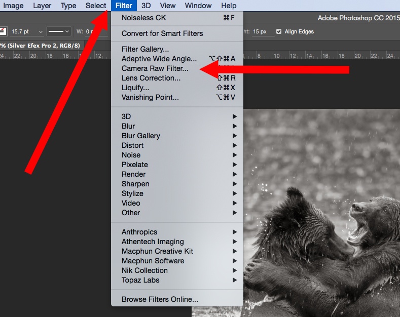
I’m sure you remember that when we opened the image, we cropped in the Camera Raw Window. Photoshop (for a number of versions now) allows you to open your image in the Camera Raw Window from within the Filter drop-down menu in Photoshop.
This is my favorite place to do my fine-tuning. Take note that changes done here ARE NOT saved in the Meta Data file, so they are not undoable as the changes are when you open the file.
However, the tools in the Camera Raw Window give you very precise control, which is why I like to use them!
Screenshot by Kent DuFault
Open the Filter drop-down menu and select “Camera Raw Filter.”

Screenshot by Kent DuFault
I want you to go back and look at an early version of the bear photograph. Take notice how the background and foreground are both very flat in their lighting. I’m going to use a dark vignette to counteract that “flatness.” The vignette will also “push” the viewer’s eyes towards the center of the picture (where we want them to go because that’s where our “story” is!). I’m creating my vignette from within the Camera Raw Window. You can find it in Reference 013. The Vignette setting is located in the Effects Tab. I’m creating a vignette in the amount of -18 and with a midpoint of 60. The red arrows in the corners show where the vignette is tapering off.
Screenshot by Kent DuFault
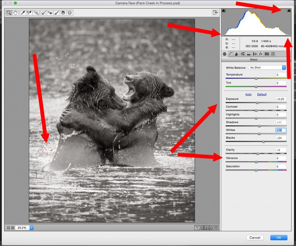
When I begin the process of fine-tuning an image in the Camera Raw Window. I like to apply “Global Adjustments” first. What do I mean by that? These adjustments are applied to the entire image. My goal is to make the image look as pleasing to my eye as possible without knocking the histogram out of whack. Look at Reference 014. Let’s talk about the histogram first. The histogram is that mountainous-looking graph in the upper right. An entire guide could be written on the histogram. For now, this is what I want you to know…
The graph should taper down to the line at both ends. If either end extends beyond the graph, a nasty little thing called “clipping” occurs. Clipping is where you are going to lose detail in your image. If you’re just posting online, it’s less important as long as the clipping isn’t too bad. If your image will be printed as a photograph or used in print (such as a magazine), it’s very important! The Camera Raw Window helps you with this by giving you a warning. See the little “spade” shaped icons? When you click on those, the software turns on a clipping warning. See the arrow on the far left?
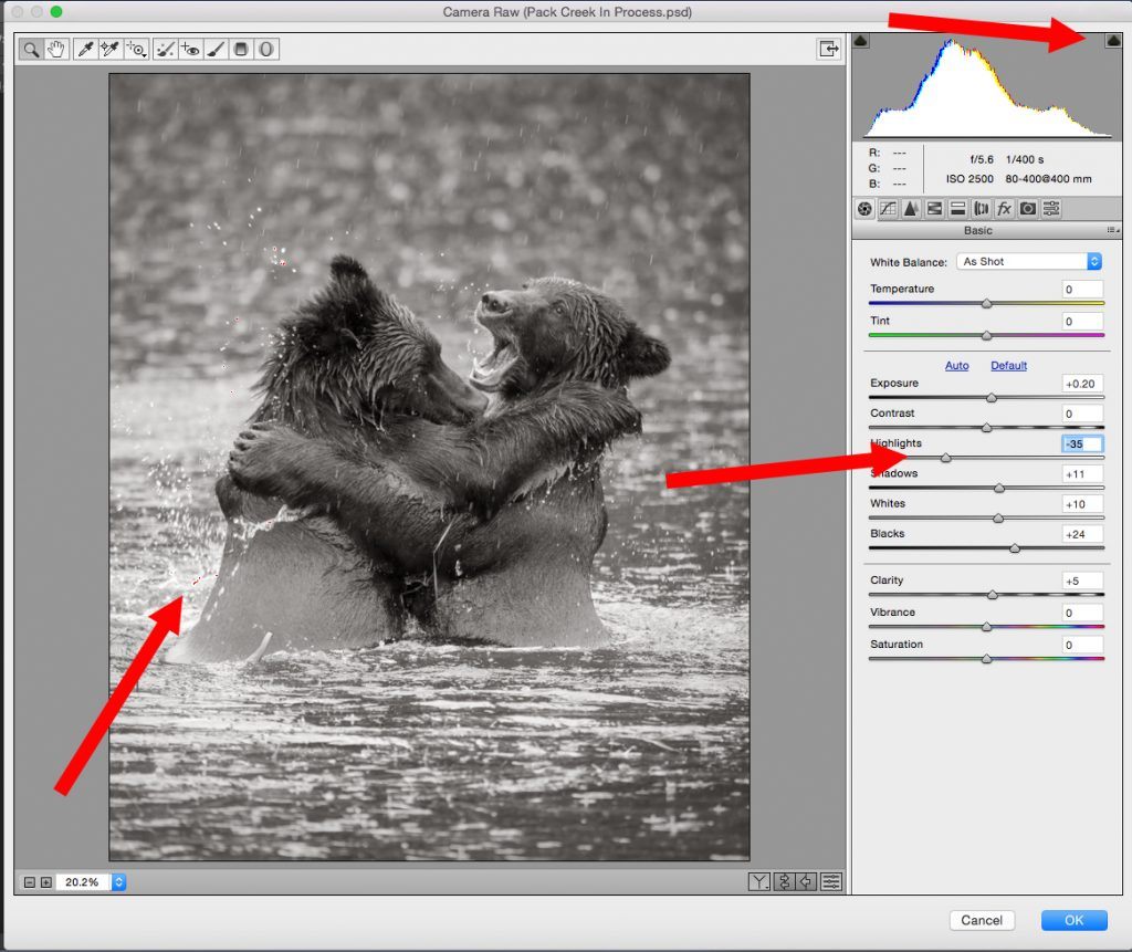
Screenshot by Kent DuFault
Those little red dots are the warning sign; they indicate clipping is occurring on the highlight end. It’s not so important when the clipping is occurring in a specular white highlight such as splashing water, but we will fix it anyway. Now look to the arrows on the right. I made these global adjustments by observing the image and watching the histogram. They included: Exposure +20, Shadows +11, Whites +10, Blacks +24, and Clarity +5. There is no magic bullet for these adjustments. You simply need to practice.
Here I have taken away the clipping by reducing the highlights to -35. You’ll notice that most of the “red clipping warning” is gone. I left just a few little dots. It’s important not to go too far when adjusting clipping on either end. You don’t want to go so far that all of your highlights look gray, or on the other end, so that your blacks look muddy. By leaving just a little bit of the warning mask showing, you know that you still have a full range of tones.
Step Six: Fine-Tune the Image with Localized Adjustments
The next part of the process is my favorite. It is these next adjustments that set you apart as being an individual artist.
This is what I’m saying with the above statement. Let’s say you take a workshop to go to Yosemite National Park in the United States to photograph brown bears (just like the image we are working on today).
Now, let’s imagine that there are 12 participants in the workshop. All of you are lined up along the same riverbank. All of you have telephoto lenses. All of you are firing away at the same two bears grappling in the river. Essentially, except for minor differences, you are all getting the same shot.
Important Point: How you deal with your image in post-production is the one way that you disconnect yourself from the group and establish your own vision. Post-production can completely change how an image is perceived, as we are going to see with Mark’s photograph. Think about that…

Screenshot by Kent DuFault
We are still in the Camera Raw Window. However, we are now going to switch over to one of my favorite Photoshop post-processing tools. It’s called the “Adjustment Brush.” The Adjustment Brush offers you an almost infinite control in making localized adjustments in your photographs. It is literally your “painter’s brush.” Look at the far left upper red arrow. This is where you select the Adjustment Brush. Now look to the very lower right red arrow. Do you see where I have checked “Overlay” and “Mask”? By checking these two items you can see exactly where you have painted your localized effect. I often check these to paint the mask, and then uncheck them to make the adjustment (so I can see the picture without the mask). The toolbox on the right includes all the adjustments that can be made to a localized area. The three buttons across the top allow you to create a new mask, add to an existing mask, or subtract from a mask. The masking is done with an adjustable paintbrush (just like in the main Photoshop workspace).
Post-production can completely change how an image is perceived.
For my first localized adjustment (as seen in Reference 016), I am reducing the exposure of the head of the bear on the left by -20.
Important Points:
- Carefully paint your masks so that the effect doesn’t bleed into any unwanted areas.
- It’s better to work in increments and keep adding new masks to build up an effect: rather than to make one big change. This is especially true when you’re just learning.
- As you create new masks, don’t forget to zero out the adjustments! I wish Adobe had made it so that when you click for a new mask, all the adjustment sliders zeroed themselves out. But they don’t. So if you don’t zero them out yourself, you’ll be making changes that you don’t want.
- Keep an eye on that histogram as you make changes. This is especially true if you’re making broad sweeping changes on either end of the tonal range (highlight or shadow).

Screenshot by Kent DuFault
Here we are adding our second localized adjustment. Please take note of the following. The “New” radio button has been selected. The “Exposure” slider has been changed to -35. The lower red arrow is pointing to a “Pin” that is green with a black dot. The green pin indicates that this mask is selected and being worked on. Do you see the white pin? That was our first mask. If we were to put our cursor over the white pin and click, we would then select that mask once again, and we could do additional work in that area.
Important Point: Always make sure you’re working on the right mask. It’s easy to get messed up.

Screenshot by Kent DuFault
You can see that I have created a “New” mask. I am no longer working with exposure, so I have reset that slider to zero. I am now going to increase the “Clarity” and “Sharpness” in the area where I want my viewer’s eyes to come to rest. Notice the red arrow pointing to the right bear’s nose. Be careful when you’re creating your masks not to overrun the area, or miss spots. Doing so will leave odd-looking changes that are known as “Artifacts.” Take your time and work slowly.
Important Point: So far, you will notice that my localized adjustments have been either in the areas of exposure, contrast, and/or sharpness. I’m creating an effect that works upon the psychological rules of composition. I’m not going to delve deeply into composition here in this guide. But, this is what I’m creating. A viewer’s eyes are attracted to an area of contrast change, and they will typically go to a lighter area over a darker area. I want the right bear’s face to be of a brighter tonal range than anywhere else in the photograph. Secondly, a viewer’s eyes will be attracted to a textured surface over a smooth surface. I’m adding texture and contrast to my subject’s face. I’m also adding those features to the second bear’s paw, arm, and face, which will act as a frame for my subject.

Diagram by Kent DuFault
Recommended Reading: If you’re not familiar with composition, you may want to start here: “Understanding Composition.”
I’m now going to address another composition issue called “eye snags”. I don’t want eye snags in the image because they draw attention away from my subject, which is where I want the viewer’s eyes to stop and rest. Eye snags can be any number of things: unwanted objects, irregular shapes, bright areas of contrast (especially near the edge of the frame), etc.
I like to identify all of my eye snags before I start dealing with them.
In the previous figure I have identified all of the eye snags.
- From the bottom right, that red arrow points to a large area of contrast near the edge of the frame. I’ll remove that with the Photoshop Clone Tool.
- The next red arrow up and to the left points to a piece of wood at the base of the left bear. I’ll remove that with the Clone Tool.
- The next arrow to the left points at a bright area of contrast on the lower part of that bear’s back. I’ll remove that with the Clone Tool set at 70% opacity.
- The next arrow to the left points at some debris in the water. These shapes are irregular and attract attention. I’ll take them out with the Clone Tool.
- The next arrow up points at some grass caught between the two bears. That’s a real attention grabber. I’ll take care of that with the “Healing Brush”.
- The next two arrows up point at a hump on the back of each bear. These are irregular shapes. Now, I must consider… does eliminating those humps effect how I want the end product to be used? It might. If this image were to be used in an anatomy guide, perhaps they wouldn’t want the body shape changed. In our case, we simply want a dramatic fine art photograph. So, I’m going to eliminate the humps with “Liquefy”. I’ll show you how to do that in a minute.
- The left bear has some water droplets and a bright highlight in her eye. They are distracting from our subject bear on the right. I’ll remove those with the Clone Tool.
- Finally, while the splashing water is good because it adds action to the scene. I’m going to remove some of it, from different points in the photograph, to further enhance the visibility of the right bear’s face.
Before I show you all of these changes, let’s take a look at how the Liquefy process was done.

Screenshot by Kent DuFault
The Liquefy workspace is opened up under the “Filter” drop-down menu. Liquefy is a very advanced tool— complicated really. Take a look at the upper left in Reference 020. The top arrow points at the “Forward Warp” tool. The next arrow down points at the “Freeze Mask” tool. The lowest arrow points to the “Thaw Mask” tool. These three tools should be the only ones you’ll probably ever want to use.
The Forward Warp tool is a brush that “pushes” pixels. That is how I am going to “fix” the humps. I am literally going to push them in.

Diagram by Kent DuFault
Important Point: Work gently with the Forward Warp tool. It’s easy to go too far and create something that doesn’t look real. It will take some practice for you to get good at this. I got good at this technique because I used to work at a portrait studio, and we would use the Liquefy technique to “thin people up.” It was easy to remove 10 or 15 pounds off of a person’s appearance. The technique is worth learning.
- The Freeze Mask tool is used to make a mask over areas that you don’t want the Forward Warp tool to affect. If you haven’t read Photzy’s Quick Guide on “How to Remove a Double Chin,” you should check it out. It goes further into the use of Liquefy and, in particular, the masking tools.
- The Thaw Mask tool is used to remove some of the masking if you went too far with it.

Photo by Mark Gromko & Editing by Kent DuFault
Here is the image with all of the eye snags removed.
Compare it to the earlier version. The composition now forces the viewer’s eyes directly to the face and mouth of the bear on the right.

Diagram by Kent DuFault
We are almost done. I want to make the last adjustments to the area within the circle in Reference 023. This area is my target area. I want this area to command attention. Now, I’m going to go look at it carefully in the Camera Raw Window. Using the Adjustment Brush, I am going to make sure that area has perfect clarity, sharpness, contrast range, and tonal values.

Screenshot by Kent DuFault
For the final touches, you want to see your target as large as possible in the
workspace window. These are the problem areas that I identified:
- The eye area was low in contrast and sharpness
- There was a strange highlight under the mouth
- The mouth and teeth didn’t stand out well against the background and lacked clarity and sharpness
- The nose area was flat in contrast and lacked sharpness
- The upper head area could be improved with a little clarity and sharpness

Screenshot by Kent DuFault
For the eye area, I reduced the black to -5 and increased the clarity to +7.

Screenshot by Kent DuFault
Inside the mouth, I increased the whites to +5, reduced the blacks to -12, increased the clarity to +11, and increased the sharpness to +4. Outside of the mouth, I cloned out the weird highlight under the mouth, and used the Adjustment Brush to darken the water between the two bears so that the mouth stood out better against the background.

Screenshot by Kent DuFault
On the upper head area I increased the whites to +5, reduced the blacks to -12, increased clarity to +11, and increased sharpness to +4.
And, now I’m done! Let’s view a before and after image side by side.

Photo by Mark Gromko & Editing by Kent DuFault
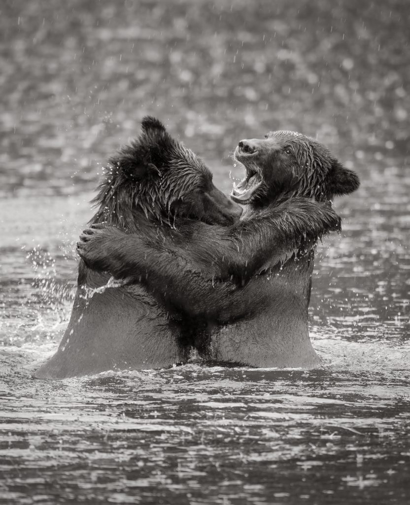
Photo by Mark Gromko & Editing by Kent DuFault
Here is the final image in a larger view.
Self-Check Quiz: I want you to take a short self-test to see what you’ve learned. All the answers are in the text.
- During what stage of your post-processing should you convert your file from color to monochrome?
- Which adjustments should you do first: Global adjustments or Localized
adjustments? - What is clipping?
- When using the Adjustment Brush in the Camera Raw Window, what must
you remember to do when you create a new mask? - List two elements of composition that attract a viewer’s eyes.
- When using the Adjustment Brush in the Camera Raw Window, how can
you tell which mask you are currently working on? - What does the Freeze Mask tool do in the Liquefy workspace?
- Name three overlays that you can use to judge your composition when
cropping within Photoshop.
Recommended Reading: Based on your knowledge obtained in this Quick Guide, here is some recommended reading that you will find in your Locker or in the Photzy Marketplace.


