


White balance and color balance are intrinsically linked. When you adjust the white balance settings in your camera, you’ll also be able to control the color balance in your image. So essentially, color balance is just an extension of white balance.
In this guide, we’ll look at white balance and color balance, how they both work, and the differences between them. Here’s what we’ll cover:
- White balance versus color balance
- What is white balance?
- What is the color balance?
- Color balance in post-production
Recommended Reading: If you want to learn how to enhance your photos and create better images, grab a copy of Photzy’s premium guide: Ultimate Guide to Fundamental Editing.
White Balance Versus Color Balance
When we take a photograph, our primary goal in most cases is to record colors as neutrally as possible. And this is where white balance comes in, allowing us to adjust our settings in-camera to achieve that neutral color balance. White balance settings allow us to control color balance for a neutral result, but in some cases, we don’t want to neutralize the colors (for example, a sunset). In these cases, we want to accurately record or perhaps amplify the color balance of our scene. The key is knowing when to use accurate colors over a neutral result.
What Is White Balance?
To understand white balance and color, we need to understand that light has different colors coming from different sources. Each of these colors has a color temperature that, whilst it isn’t visible to the naked eye, will need to be compensated for.
Color temperature is measured in units of Kelvin (K). These are the basic ranges for different types of light:
- 1000-2000k: Candlelight
- 2500-3500k: Tungsten Light (normal household bulb)
- 3000-4000k: Sunrise/Sunset (clear skies)
- 4000-5000k: Fluorescent Light
- 5000-5500k: Electronic Flash
- 5000-6500k: Daylight (clear skies with sun overhead)
- 6500-8000k: Overcast skies (moderate)
- 9000-10000k: Heavily overcast skies or shade
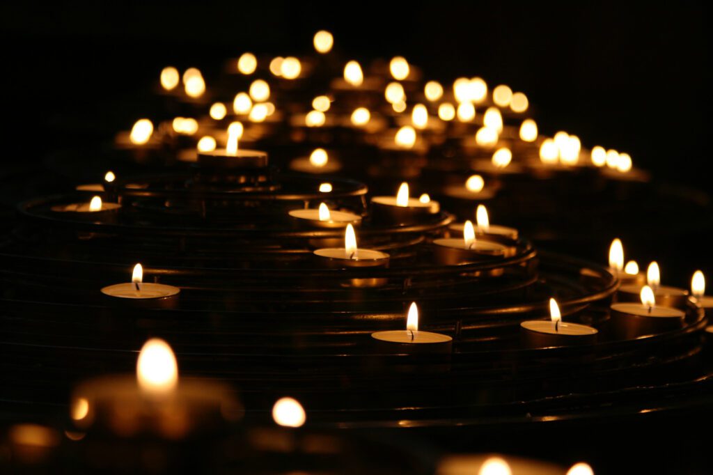
Candlelight has the lowest Kelvin rating of between 1000k–2000k, making for soft and delicate images. Photograph by Mike Labrum
Key Lesson: White balance balances the color temperature in your photograph by adding the opposite color to those in the image to bring the color temperature back to neutral. A neutral color temperature has a reading of between 5000-6500K.
Cameras have a range of white balance presets on them as follows:
Auto White Balance (AWB) is the default white balance setting, whereby the camera sets the white balance according to the available ambient and/or flash lighting. AWB on modern cameras is pretty reliable, although varied lighting sources and strong ambient lighting can still confuse it.
Custom/Preset White Balance allows users to set their own white balance using a gray card (which gives a shot with 18% gray, which is the midpoint between true black and true white). This is often used by professional photographers in a studio environment, where it is absolutely vital to have a true white background.
Kelvin White Balance allows you to set the color temperature at will, giving a very precise result, as you can tweak the Kelvins in small increments.
Tungsten White Balance adjusts the white balance to deal with the orange cast put on images by normal household bulbs.
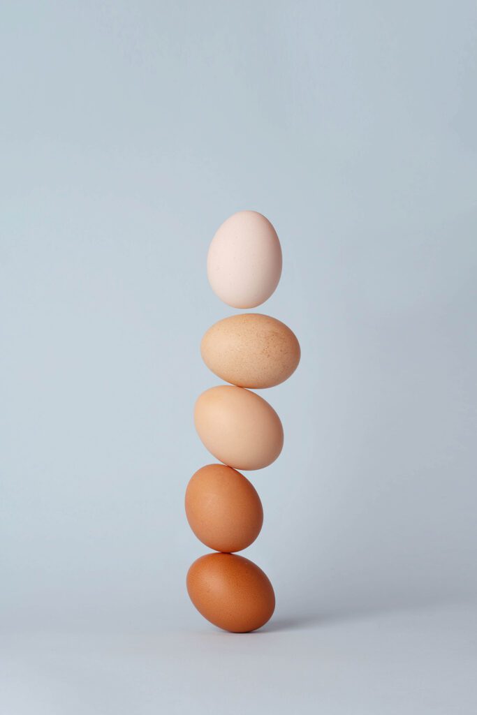
Color balance allows us to bring out the individual tones and different colors of these eggs. Photograph by 青 晨
Fluorescent White Balance adjusts the white balance to remove the green or blue tinge produced by fluorescent strip lighting. There are a lot of different types of fluorescent bulbs so some cameras will have several different presets for this setting.
Daylight White Balance is, fairly obviously, designed for shooting in daylight. However, it should only be used when there are clear skies and the sun is overhead.
Flash White Balance is for use with external flashguns (speedlights). As flash can be quite cool, this mode warms up shots a touch.
Cloudy White Balance is for use in the daytime when skies aren’t clear. As it presumes there is some cloud coverage, it will warm shots up a little more than the daylight mode.
Shady White Balance is, again somewhat obviously, for use in shady conditions. Shade tends to cast a slightly blue/green tinge on subjects, so this mode will compensate for that by adding a touch of yellow.
What Is Color Balance?
Color balance is the adjustment of the intensities of colors (this typically refers to the primary colors of red, green, and blue). Color balance changes the overall mixture of colors in an image and is also used for color correction.
Many objects and scenes that we come across from day to day exhibit a strong color cast. This is often down to the way light is reflecting onto things. So, for example, sunlit grass may photograph with a yellow/green tinge while a shaded area of green grass will reflect and appear bluer in color.
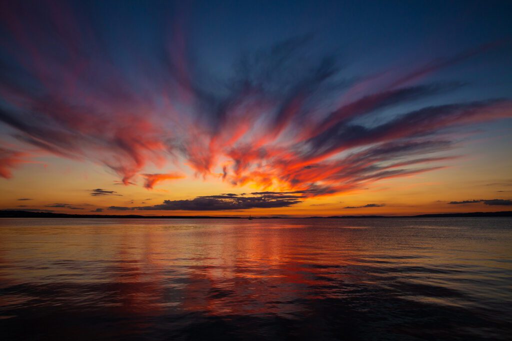
Shooting sunsets shouldn’t be left to auto white balance, where the camera is going to wash out the beautiful colors in the sky. Photograph by Frank Oberle
Key Lesson: So, why don’t we necessarily perceive these changes in color in the world around us? Well, it’s simply that our brains store memories of how we believe things ‘should’ look. Even if a subject looks quite different, our memories affect the way we perceive it. Our brains are constantly trying to ‘white balance’ a scene to make colors look more neutral.
But sometimes neutral colors take the ‘wow’ factor out of your photographs. We should always remember that photography is all about light and showing off that light to its full advantage. By switching your white balance to the Daylight setting, you can effectively ‘turn off’ your white balance and accurately capture the actual color of the light you’re photographing. It’s particularly useful to try out when you’re photographing sunrises or sunsets. Auto white balance will neutralize the vivid colors and take away the impact of the light.
Color Balance in Post-Production
If you’re working in Adobe Photoshop, you’ll be able to select and use the color balance tool to make alterations. Choose Image > Adjustments > Color Balance. Most of the time you will want to select the Midtones options from the Shadows, Midtones, or Highlights panel unless your image has a color cast in the shadows or highlights that don’t affect the overall image.

The vivid colors of a red and green chameleon perfectly illustrate two opposite colors on the color wheel. Photograph by Dário Gomes
Select the Preserve Luminosity option. This means that Photoshop modifies the colors of the image, but the brightness and contrast of the tones will stay the same. You can now move the Cyan/Red, Magenta/Green, or Yellow/Blue slider to add or subtract colors. The colors are arranged by their opposites on the color wheel, so adding magenta to an image subtracts green from the image and so on.
We should always remember that photography is all about light and showing off that light to its full advantage.
It’s important to remember that all colors are made from the three primary colors of red, blue, and green. If we put these colors onto a color wheel, then the point at which they all overlap in the center will be a neutral gray (between black and white). Where two of the colors overlap, they form other colors, which are known as subtractive primary colors. Alternatively, you can look at it in this way: when you remove one color from the middle of the wheel, you will get a new color. If you remove or subtract red from gray, you’ll be left with a mixture of blue and green, better known as cyan. Removing green from gray leaves a mixture of red and blue, or magenta as it’s more commonly known. Red and green combined give you the last of the subtractive colors: yellow. These six colors are related to each other, and knowing how they work with their counterparts will leave you able to easily correct any color casts in your images or tweak certain colors as required.
Recommended Reading: If you want to learn how to enhance your photos and create better images, grab a copy of Photzy’s premium guide: Ultimate Guide to Fundamental Editing.
Conclusion

White balance is an essential tool to working with light successfully and taking into account the different color temperatures. But white balance always tries to make your colors neutral and that’s not always ideal. Color balance allows us to work with colors on a more individual level, choosing how the colors appear on the screen and highlighting them in particular situations. Just remember that you can’t have one without the other!
Self-Check Quiz:
- What unit is color temperature measured in?
- What Kelvin range does a neutral color temperature have?
- When would you use the tungsten white balance setting?
- What is the color balance?
- Which white balance setting effectively neutralizes the effects of white balance?
- What is the opposite of cyan on the color wheel?


