
Photo post-processing programs have many ways of changing the contrast in your image. Lightroom has a Contrast slider, but it also has Clarity, Texture, and Dehaze adjustments. These tools all affect the contrast in your image in different ways. Many photographers do not know how to use these tools. It is not immediately clear what they are, but these tools can have a powerful effect on your image. Some photographers use the tools interchangeably, but each tool is unique, affecting your photos in different ways.
In this guide, we will explore the differences between the contrast tools in Lightroom. By the end, you will understand how each tool affects your image and how you can use each to best effect your photo.
What we will cover:
- Defining Tonal Values and Frequencies
- Defining Contrast
- How to Use Clarity
- How to Use Texture
- How to Use Dehaze
Recommended Reading: If you want to learn how to enhance your photos and create better images, grab a copy of Photzy’s premium guide: Ultimate Guide to Fundamental Editing.
Using Clarity, Texture, and Dehaze on different parts of this image, I can bring out the texture in the rocks but smooth out the clouds and water. Photograph by Jenn Mishra
To describe how Clarity, Texture, and Dehaze selectively affects contrast, we need to talk about tonal values and frequencies. Tonal values are easier to understand, so let’s start there.
Tonal Values and Frequencies in Photography
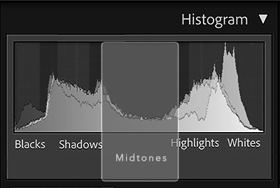
Tonal value describes the range of light in your image. A histogram is a graphic representation of the tonal values in a photo. Tonal values include blacks, shadows, mid-tones, highlights, and whites. On a histogram, the blacks are on the far left and the whites are on the far right.
A histogram shows peaks in shadows and whites, but not many tonal values in the mid-tones. This indicates a high-contrast image. Photograph by Jenn Mishra
The more of each tonal value in an image, the higher the peak on the graph. For instance, a high peak in the black section of a histogram means that there is a lot of black in your image. A peak in the center of the graph indicates a lot of mid-tones in the photo. Histograms may also show color information. A spike of red on the left means there are a lot of darker reds in your picture.
Frequencies are a little harder to describe as they are mathematically determined. But let’s keep the definition practical. Frequency has to do with how much change or variation there is in an image.
The more of each tonal value in an image, the higher the peak on the graph.
A high-frequency image has a lot of changing elements like lines and colors. High frequency describes areas of your image that are very detailed or are along edges of objects or people. A low-frequency image has little variation. They are more consistent and show little change. For instance, a large area of blue sky has little change and has a low frequency.

Edges and detailed areas are high frequency. Areas with little change, like the night sky, are low frequency. Photograph by Jenn Mishra
Portrait photographers often separate photos into high and low frequencies for post-processing. This way, they can smooth out skin texture (high frequency) without affecting the rest of the image.
Definitions :
Some of the terms used in this guide may be new to you, or you may have only a general understanding of the term. We will dive into many of these more deeply, but let’s start with a list of brief definitions that you can refer to quickly:
CONTRAST. The difference between the lightest and darkest tones in an image.
FREQUENCY. The amount of detail in an image. High-frequency sections contain a lot of detail. Low-frequency areas have little change.
HISTOGRAM. A graphic representation of the distribution of tonal values (light) in the image.
MID-TONE. Luminance values that are not dark or light but fall into the middle area.
NOISE REDUCTION. Removing electronic grain from an image. This smooths edges and detail.
SHARPENING. Enhancing edge detail to make an image appear clearer.
TONAL VALUE. The amount of light in your image, independent of color. Tonal values vary from very dark blacks to light whites.
Locating Contrast Tools in Lightroom and Adobe Camera Raw
In Lightroom Classic and Adobe Camera Raw, the contrast tools, including Clarity, Texture, and Dehaze, are found in the Basic panel of the Develop module. The Texture tool is the newest addition to Lightroom. It was added in 2019 to version 8.3.
Lightroom CC is organized differently. Contrast is in the Light panel with exposure. Clarity, Texture, and Dehaze are in the Effects panel.
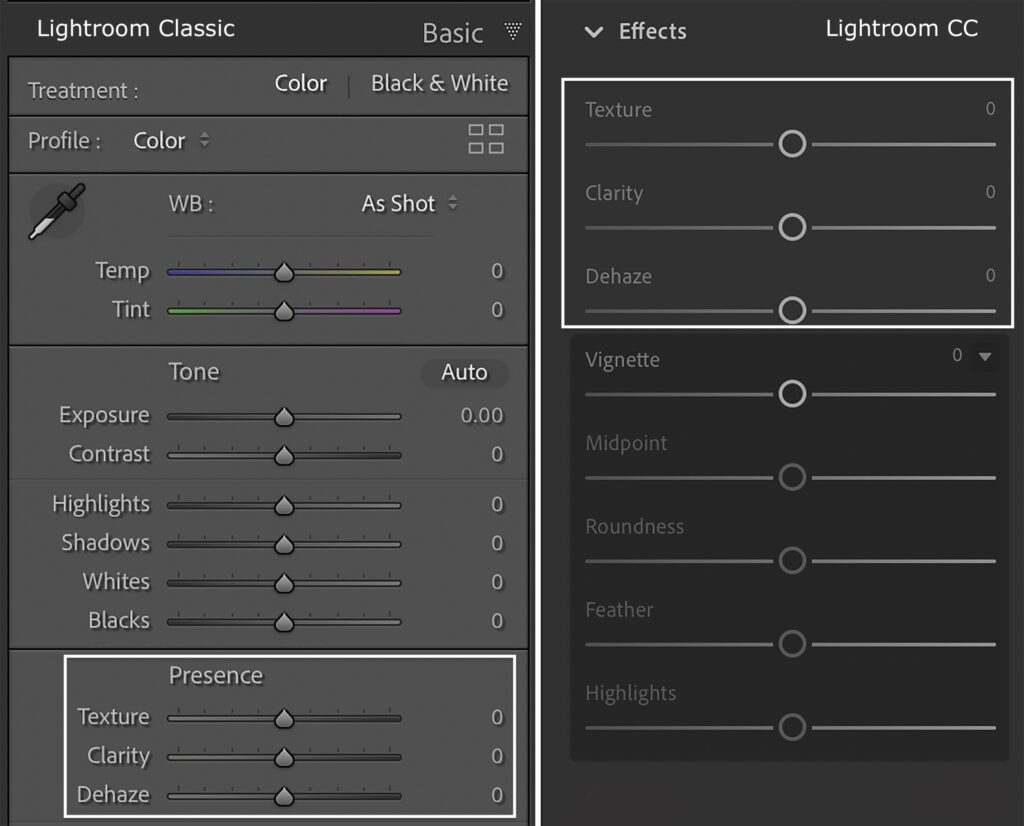
Location of Texture, Clarity, and Dehaze sliders in Lightroom Classic (left) and Lightroom CC (right). Photograph by Jenn Mishra
The sliders default to zero. Moving the slider to the right adds more contrast. To lower the contrast, move the slider to the left.
What Is Contrast?
Clarity, Texture, and Dehaze are all tools that control contrast. Let’s look at the more general Contrast adjustment to discover why we need these specialized tools when post-processing our images.
Contrast is the difference between the lightest and darkest tones in a photo. A high-contrast photo will have extreme dark and light tones. A low-contrast image uses a reduced range of light. The darkest tones and lightest tones are not far apart in an exposure.
When you add contrast to a photo, you increase the difference between light and dark tones. You push the dark tones darker and the light tones lighter. Decreasing the contrast evens out tonal differences.

Compare the original image with zero Contrast added (left) and versions with +100 (middle) and -100 Contrast (right) added in Lightroom. Photograph by Jenn Mishra
We often refer to images with low contrast as “flat,” and very high-contrast images as “contrasty.” Usually, these descriptions call attention to the look in a negative sense. But the amount of contrast in your image is a preference. There is nothing technically wrong with low- or high-contrast photos.
Changing contrast affects the image in many ways. In a high-contrast image, the colors look more saturated, and overall exposure may look darker. Lowering the contrast evens out shadows and highlights. It may look as if there is a haze or film over the image.
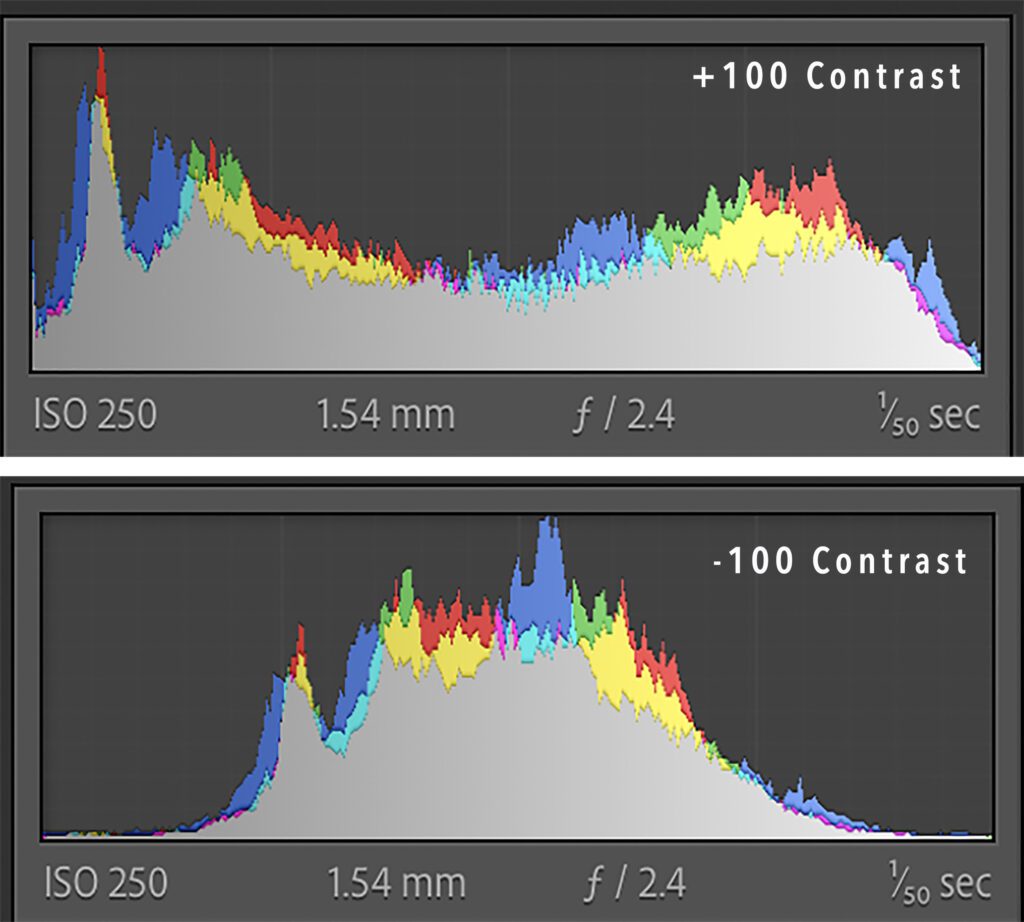
Compare the high-contrast histogram (top) with the low-contrast histogram (bottom). The peaks are compressed in the center for the low-contrast version. The peaks spread towards the whites and blacks in the high-contrast version. Photograph by Jenn Mishra
Compare the histograms of the low- and high-contrast versions of the spiral staircase image. In the low-contrast image, the peaks compress in the center of the graph. In the high-contrast version, the light spreads out across blacks, shadows, mid-tones, highlights, and whites.
Contrast changes the range of light across your entire image. Sometimes, we want to bring out certain tones and leave others alone, and that’s where the specialty contrast adjustments like Clarity, Texture, and Dehaze come in handy.
How to Use Clarity
The Clarity tool in Lightroom is a specialty contrast adjustment. It does not affect your entire image like the Contrast slider. Clarity affects only the mid-tones. It makes the dark mid-tones darker and the light mid-tones lighter. The highlights and shadows in your photo are not affected.
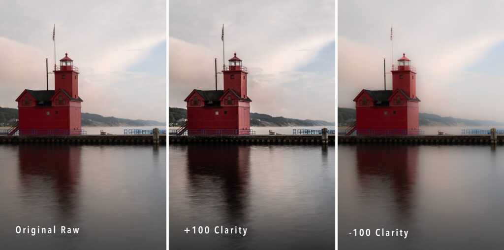
The image on the left is the original RAW file. In the middle version, Clarity is set to +100. On the right, is Clarity is -100. Photograph by Jenn Mishra
At -100 Clarity, the image takes on an ethereal glow. Decreasing Clarity is a great way to create a dreamy look in your photo. At +100 Clarity, the edges sharpen by exaggerating tonal differences in the mid-tones. However, notice that the dark shadows do not get darker. There are some other perceptual changes as well. Increasing the Clarity darkens your image and makes it look more saturated.
The Clarity tool in Lightroom is a specialty contrast adjustment. It does not affect your entire image like the Contrast slider. Clarity affects only the mid-tones.
Compare +100 Contrast and +100 Clarity versions of this image. The versions with Contrast adjustments either darken the shadows and blacks or bring them closer to the mid-tones. Contrast does the same with the highlights and whites, either pushing them to the extreme of bringing them towards the middle. The images with clarity adjustments don’t affect the darker or lighter tones.
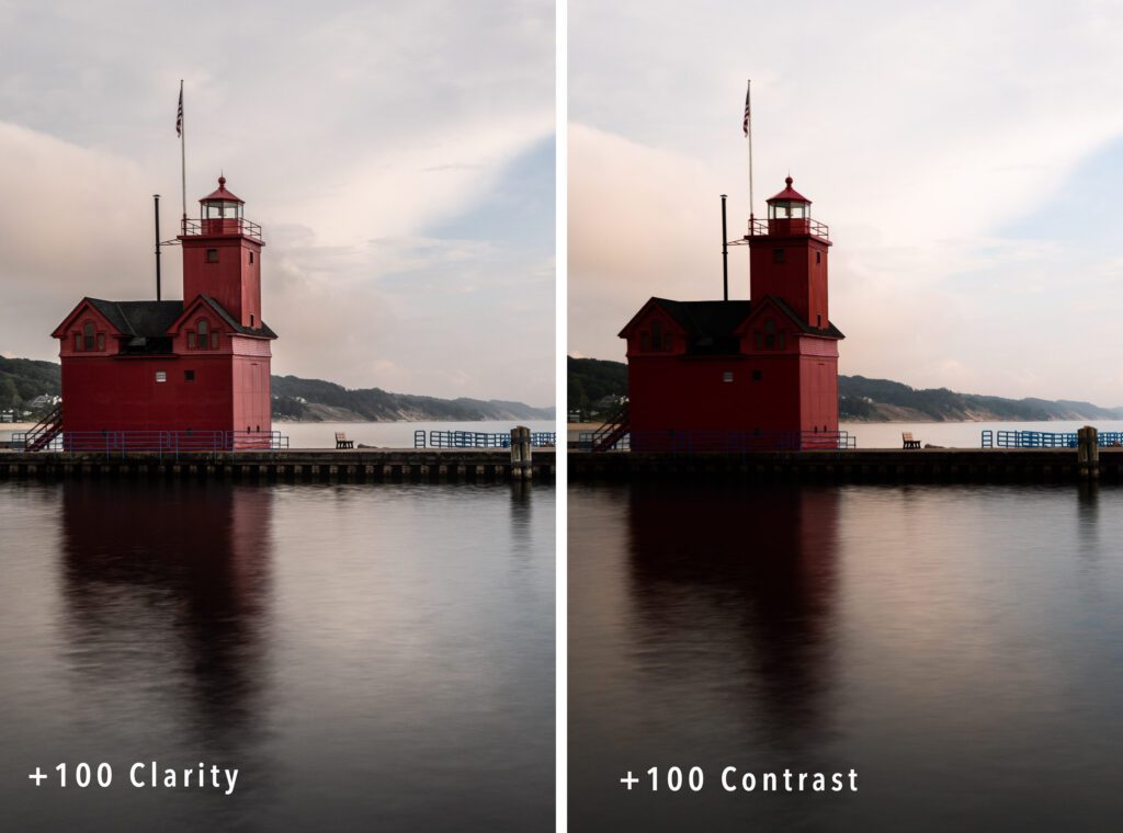
Compare an image with +100 Clarity (left) with a version that uses +100 Contrast (right). The version edited with contrast has darker shadows and lighter highlights. Photograph by Jenn Mishra
Clarity enhances textures and sharpens your image. This may be confusing as Lightroom also contains Texture and Sharpening sliders. We will talk about the differences between Texture and Clarity in the next section. Clarity may also add noise to your image or sharpen the edges too much. Balance Clarity with the Sharpening and Noise Reduction sliders in the Detail panel.
Clarity is often added to landscape photos to bring out natural textures. Any subject may benefit from some Clarity. Some landscape images will look good with reduced Clarity. This will make the scene glow. But go easy. You do not have to add or subtract much to change the look of your photo.
How to Use Texture
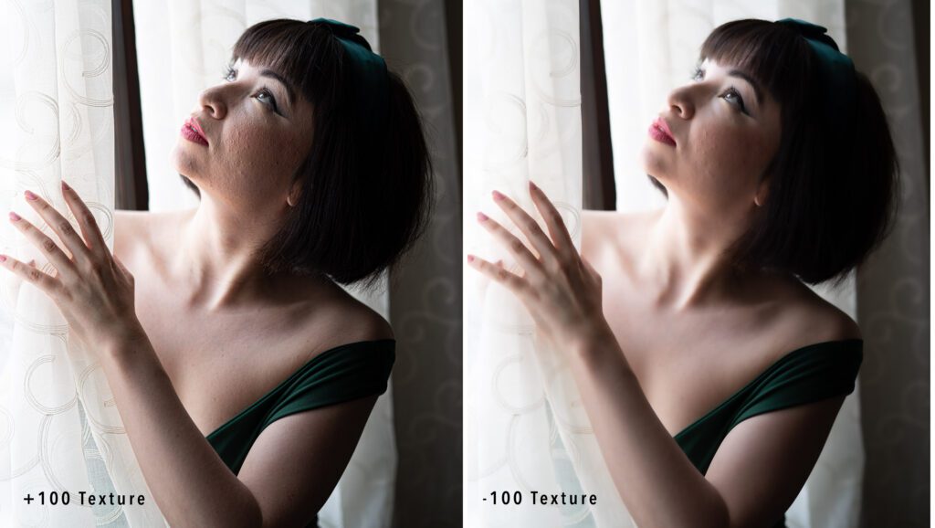
Compare the skin texture in a portrait edited only with +100 Texture (left) and -100 Texture (right). Especially, notice the change in texture on the model’s cheek. Photograph by Jenn Mishra
The Texture slider works on high-frequency parts of an image. Adobe designed this tool to smooth skin tones in portraits. Before Adobe added the Texture tool, portrait photographers had to take images into Photoshop and separate frequencies. This process is tedious if you are editing many photos. Adobe developed Texture to give portrait photographers a way of adjusting skin textures in Lightroom.
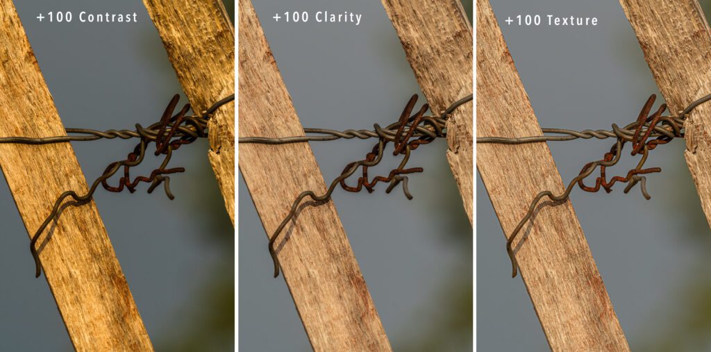
Comparison of an image edited with +100 Contrast (left), +100 Clarity (middle), or +100 Texture (right). The color saturation is evident in the high-contrast version. Texture brings out more of the wood detail. Photograph by Jenn Mishra
You can also use Texture to enhance detail in high-frequency areas. For instance, Texture will bring out leaves on trees.
Clarity and Texture affect different areas of your image. Clarity targets mid-tones. Texture sharpens detail. These areas may overlap in some photos, but they can also be distinct. For instance, leaves on trees that are in shadow will not be affected by Clarity, but they will be affected by Texture.
Unlike Clarity and Contrast, Texture does not change the overall look of an image by making it darker or making the colors appear more saturated.
How to Use Dehaze
Dehaze is also a form of Contrast control. Adobe likely had landscape photographers in mind when they developed this tool. It removes atmospheric haze. Atmospheric haze can be caused by sunlight hitting the lens or heavy air between the camera and a distant mountain. The name of the tool is a bit confusing. By adding Dehaze, you are removing haze from your image.
Atmospheric haze can be caused by sunlight hitting the lens or heavy air between the camera and a distant mountain.
The tool adds or removes contrast from an image, much like the Contrast slider, but it only affects areas of low contrast. Dehaze skips areas where there is already high contrast – a large difference between the lights and darks. It primarily works on the mid-tone areas of your image.
Dehaze works well to bring out detail in areas that may look flat, like a cloudy sky. Dehaze also removes window glare. Like Clarity and Contrast, Dehaze darkens the image and saturates the colors.

The image on the left is the original RAW file. In the middle version, Dehaze is set to +100. On the right, Dehaze is -100. Photograph by Jenn Mishra
The tool is used mostly to remove unwanted atmospheric haze from a landscape photo, but you can also add haze by moving the Dehaze slider to the left. This spreads a film over your photo, giving it an old-fashioned look. It can also make your image look foggy or misty. Using local adjustments, you can add patches of haze to your landscape or enhance fog that is already in the scene.
Many photographers use the Dehaze tool when working with black and white images. These images may already have areas of high contrast or a lot of mid-tone grays. Dehaze only affects the mid-tone areas of low contrast.
Recommended Reading: If you want to learn how to enhance your photos and create better images, grab a copy of Photzy’s premium guide: Ultimate Guide to Fundamental Editing.
Conclusion
Clarity, Texture, and Dehaze are contrast adjustments that selectively affect areas of your photo. Clarity affects mid-tones. Texture affects only the details. Dehaze targets low-contrast areas.
With these tools, a little goes a long way. I have shown exaggerated examples in this guide to make the effects of the sliders visible. In reality, I rarely push the sliders beyond plus or minus 25.
The Clarity, Texture, and Dehaze sliders are also available as local adjustments. For instance, you can use a brush tool to smooth water by decreasing the Texture. Or you can use a radial filter to add fog in a distant valley by decreasing Dehaze. I often add subtle sunrays to my landscape photos. I use a radial filter with increased temperature and decreased Dehaze. This adds a sun-kissed look to areas of my photo.
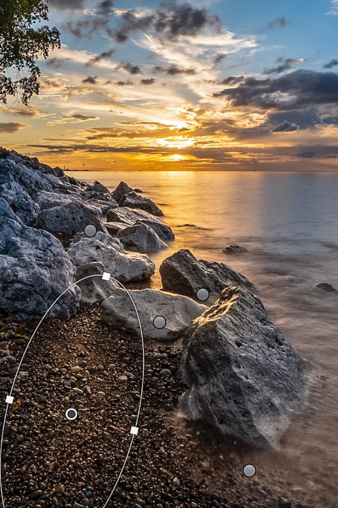
The pins in this sunset represent added sun rays on the beach created using radial filters, warmer white balance, and decreased Dehaze. Photograph by Jenn Mishra
Contrast, Clarity, and Dehaze affect the overall exposure, saturation, and sharpness of your photo. After using the sliders, you may want to adjust these to compensate.
If you are looking for ways to make your photos pop, look no further than these powerful contrast tools.

Photograph by Jenn Mishra
Self-Check Quiz:
- Define tonal values.
- What type of frequency does an area with little change in detail have?
- What do the peaks on a histogram show?
- Why do portrait photographers separate frequencies before post-processing?
- Define contrast.
- Where is the Clarity slider located in Lightroom CC?
- Where is the Texture slider located in Lightroom Classic?
- Which tonal values does Clarity affect?
- When might you want to decrease Texture?
- How does increasing Dehaze change the look of a photo?
Assignment:
Choose an image that looks flat. It might be a landscape taken on a gray day. Explore the effects of the Contrast, Clarity, Texture, and Dehaze sliders. Take the sliders to -100 and +100 to see the extreme effect. The best result will likely be less extreme. Try adding different combinations of contrast effects for a balanced look.


