


One of the key elements of any good photograph is the colors the photographer includes, or the tones, in the case of black and white images.
Color grading is the process of manipulating the colors in a photograph during editing. Color grading is often used in video and movie editing to influence mood and atmosphere. It’s also become very popular with photographers.
Filters in apps like Instagram and Snapchat provide instant color grading. These are great for treating your photos before posting them to social media, but if you want something more tailored and creative, then there are tools you can use to manually color grade your photos.
The process of color grading differs from color correction. Color correction focuses on adjusting color temperature, tone, and luminosity values to achieve a realistic-looking image. The feeling created using color grading is the aim, rather than getting colors looking realistic. Color grading primarily uses controls for hue, saturation, levels, and adjustment curves. Solid color fill layers can also be introduced.
In this guide, I’ll walk you through some reasons you may want to color-grade your photos. I’ll also offer some tips on how to achieve the color grading look you want. I use Adobe Lightroom to color-grade RAW files and refer to them in my examples.
Recommended Reading: If you want to learn how to enhance your photos and create better images, grab a copy of Photzy’s premium guide: Ultimate Guide to Fundamental Editing.
Color Grading Adds Mood to an Image
In previous versions of Lightroom, you could use the Split Toning sliders to manage color. Now the interface has changed and a new Color Grading panel has been added. The controls are different and there are three of them, rather than two. Much like color grading in video editing software, the three circles control the shadow, mid-tones, and highlights. To control the hue and saturation, click and drag anywhere within each circle.
Ask yourself how you feel when you look at a photo if you want to add color grading too. Then think about what colors you can add to help enhance this feeling. Adding cool colors like blue, purple, and green tends to make a photo more melancholy or sorrowful. Introducing warmer hues will lighten the mood and make it jollier.
Adding cool colors like blue, purple, and green tends to make a photo more melancholy or sorrowful. Introducing warmer hues will lighten the mood and make it jollier.
This process is very subjective. There is no right or wrong way to color balance an image. Concentrate on controlling the color in the shadows and highlights to achieve the look and feel you want for each photo.
Photographs by Kevin Landwer-Johan
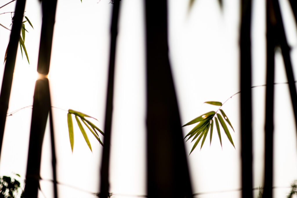
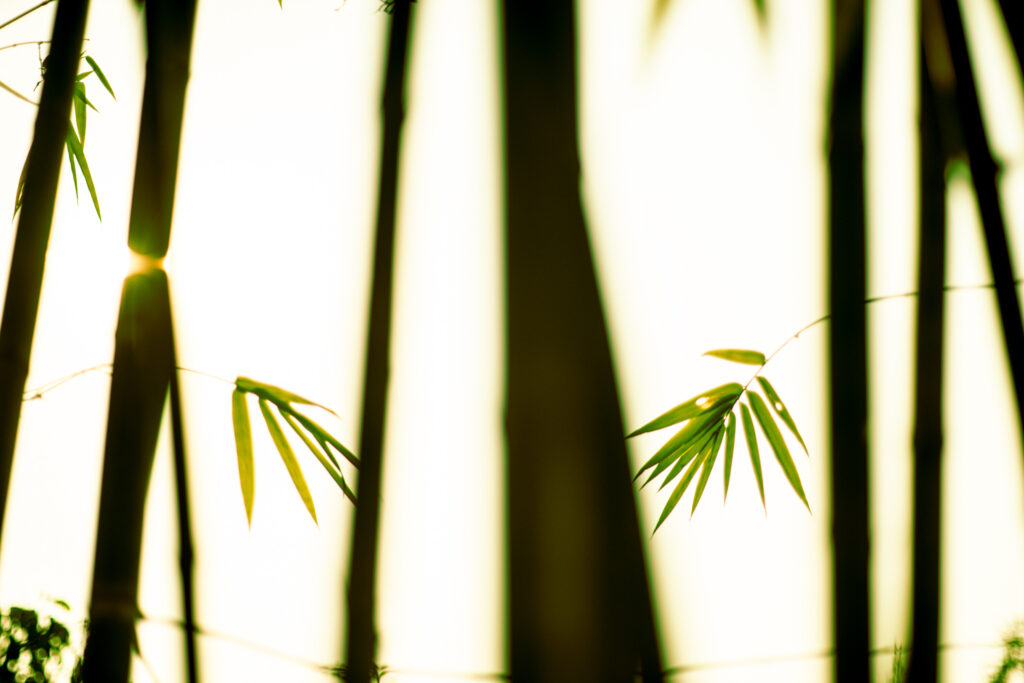
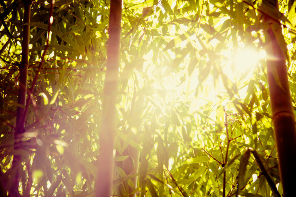
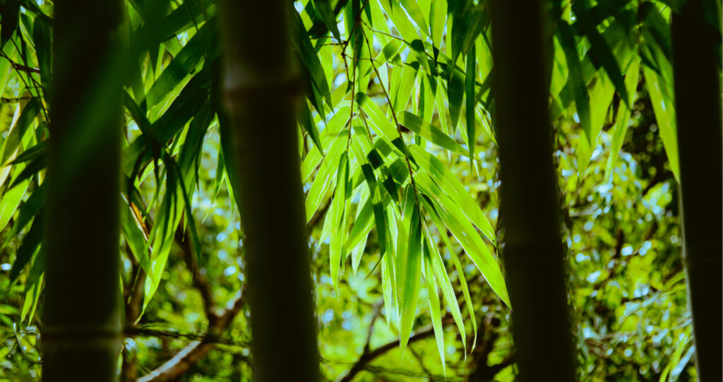
For this example, I wanted to warm up the image to give the color of the leaves a boost to show they have life. I wanted to keep the stems of the bamboo dark for the contrast of feeling. I adjusted levels in the Basic panel and then used the Color Grading panel to introduce more warmth. I boosted the yellows in the shadows and highlights and then added more green in the mid-tones, which are contained in the two leaves. The top image has a basic color correction and level adjustments. The bottom includes the color grading tweaks.
The most noticeable difference is the coloring along the edges of the bamboo stems.
Key Lesson: Before you begin color grading a photo, spend some time thinking about it and how you feel looking at it. What kind of mood does the image convey? Then decide how you can best enhance this mood. Often, it’s best to work with the feeling that a RAW image has rather than to alter this mood.
Help Build Your Personal Photographic Style
One additional method to build your personal photographic style is to be consistent in how you edit and color grade your photos. I’m sure you’ve scrolled through many Instagram feeds and admired the ‘look’ of the photos. Often this ‘look’ is achieved simply by applying the same filter to all similar photos. By managing your color grading manually, you can develop your own ‘look.’ This can then be saved as a preset that you can apply as easily as a filter.
It takes time to develop any form of style. The more consistent you are with every aspect of your photography, the more evident your style becomes.
Keeping a similar type of coloring throughout your photography portfolio tends to strengthen it. People see your photos and know they are yours, partly because of the color grading. It will take some experimenting, but in time you can come up with a series of color grades that work well with the types of photos you like to take.
The more you experiment using the color grading tools in Lightroom, the more you’ll understand how much you can achieve. The more you practice, the more your style can develop. You can keep it as simple as you like or come up with a more complex series of steps each time you edit. Whatever you decide, keeping your method consistent will certainly help cultivate your style.
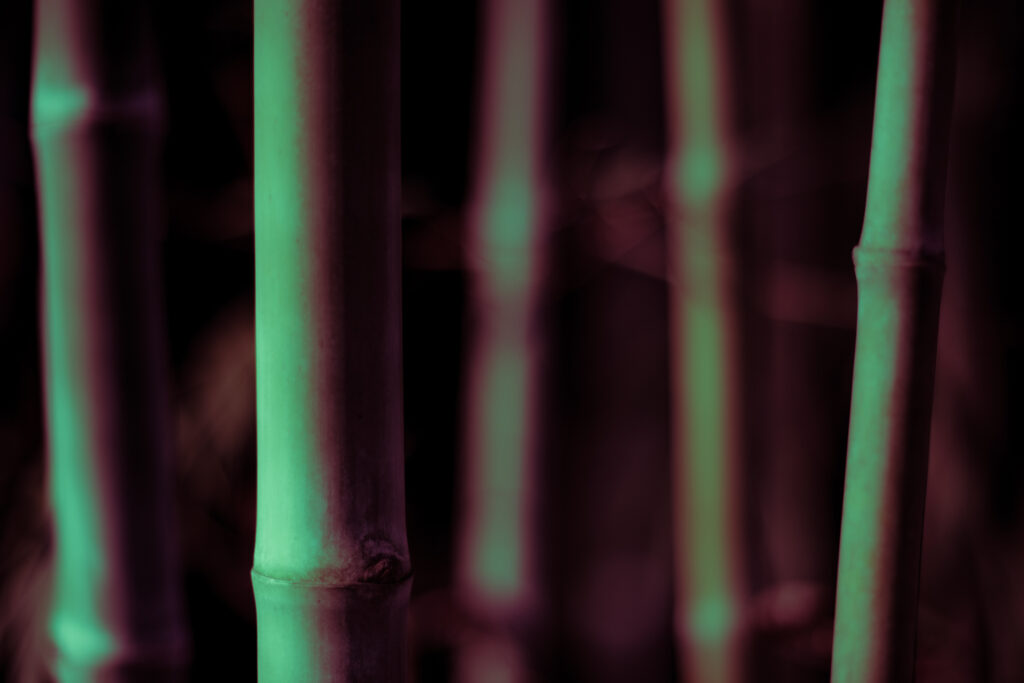
Photograph by Kevin Landwer-Johan
In the image above, I’ve added red to the shadows and green to the highlights and mid-tones using the Color Grading panel. I also adjusted the green and red curves to enhance this look.
Key Lesson: Each time you color grade an image, save a copy to a folder. Doing this will help you keep track of your changes. Over time you’ll see your personal style developing and be able to keep it moving in the same direction.
Unite a Series of Photographs With Color Grading
When you have a series of similar photographs to edit, you can enhance the cohesiveness of the set using color grading. Adding the same style of color grade to a series of photos helps hold them together. It can keep a viewer’s attention and lead them through the story the images tell.
This is particularly effective when you’ve taken all the images in the same location and lighting. When the light and contrast values are similar to start with, the effect of color grading is more consistent.
Make a selection of images you want to use in your series. Look at them as a group and decide the mood you want to create with color grading. Consider the images together and individually. Keeping in mind the style you want to create, ask yourself how it will affect the feel of each image in your selection.
When the light and contrast values are similar to start with, the effect of color grading is more consistent.
I’ll often create a Virtual Copy of any image I want to color grade in Lightroom. If I’m not sure of the direction I’ll take with my color grading, then I’ll create more than one copy. This allows me to experiment and then compare the different looks I can make for each photo.
Once you apply all the color grading you want to one of the images and are happy with it, you can copy and paste the alterations to all the images in the series.
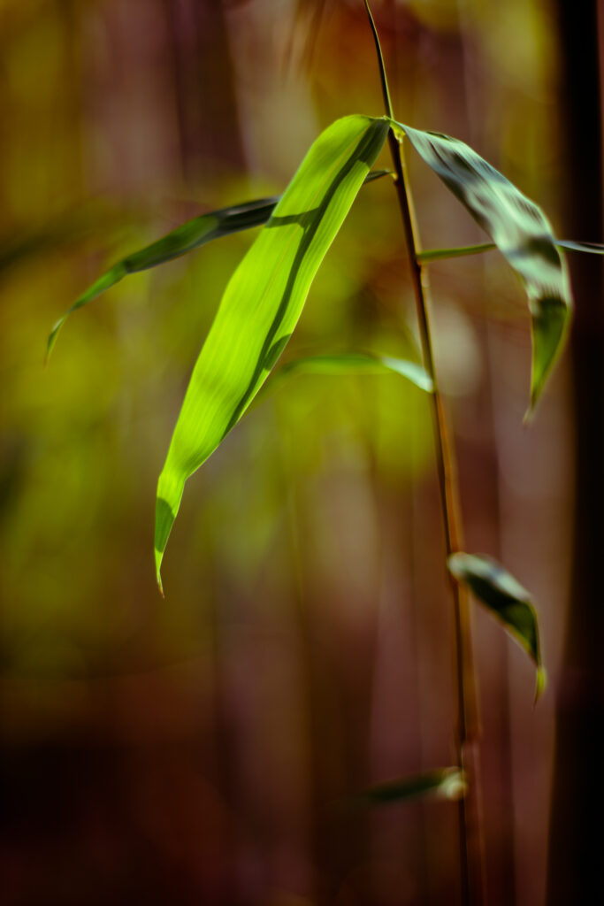

Photograph by Kevin Landwer-Johan
I color-graded the image on the left and then copied and pasted the edits to the image on the right so they have a similar feel.
Key Lesson: Working with RAW files is always preferable when performing any editing. RAW files contain all the data your camera captures when you take a photo. This gives you more flexibility when editing before you start to lose quality. Even with RAW files, you need to take care not to over-edit as this can cause artifacts. Avoid pushing any of the adjustment sliders to the extremes as this will help maintain image quality.
Recommended Reading: If you want to learn how to enhance your photos and create better images, grab a copy of Photzy’s premium guide: Ultimate Guide to Fundamental Editing.
Tips for Color Grading in Lightroom
Use the ‘Y’ keyboard shortcut in Lightroom to compare your edits with the original photo. This will help you decide if you like the direction you’re taking with the color grading process.
Color correct each image before you start to color grade it. Beginning with well-balanced color works as a good foundation.

Photograph by Kevin Landwer-Johan
Edit RAW files to maintain the most flexibility and image quality.
Experiment and practice as much as you have time. The more you explore the process of color grading, the more interesting styles you can come up with. Don’t be restricted to the suggestions I’ve made in this guide and explore more of the Lightroom controls for managing colors.
Conclusion
Color grading is about developing mood, atmosphere, and feeling in your photos. There is no right or wrong way of doing this. You can be as creative as you like. Color is one of the main elements of any good photo. How you treat it when editing can control the feel you want the image to portray.
Photograph by Kevin Landwer-Johan
As you begin to color grade, you might find it challenging to come up with a ‘look’ you like. Don’t give up! Keep experimenting. Make Virtual Copies and compare the changes you make to each one. This helps you develop a style as you see the effect of the changes you make.
Start simply and slowly. Begin with the basics. As you become more comfortable, experiment with managing the colors in your main subject and the background separately. This can take your color grading to a whole new level.
Photograph by Kevin Landwer-Johan
Self-Check Quiz:
- How does color grading differ from color correcting?
- Why is it best to use RAW files when color grading?
- Is the process of color grading subjective or objective?
- How do users of some social media apps apply color grading?
- What is the advantage of saving each photo you color-grade to a folder?
- Can color grading a series of images help unite them visually?
- What is the keyboard shortcut that allows you to compare the edits you make with the original image?


