

Contrast is one of the most crucial components of a great photo. If it’s not done correctly, you end up with photos where the subject is lost in the moment and seemingly out of place in the frame.
Proper use of tonal contrast in photography is a good way to set the mood in your photos and grab the viewer’s attention. The key is identifying your dominant tone, choosing a complementary companion tone, and creating a visual sensation that effectively uses both tones to grab the viewer’s attention.
In this guide, you will learn how to use tonal contrast creatively and effectively.
In this guide you will learn the following:
- What is tonal contrast in photography?
- Why should you use tonal contrasts?
- The difference between color contrast and tonal contrast
- A guide featuring 10 techniques to use tonal contrasts creatively
- A self-check quiz to ensure you learned properly!
Recommended Reading: If you’d like to improve your composition skills for better images, grab a copy of Photzy’s best-selling premium guide: Advanced Composition.
What Is Tonal Contrast in Photography?
To fully understand tonal contrast, let’s start with a brief overview of the concept of “tonality” in photography. According to the Oxford Dictionary, the word “tonality” refers to the color scheme or range of tones used in a picture.
Essentially, it is referring to a qualitative measurement by which we can assess how various tones are within a photograph.
Tonal contrast in photography is the difference in the luminance values between different areas of a photograph. Or simply put, the difference between various tones.
The contrast is best described as the difference between large and small areas of resulting luminance values.
Hence, tonal contrast is the difference between two tones. In an image or even a scene, there will be high-key areas (light) and low-key areas (dark). The most obvious example would be a sunset image with a light sky and a dark foreground.
Why Use Tonal Contrast in Photography?
There are many elements to consider while taking a photo, with the most obvious being subject and composition. Of course, aside from these two things, other considerations should be kept in mind at all times.
Tonal contrast is one of these considerations, and it can play an important role in a photo’s final quality.
When shooting images with tonal contrast in mind, you’re striving to present an isolated feeling within the image. When a viewer takes in your image, they should be able to identify a single subject based on its visual impact alone.
Tonal contrast is important in photography because it draws the eye to various elements in a photograph. The difference between light and dark regions, or bright and muted colors, is what makes images interesting and eye-catching.
- Tonal contrast helps you accentuate key areas within the image and eliminates distractions from the rest of the composition.
- Tonal contrast exists to draw your attention to contrasting elements like shadows and highlights which help guide the viewer’s eyes around the image.
Good tonal contrast, either light to dark or dark to light, allows the eye to follow discernible lines through one’s photograph.
- It can be used to create visual hierarchy, improve emphasis, and bring attention to specific parts of an image.
- The greater the tonal contrast between two areas is, the stronger the visual separation is. People tend to focus on areas with the highest levels of contrast.
Tonal contrast doesn’t have to be extreme in nature; sometimes simple adjustments can help you drastically change the tonal values of an image.
In conclusion, tonal contrast in photography is used to add visual interest to your image. It brings the contrast between large areas of illumination and darkness while keeping a consistent light source or color temperature.
However, the general purpose of photographs is to capture moments, so with this contrast being used sparingly, it will enhance the image rather than diminish it. Using photos with heavy contrasts may attract criticism from viewers who prefer something more subtle and less dramatic.
The effect of tonal contrast is all in the eye of the beholder, so if you like how a photo looks with it, then it’s definitely worth using. Thus, use it only when you feel it’s appropriate.
Making the most out of light and shadow using tonal contrasts will make your photos look more interesting, give them depth, and boost the artistic quality.
What are the differences between tonal contrast and color contrast in photography?
Even though color contrast is more popular, it’s important to remember that tonal contrast can still make a big impact on your photographs.
Tonal contrast emphasizes the difference between lightness and darkness. Color contrast, on the other hand, emphasizes the difference between colors.
When it comes to black and white photography and editing, tonal contrast is more important than color. A high enough tonal contrast level can even help a black and white photo look better than the full-color version.
Making the most out of light and shadow using tonal contrasts will make your photos look more interesting, give them depth, and boost the artistic quality.
That being said, tonal contrast doesn’t have to be entirely about light and dark. When there is a range of tones between two colors, tonal contrast can occur.
To put this in visual terms, red and green will appear contrasting, as the color contrast is more obvious than tone contrast. But different shades of red will blend into one another more seamlessly, providing tonal contrast.
From landscapes to portraits, you can enhance your shots with various colors and shadows. A lovely sunset works wonderfully with the golden tones of a sandy beach.
If you’re an animal photographer, it can be harder to make the subject stand out from a wooden backdrop or a shady forest. Making use of tonal contrast in these cases helps the colors stand out more clearly.
It’s difficult to imagine a scene with tons of color contrast but no tonal contrast (unless it’s a black and white image). Usually, there is an interaction between the two.
Guide to Using Tonal Contrast Creatively in Your Photos
Tonal contrast is a powerful tool that can be used to great effect. However, it can be difficult to use in a way that looks natural, and even some pros may be confused about how to properly apply it. The following guide will provide you with a few ideas for how you can incorporate tonal contrast creatively into your work.
1. Tonal Compositional Balance
When using complementary tones in your composition, remember that you need to also balance the composition through elements of tone.
While the relative differences between warm and cool colors are important, so too is the interplay of opposite colors (say, red and green), as well as high-intensity colors with low-intensity hues (like adding a touch of red to blue).
To help you think about it another way, if an area has too much contrast, it reads as overbearing and overpowering, whereas if there’s not enough contrast, everything starts to blend dully together.
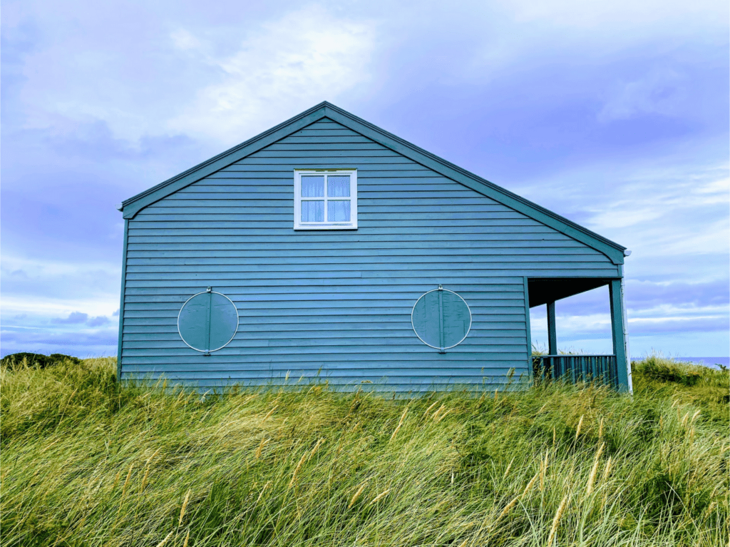
In the image above, there is little tonal contrast; the house, sky, and grass are all brightly illuminated. Though there are tonal contrasts in parts of the image, it does not create a sense of balance throughout.

In the image above, however, the shadows caused by the forest create a contrast with the sunlight, creating a balanced composition. This naturally helps the subject (in this case, the house) get more emphasis.
A composition may have a good balance, but that doesn’t mean the overall impact of the piece is overwhelmingly positive. Tonal compositional balance only goes so far as to ensure that the tones of your photo are present in roughly equal amounts.
2. Dark vs. Light Background
Whether a photographer is addressing memories or moments, there are important decisions to be made about the direction of the shoot. The differences between light and dark backgrounds and how they complement different areas of the frame will continue to affect the decisions we make with our work.

Context matters more than choice when it comes to which background is right for any given project. In the image above, a light background helps provide a focal point: the rocks.
But the photo above features a darker background which presents the branches and leaves beautifully.

This is not to say that the background must contrast the subject. In the image on the next page, a light background is used with two human subjects that are well illuminated, providing minimal tonal contrast. But it’s still a good composition due to the use of leading lines and complementary color schemes which suit the aesthetic of the shot.

We could go on and on about this topic, but the main takeaway is that you should use whichever background tone fits the mood of your photo the best.
Recommended Reading: If you’d like to improve your composition skills for better images, grab a copy of Photzy’s best-selling premium guide: Advanced Composition.
3. Using Natural Light
Putting yourself into a situation where natural light makes your photos really “pop” might mean working a little harder and getting out of the comfort zone of your studio or home setup, but the results you’ll get are generally worth the extra effort.
Even when the natural light is soft, you can use it to create interesting tonal contrast in your photos by keeping it off the subjects for a few seconds before snapping the shutter. This will allow beautiful shadows to form on your subjects as the light illuminates the scene behind them.

Using a diffused window light can also create aerial highlights that signal depth and provide visual interest to otherwise flat objects. You’ll be able to achieve photos that have lots of dynamic range and moodier tones.
Even when the natural light is soft, you can use it to create interesting tonal contrast in your photos by keeping it off the subjects for a few seconds before snapping the shutter.
If you want to use natural light for tonal contrast, be it for compositional balance or otherwise, remember to make the most of it by taking the time to experiment.
With that being said, as much as natural light is a valuable tool, it can’t be relied upon. Whether you’re working indoors or out, always have an extra set of lighting tools on hand. You never know when they may come in handy.
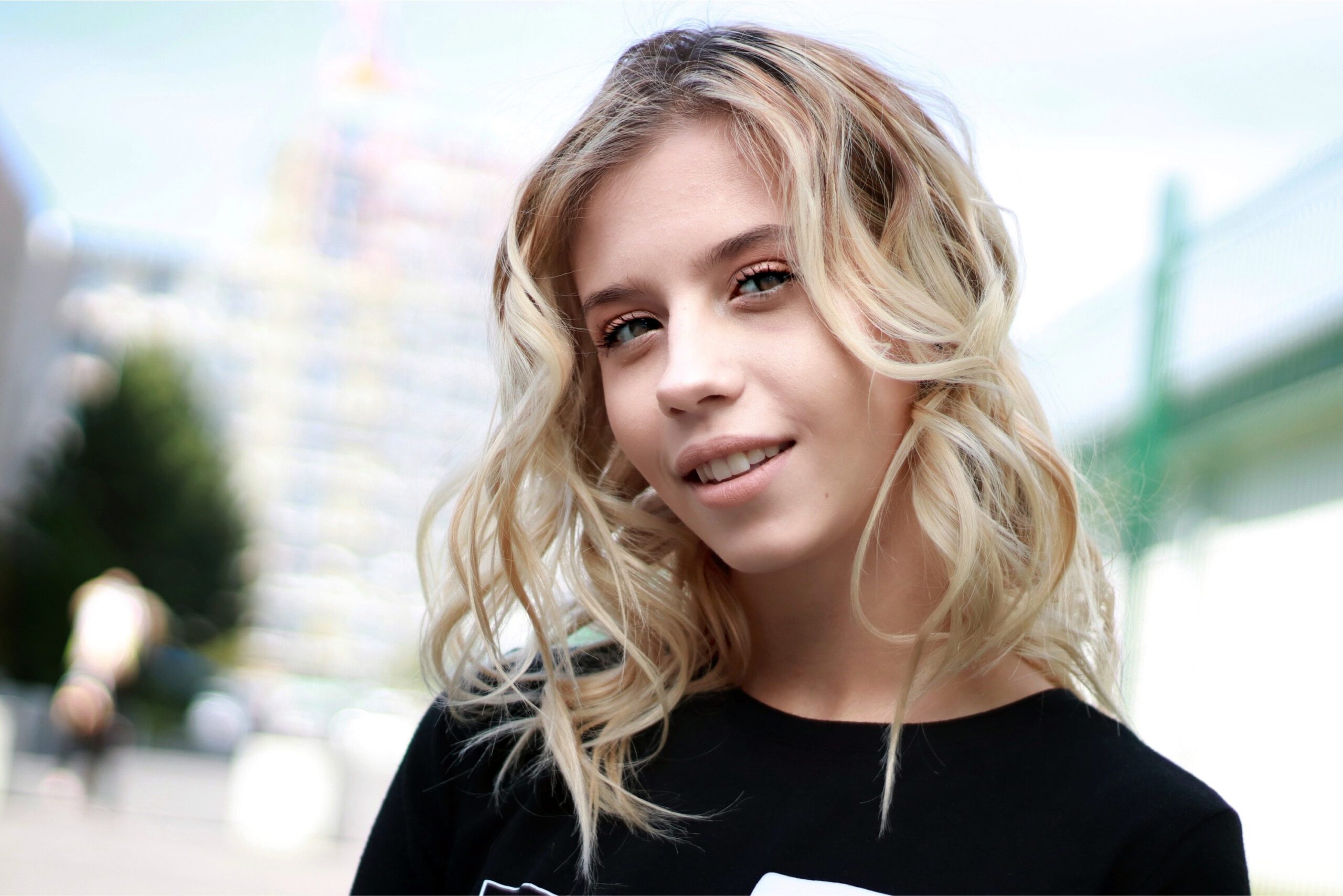
4. Creating a Monochromatic Color Scheme
A monochromatic color scheme is a color scheme that uses various tones or shades of one or two adjacent colors. By making different shades of the same color, you can highlight certain parts of the scene and generate shapes that wouldn’t otherwise be possible.

The biggest con to monochromatic color schemes is that they can often feel dull and uninteresting. However, if you find a way to mix in brighter colors or splashes of complementary colors, it can shake things up, like in the image on the next page.

Monochromatic color schemes don’t have the same high contrast that you would get from colorful pictures (e.g., red + green, blue + orange). Instead, they create a visually calming and very smooth contrast.
5. Providing Tonal Contrast to Textures
Have you wondered why some photos look more realistic than others? Have you ever noticed in images how the textures can give a sense of a 3D element when they take on different hues? Applying tonal contrasts to textures can make pictures look realistic.

The cracked and bumpy textures in the image above are contrasted gracefully with the use of tones, despite having almost the same color scheme throughout.
Photos with varying tones and textures create a greater sense of dimensionality, which looks more appealing. So, the next time you’re trying to capture a perfect shot, don’t forget to apply tonal contrast to textures and make your photo stand out!
6. Storytelling by Using Tonal Contrast
When taking photos for storytelling purposes, you’re not necessarily looking for technically perfect images. You’re instead looking for an image that says something meaningful, and in this case, uses tonal contrast creatively to do so.
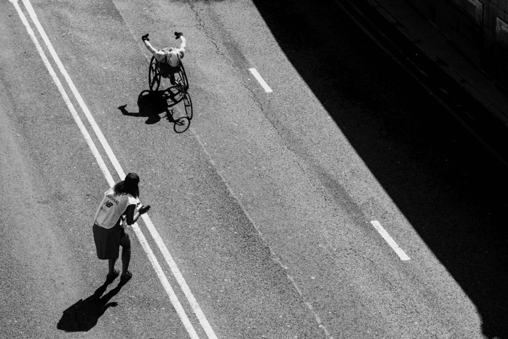
When used correctly, tonal contrast can help in creating a narrative and evoking an emotion. In the image above, the viewer may initially think they see a photo of a disabled person, but once they keep looking, it may trigger thoughts on the value of life, leaving them feeling motivated.
7. Being Dramatic With Framing
Although the photos that you take use tonal contrast, the problem is that they often lack dramatic interest because of the lack of framing. Framing your subject will give it more visual appeal with a sense of being trapped by the shot that you’re taking.

Is the image above a photo of a puddle’s reflection or a cave’s opening? Is the tree shaped like that or framed invertedly? Framing images like this alongside discernible tonal contrast will always leave the viewers guessing.
Framing your subject will give it more visual appeal with a sense of being trapped by the shot that you’re taking.
Browsing through historical content and exploring hundreds of photographs from around the world, we have seen many images that possess a very special and dramatic contrast. Framing can have a dramatic effect, playing with the scale and proportion to add dynamism and drama to a shot.
8. Using Lines and Curves
By using lines and curves with contrast in a scene, a photographer can manipulate the viewer’s focus. This provides for more dynamic compositions and encourages viewers to explore your photograph further.

In the image above, the silhouette of the body provides curves that are emphasized due to stark tonal contrast with the background. The lights and walls in the backgrounds are also placed in linear directions, which do tonally contrast each other and frame the subject.
Tonal contrasts between dark and light sections amplify the shapes and lines in a photograph. Photographs are more than just snapshots, and using this technique is like painting with a brush that paints its picture.
9. Applying Tonal Contrast Through Post-production
Post-processing is vital for adding and/or maintaining tonal contrast in a photo. You may capture a shot that is well composed but lacks the tonal contrast that you were intending. And there may be no way to retake the shot or get tonal contrast in the real-life setting.
In that case, post-production will help you achieve that goal.

Plenty of photographers utilize post-production not only to use tonal contrast creatively but to also maintain a professional standard of the image. All the images that you’ve seen throughout this guide have some sort of photo editing done to them. Thus, do not underestimate the power of post-production for tonal contrast or otherwise!
10. Experiment and Have Fun!
Get out there and try using different tonal contrasts and see what happens. Alternating similar tones can lead to your best abstract photography yet!
What drew you to photography in the first place? It could be beautiful photos of nature, or perhaps a subject that is close and dear to your heart. It may not necessarily be a shot that is perfect in photographic theory.

Experiment by using different tones with different textures, using light and shadow, or even using negative space. Start noticing how tonal contrast affects different objects in your daily life and incorporate that knowledge into your work.
Ultimately, remember that you are the artist behind your work. Don’t be afraid to break the rules if that’s what it takes for you to create the shot you want.
Practice will take you a long way when it comes to maximizing your photographs’ tonal contrast. Practice, experiment, and you’ll get there.
Recommended Reading: If you’d like to improve your composition skills for better images, grab a copy of Photzy’s best-selling premium guide: Advanced Composition.
Conclusion

Tonal contrast in photography can be used in several ways, from minor adjustments in exposure to creating striking compositions that attract and hold attention. Not all photographs benefit from tonal contrast, so it’s important to understand how this concept works when composing your shots.
We hope this guide has helped you understand how to use the concept creatively and that you’ll be able to apply these principles to your photography for improved and more dynamic results!
Self-Check Quiz:
- What is tonal contrast? Why should you use it?
- How is tonal contrast different and similar to color contrast?
- Will using just tonal contrast make your photo look great? Why or why not?
- How do you use varying colors in a monochromatic tonal scheme?
- Is post-production really needed for tonal contrasts?


