

Part One of this series on color management discussed the naked eye and whether it can be trusted in making objective measurements. It also detailed how color information is translated between devices using ICC profiles and the reference color chart used in photography. Part Two covered the different color spaces as well as monitor calibration and other considerations for the photo editing environment. This guide takes a look at color calibration of the camera and the printer. It will also examine output considerations for the printer as well as for the web.
Recommended Reading: Want to create memorable, fascinating, and impressive color photographs? Grab a copy of Photzy’s premium guide: Rich and Vibrant Color Photography Volume 2.
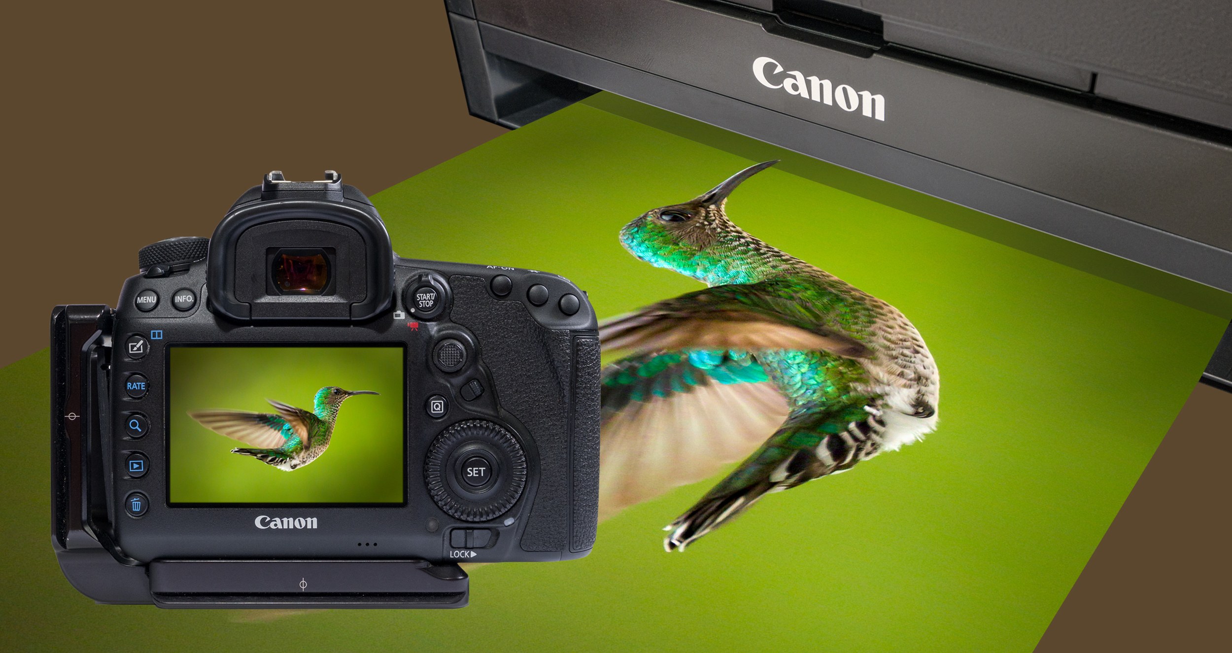
Why Profile a Camera?
While many photographers calibrate their monitors and printers, few calibrate the output from their cameras. Although a much less frequent consideration, it’s no less important. With cameras costing hundreds or even thousands of dollars, one would think they should be set up properly by the manufacturer. So, why is this even necessary, and what kind of improvements might be gained?
A camera sensor sees all light, unlike the human eye, which has limitations. The sensor sees infra-red light, which we do not. The process of converting the sensor’s light-induced electrical currents to usable data is a complex one. Colors outside of the color spaces we use, along with brightness information, must be mapped to the color space of a JPG, for instance. JPGs, of course, are used for viewing on the camera’s LCD screen as well as for exporting to a computer. RAW files, on the other hand, include much more data, which we’ll be exploring shortly.
A camera sensor sees all light, unlike the human eye, which has limitations. The sensor sees infra-red light, which we do not.
Manufacturers make decisions about how that mapping to JPG is done, and there is a fair amount of subjectivity involved. Those decisions are guided by what they feel is a pleasing color and not always by what’s most accurate. Compare any two brands and it’s obvious that they’re not set up in the same way. Beyond these issues there are variations in production, so no two units are 100% identical.
All cameras see colors differently. Even the light source and the lens can cause color shifts. At some point a compromise has to be made by the manufacturer that will be a good general calibration for most situations. Like a monitor, the camera needs to be calibrated to the industry standard so its color output is as close as possible to what it sees.
This brief explanation is a huge oversimplification of the issue, but hopefully you can see that your expensive camera investment is not likely to be outputting the most accurate color information.
If you’ve calibrated your monitor as detailed in Part Two, the following examples will be more self-evident. If not, now would be a good time to calibrate your monitor.
Raw File Considerations

This image shows the results of a RAW file which has been imported into Lightroom. On the left, the Adobe Standard profile has been selected. On the right, a custom camera color profile has been selected. The differences in the red, blue, orange, and gold are obvious. Some of the colors are more intense, but not all colors have been changed to the same degree. If one was to increase saturation in post-processing to make a correction, all of the colors would be affected by the same amount. That’s clearly not what’s required. In addition, the hue of some colors has changed slightly, which would not be addressed by saturation. A camera profile deals with these issues correctly.
As a side note, this image was taken with light from a south-facing window at midday. Except for applying the two different color profiles, only a small amount of capture sharpening was applied to the RAW file. The subject is the pen holder from my editing desk. The camera profile version on the right matches the actual color of the subjects exactly as I see them, rendering it a true representation.
JPGs look better than RAW files right out of the camera, but RAW files hold more information. The reason they look better out of the camera is because they have had a lot of processing done to them by the camera. This processing includes baking in a color profile that the manufacturer feels is most pleasing. Let’s look at the differences between a JPG and versions of a RAW file taken simultaneously.
What about JPGS?

This image has a JPG in the upper-left corner and virtual copies of the RAW file in the other three quadrants. A 50% grey border has been placed around the four images for a neutral reference. The JPG’s color in the upper left differs from the RAW version in the lower left, which has had the Adobe Standard V2 profile applied to it. Every RAW file must have a profile applied to it, but a JPG doesn’t because its profile is already applied in-camera. The Adobe Standard V2 profile is intended for use on any RAW file regardless of the camera make, model, or lens. It stands to reason that a single Adobe color profile could not be accurate for all the combinations of products on the market. By nature, generic camera profiles are heavily compromised and, as such, they rarely are the best in any given situation.
JPGs look better than RAW files right out of the camera, but RAW files hold more information.
The two RAW images on the right have had a custom profile for the Fuji X-T3 applied. The profile was made from an image taken in the same light with the same lens. These two are the same except the bottom one has had its white balance set. It’s important to note at this point in our discussion that white balance is not the same thing as color calibration.
White Balance

This image is composed from two copies of the same RAW file. I flipped the left half so the backgrounds would join at the same point. The left half has an Adobe profile applied while the right has a custom camera profile applied. Both images have had their white balance set. The border around the outside is neutral gray for reference. With white balances applied, the backgrounds are the same as the border. However, the colors of the subjects are very different. Camera calibration has corrected the colors of the subjects while white balancing has corrected for the color of the light illuminating the subject.
Here’s a tip for anyone using AWB (Automatic White Balance). This camera function attempts to make the color of every image neutral. This means that every single image can have a different white balance, so every single image can require white balancing. This can be very time consuming. Using Kelvin for white balance in your camera can simplify this process tremendously. I personally use 5600 Kelvin as my default white balance color temperature. This midday temperature setting doesn’t neutralize the warmth of the golden hour, for instance. When neutral colors are required, shoot a gray and use that to set the white balance. It’s not difficult to learn, and I encourage you to explore this approach.
Key Lesson: Camera calibration corrects color accuracy while white balance corrects the color cast caused by the temperature of the light source.
Camera Profiling

Before discussing the calibration process, it bears repeating that camera calibration is affected by not only the camera but also the lighting conditions and, to a lesser degree, the lens. Because of this, it will most likely be necessary to perform more than one calibration to cover different lens and lighting conditions. It may be that only a few calibrations are necessary, but it’s beneficial to keep this in mind.
To profile your camera, you’ll need an X-Rite ColorChecker Passport. The software that creates the profile is a free download from X-Rite. It’s both a standalone program and a plug-in. It used to be that only Lightroom or Adobe Camera RAW could be used with the software because it used the DNG file format. As of January 2019, X-Rite now also supports Capture One and I believe it uses a TIFF file for that program. If you’re using Capture One, be sure to download the newest version. The software supports PC and Mac and can be found on the xritephoto.com website.
This image is a ColorChecker Passport. There’s another gray card fold-out on the back.
The AWB (Automatic White Balance) function attempts to make the color of every image neutral.
The process of creating an ICC camera profile is very simple, and there are several good video tutorials on the web including those from X-Rite. To find the ColorChecker documentation, search for “ColorChecker software ICC workflow pdf.” What follows is a brief description of the process for using the Lightroom plug-in and the standalone version.
Create a RAW photo of the ColorChecker with the lens and lighting conditions you wish to profile. Calibration can only be done with a RAW image. If you shoot JPG, you are out of luck, but this would be a great reason to change over to shooting RAW. Import the RAW image into Lightroom as a DNG file. Choose ‘Export with Preset’ and then ‘ColorChecker Camera Calibration’ from the File drop-down in Lightroom. The X-Rite software asks you to name the profile and then select ‘Save.’ I find it helpful to include the camera model, lens, and lighting conditions in the name to make it easier to choose a profile at a later date. An example might be “XT3_10-40_overcast.” Another approach might be to name it for a specific shoot if the shoot is color critical and you’re doing a custom profile for it.
At this point the software plug-in creates the camera profile, which will take about a minute. After the profile is created, Lightroom must be closed and reopened because the profile assets are read when Lightroom is first launched.
It’s not necessary to white balance the DNG file before creating a profile. The software knows which sample on the ColorChecker is neutral and uses it when making the profile. The profile that’s created is also available in Adobe Camera RAW.
For the standalone version, all that’s needed is to drag and drop a DNG of the ColorChecker image onto the software and from there the process is pretty much the same as the plug-in one. Just select ‘Create Profile,’ name it, and you’re done.

In older versions of Lightroom the color profiles can be found in the ‘Develop’ module under ‘Camera Calibration.’ In newer versions of Lightroom Classic they can be found in the ‘Develop’ module near the top of the Basic Panel, as shown in the previous image.
Camera profiles can be used in presets. Including the camera profile in an import preset along with any capture sharpening and lens profile can simplify and speed up the workflow.
Color improvements will vary from camera to camera, but for most cameras the colors will suddenly come to life, revealing richer and correct color relationships. When shooting with different cameras there’ll no longer be a color difference issue. Because they’re all calibrated to the same standard, the color results will be consistent.

This image shows the before and after for a Fujifilm X-T3. There are considerable improvements in many of the colors.
Color editing is a subjective endeavor, but applying a calibrated camera color profile is the perfect starting point. If a shoot is color critical, take a photo of the ColorChecker first and use it to white balance and profile all of the images.

Recommended Reading: Want to create memorable, fascinating, and impressive color photographs? Grab a copy of Photzy’s premium guide: Rich and Vibrant Color Photography Volume 2.
So, What about Prophoto?
Color spaces were discussed in Part Two of this guide. You’ll remember that sRGB is the color space for the internet, so all images prepared for the web should be in this format. Adobe RGB is a good match for all of the colors that an inkjet printer can print, so it’s the logical choice for anything that will be printed.
Most monitors display all of sRGB and the higher end ones made for photographic use cover most or all of Adobe RGB. Camera sensors cover all the colors we can see and more, so a RAW file doesn’t limit either sRGB or Adobe RGB.
So, if we have more color information in a RAW file than there is in sRGB and Adobe RGB, why don’t we use ProPhoto, which is the biggest color space? This is a contentious issue worth discussing.
Consider this: There are no monitors in the world that can display the ProPhoto color space. When it comes to printing, there are only a handful of printers costing hundreds of thousands of dollars that can print it. So, if you can’t see the additional colors, and you can’t print them, why bother with them in the first place?
I’m not suggesting that the original RAW files should be thrown away. Who knows what the future will bring? The extra color might be useful someday. Until then, there is no reason to be working in ProPhoto. You have to leave it for the web or print anyways, and that means more conversions, which can lead to mistakes. Edit in Adobe RGB and be happy that you have all of today’s color needs covered because Adobe RGB best matches printer color output and it can easily be converted to sRGB for the web.
sRGB is the color space for the internet, so all images prepared for the web should be in this format.
Output for the Web
Editing in Adobe RGB is my default. To prepare an image for the web there are just a few considerations, including the size, the format, and the color space of the image. The first thing to do is save a high-quality copy in TIFF or PSD before starting to resize for the internet. To prepare it for the web, convert the image to sRGB. If the image is left in Adobe RGB, there is no telling what it will look like on any other monitors because most browsers are not color managed. Most likely, the image will be de-saturated and grayed out, so convert to sRGB and know that it will look as good as possible.
A good way to convert to sRGB is to use Photoshop’s ‘Convert to Profile,’ which is found under the Edit tab. Select the Destination Color Space as sRGB IEC61966-2.1. Save the image as an appropriately sized JPG with a resolution of 72 pixels per inch.
Output for Print
Adobe RGB is the color space that best matches the color capabilities of an inkjet printer, so it’s the best color space to use for post-processing. This compatibility makes for an easier conversion for the printer driver and therefore a more accurate color print. Unlike the web, where there is only one answer for color, printing involves different hardware, ink, and paper which all affect the color output.
There are two different options for how the color conversion process is done when printing. One is to let the printer make the decisions about how to convert colors. The other is to have the software control the color conversion process. Of the two, the latter is the better choice.
In both cases, the conversion process is controlled by an ICC profile. In the case of the printer doing the conversion, it’s a more general profile. An XYZ printer manufacturer, that also sells XYZ paper, will have profiles for their paper which is usually installed with the printer’s software. The profile is created for the manufacturer’s own papers only and it doesn’t take into account any model variations. The same ICC profile may in fact be used for different models in the manufacturer’s lineup. As long as you stay with XYZ paper, your results will be adequate.
In comparison, computer software-controlled color conversion is much more accurate because it uses very specific ICC profiles. Custom ICC profiles take into consideration both the make and model of the printer, ink, and specific paper that’s being printed. If an after-market paper from a paper manufacturer like Red River, Hahnemule, or Ilford is used, they will have custom ICC profiles that can be downloaded from their website for most major printer makes and models. These custom profiles are distinct for each of their paper types.
There is one more issue to consider. Similar to camera calibration, paper manufacturers’ ICC profiles are conservative. They don’t take printer, ink, or paper variations into account. If you want an ICC profile that’s the most accurate, then you’ll have to create one yourself using your exact printer, ink, and paper.

For making a custom ICC profile there are several devices on the market. X-Rite has one called ColorMunki Photo. This device is designed to calibrate monitors as well as create ICC profiles for printer and paper combinations. The process begins by printing a specific color chart that is then scanned with the ColorMunki. Next, the software generates a more specific color chart and the process is repeated. When the scanning is complete, the software creates a very specific ICC profile for that exact printer, ink, and paper combination.
When it comes to accurate color printing, the best practice is to turn off all of the color control in the printer’s driver software and then use a specific ICC profile in the editing software to control the color conversion instead. In this image, the choices have been made in Photoshop’s Print Settings for what handles color, the printer ICC profile, rendering intent, and black point. The warning reminds us that the color management has to be turned off in the printer’s settings. The printer’s manual will detail how to turn the color matching off.
Soft Proofing

Wouldn’t it be nice if it was possible to see what a print would look like before it’s printed? Well, that is what soft proofing is for. Soft proofing is the process of simulating the printer’s output with a specific paper and rendering intent. Both Lightroom and Photoshop have this ability.
In Lightroom there’s a button at the bottom of the Develop module. Once it’s turned on, a proof settings box appears in the upper right with options for choosing the printer/paper combination, the rendering intent, and whether to simulate paper and ink. Simulating the paper and ink’s accuracy is questionable, and therefore less useful.
The rendering intent is either Perceptual or Relative. Perceptual will attempt to move any colors that the printer/paper can’t print into the color space that it can print. It does this by shifting all of the colors in relation to each other, thereby maintaining the general appearance. This approach doesn’t create banding, which is an advantage. Banding is when the color of the sky, as an example, seems to break apart into visible layers instead of gradually fading between shades.

Relative rendering takes all of the colors that the printer can’t print and moves them into the space it can. All of the colors that are within the printer’s ability are left unchanged. For some images this works well, but for others the crowding of extra colors into the smaller space can result in banding.
The same proofing can be found in Photoshop under View/Proof Setup/ Custom. The choices are the same with a couple of small changes. There is a Preview toggle which is useful for comparing before and after, and a selection for Black Point Compensation, which is best turned on. Simulate paper and ink are separated but their accuracy is questionable and therefore less useful, just like in Lightroom. Adobe would be well advised to improve or reconsider this function. The rendering intent has two additional options, but they don’t apply to photography.
Soft proofing can show if there are going to be any major problems with color or brightness when the print is made. Using this as a guide, it’s possible to make adjustments to correct for any issues.
Recommended Reading: Want to create memorable, fascinating, and impressive color photographs? Grab a copy of Photzy’s premium guide: Rich and Vibrant Color Photography Volume 2.
My Prints Are Too Dark
More often than not, this is a complaint when printing. This issue was mentioned back in Part Two on monitor calibration. The answer is often that the monitor is too bright. Here’s how that works: When the monitor is too bright, the darks appear too light and washed out. As a result, the tendency is to make them darker so that there’s good contrast on the monitor. This results is an image file that is too dark, and that’s what the printer accurately prints.
On the other hand, when the monitor is darker it becomes necessary to lighten the darks to reveal shadow details. This results in a print that’s not as dark. The only way to find the sweet spot, where what’s seen on the monitor is what comes out as a print, is to do some test printing and comparing. The issue is not insurmountable, it just takes a little trial and error.
When the monitor is too bright, the darks appear too light and washed out. As a result, the tendency is to make them darker so that there's good contrast on the monitor.
There are a couple of other items that need to be mentioned. Monitors are light sources that shine into our eyes, but prints rely on reflected light. This needs to be considered when striking a balance between the monitor’s brightness and the brightness of a print. The print ideally should be illuminated by an appropriately bright and color-balanced light source when comparing the two. Also be aware that the brightness adjustment in the Print Module of Lightroom can be helpful in getting predictable results in the brightness of prints.
In the end it’s much less expensive and frustrating to have a Color-Managed Workflow. Your colors will fly, and you’ll achieve predictable results while wasting less paper and ink.
Conclusion

Producing photographic work that’s accurate to what the photographer saw is a much easier task when the workflow is color calibrated. Even if the final product is to be more of an artistic nature, a color-managed workflow will bring more predictable outcomes.
The theory of marginal gains says that small, incremental improvements can add up to significant improvement. While that may be true, in the case of the Color-Managed Workflow it may be more accurate to say that one bad apple can spoil the whole bunch.
A camera that isn’t calibrated can lead to poor decisions about color and brightness in the post-processing phase. A badly or non-calibrated monitor will make it impossible to make accurate choices. The printer is at the mercy of every edit upstream and it too can ruin the final result. Get all three calibrated to the same industry standard and everything falls into place. Now all that’s required is artistry and experience to create photographic works of art. Sounds easy, right?
Enjoy the journey…happy editing!


