

Everyone wants to be a better photographer, and I’ll tell you straight up that if you can master these seven skills, you will be on your way to becoming the best photographer you can be.
I like to refer to them as the Seven Key Principles.
That’s a bold statement, but it’s true. These seven skills are necessary to compose your images in a way that will communicate your intent to some random viewer out there in the world.
Are these skills hard? I don’t think so. But they do take practice.
We will discuss each one and view sample photos. Then it’s up to you to get out there and practice.
Are you ready? I think you are.
Here are the seven crucial composition skills that we will discuss:
- Patterns
- Balance
- Negative space
- Grouping
- Closure
- Color
- Light and shadow
Recommended Reading: If you’d like to improve your composition skills for better images, grab a copy of Photzy’s best-selling premium guide: Advanced Composition.
Patterns – Using the Survival Instinct Given to Us by Nature
Patterns help us identify and make sense of the visual world. It is part of our survival instinct. A pattern also provides a sense of comfort through regularity and understanding.

Nature is filled with patterns, and elements of patterns can be put together in a predictable manner that any random viewer can appreciate.

Patterns are so important to our existence that numerous industries use them. Why? Because they get our attention! Patterns can be found in road signs, architecture, product packaging, and advertising.

Patterns don’t need to be symmetrical to be effective. They can also have a generous amount of negative space, which we will discuss shortly. As little as three objects can create a pattern.
Key Lesson: Incorporating a pattern into a photo is a surefire method to getting it noticed. Patterns can be symmetrical or asymmetrical. A pattern can be established with as few as three elements.
Patterns are so important to our existence that numerous industries use them. Why? Because they get our attention!
Balance – When an Image Is in Balance, It Creates a Warm Fuzzy Feeling of Harmony
The element of balance in photo composition is a bit trickier to master than patterns.
Balance creates a visual aesthetic. It is used to establish visual weight, which can be described as the order in which things are viewed when someone sees the photo.

I like to use this analogy. Imagine you’re standing in your front yard looking across the street. You don’t take in the entire block immediately. You look here, and then you look there until, finally, your eyes come to rest on something of interest. It might be a pretty girl sitting on a stoop or the neighbor’s unkept lawn. This is visual weight. Each place that your eyes land upon has visual weight because it attracts your eyes. But the pretty girl or unkept yard has the most visual weight because that’s where you stop scanning the scene. The location of the most visual weight should always be the subject area of the photograph.

Balance can create unity or division in a photo. Symmetrical balance promotes feelings of stability and order.

Asymmetrical balance, sometimes called an unbalanced composition, typically causes the feeling of disunity and leaves viewers with an uneasy and disturbed psyche.

Key Lesson: As a photographer, you can choose to compose your shots with symmetrical or asymmetrical balance. This choice will help establish the mood you wish to convey to your viewers. Symmetrical balance creates harmony. Asymmetrical balance creates a disturbance.
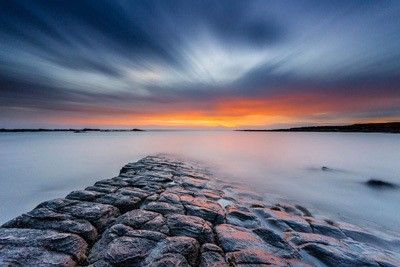
Negative Space – Everything That Isn’t the Subject of Your Photo
As we move through our list, each point is getting more advanced, so stick with me.
Simply stated, negative space is everything within the frame of a photo that is not the subject area.
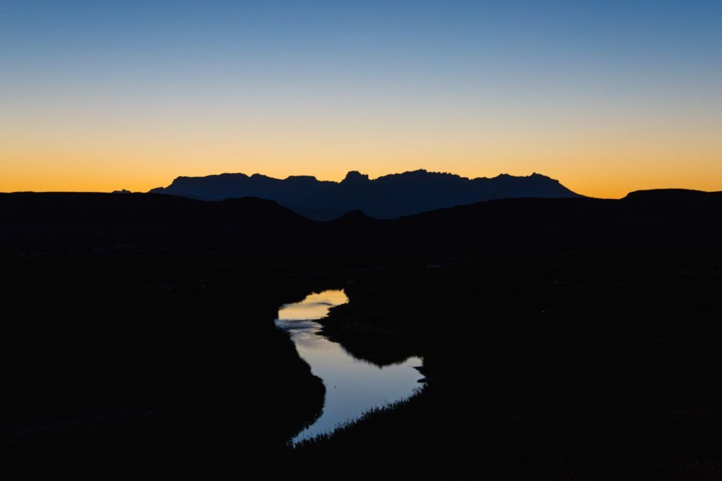
When you view the image above, what do you think the photo’s subject is? Do you think it’s the landscape? Perhaps, it’s the sunset. Could it be the river?
Close your eyes for a few seconds and then open them while looking at the image above. Where do your eyes come to rest? They stop on the river, don’t they?
Key Lesson: When you’re getting ready to take a picture, this eye-closing test is a fantastic method in helping you to compose your shot. It will tell you what your subject truly happens to be. And believe me, many pictures are taken where the photographer didn’t compose to a subject area.
Everything other than the river is negative space.

Here is the thing about negative space. You can’t ignore it and create good pictures. If you include a lot of negative space, it must have meaning.
The image above works with a ton of negative space because the subject looks upward at the negative space. This creates a mood of vastness and a story of being small.
Had the subject been looking straight ahead, this photo, composed as it is, would not have worked at all.
Negative space is the equivalent of dead space. It can distract a viewer’s eyes if it has no meaning to the overall story and composition of the image.

The image above is an example of the poor use of negative space. The empty sky between the airplane and the power pole creates a vacuum. It separates those elements, so neither can claim to be the subject area.

Negative space doesn’t have to be a large area containing nothing, a common misconception.
Negative space can become the subject area. That’s the case in the image above. This is common in photos with geometric or graphic shapes as their main point of interest.
Key Lesson: Negative space is any area within the frame of a photo that isn’t the subject area. The subject area should always hold the most visual weight. If negative space is included, it should add meaning and/or story to the composition. Negative space used in certain types of photographic genres such as abstract, architecture, minimalism, or still life can become the subject area.
Recommended Reading: If you’d like to improve your composition skills for better images, grab a copy of Photzy’s best-selling premium guide: Advanced Composition.
Grouping – The Mind Likes to Group Things Together, and That Makes It a Powerful Force in a Photo
When the mind takes in a scene, it likes to group things together. Oh, there’s a stand of trees over there. There are three cars parked across from my house, etc.

Key Lesson: It is a proven and time-tested composition tool that a subject with a grouping of three, five, or seven generates more interest than a singular subject. In addition, a group of three is the most powerful, followed by five, and seven trails the others. If there are more than seven, it can diminish the strength of a shot because it becomes too busy. One exception to this is portraiture. A photographer is often called upon to photograph larger groups. This is why portrait photographers study the art of posing. Posing a group overcomes the deficit created by the larger number of subjects.

There will be moments when you are confronted with a scene you want to photograph, and you have no choice over how many are grouped together.
This is where you must reach into your bag of tricks and find another way to create separation. One method used in the image above is light and shadow, creating color and tonal contrast.
When grouping works well for the image, it will assist in leading a viewer through the photograph.
Key Lesson: The mind likes to group things together. A group of three is the most powerful, followed by five and then seven. Large group portraiture relies on posing to establish order and continuity through the portrait. Color and tonal contrast is one method that can be used to create separation in a larger group of objects. A well-composed grouping should help lead a viewer into and through the photo.
Closure – Because Humans Need a Beginning, a Middle, and an End
Have you ever read a book or watched a movie with a flat and unsatisfying ending? Of course, you have. We all have.
We feel this way because we crave a beginning, a middle, and an end. That’s why storytelling in photography form is so important.
I hate to say it, but many photographers I’ve met over the decades ignore this vital aspect of photography.

There’s this prevailing attitude that if it’s pretty, it is good enough. And maybe that is good enough for some folks. But not us, the photographers who want to communicate! I think the image above falls into this category.
Sure, it’s a pretty picture. The colored hues are lovely. The bird is flying and relatively sharp. Okay. But what else does it say? Not much.
It has no closure. The bird is quite literally flying out of the scene – the story.
I like to describe closure to my photography students like this:
- When a viewer’s eyes enter the picture, this is the first chapter of a book.
- As the eyes follow the composition through the shot, that is in the middle of a book.
- Finally, where they come to rest in the scene is at the end of the book. At that point, a viewer should have an ‘ah ha’ moment of clarity. The purpose of why you, me, or whoever took a photograph, to begin with. That’s closure.
When a viewer’s eyes enter the picture, this is the first chapter of a book.
In the image above, if the bird were more to the right of the frame flying toward the left side, and on the left side we saw an extended hand holding some bread, well, guess what? We have closure!

Closure is often inhibited by including the area around the subject. Is the yellow boat the subject? If so, what does the rest of the picture have to do with it? If not, why is it so prominent in the composition? I have no closure.

Study the image above for a minute. There is undoubtedly an opening and a middle, but where’s the end? Where is the closure? Where do we stop looking and have an ‘ah ha’ moment?
Key Lesson: Issues like this are quickly resolved with a little bit of brain power. That thinking should start when taking a picture and end when post-processing it.

Photograph by Daniela Cuevas and Cropping by Kent DuFault
Do you feel closure now? Where do your eyes stop? They stop on the red balloon! Right?
With a simple crop and a visual plan, we now have closure and a much stronger photograph. Compare the two and you will see what I’m saying. Your eyes no longer wander. They know where to go.
Key Lesson: Closure is necessary to complete a photo composition. Without closure, your viewers will be left feeling empty and wanting more. The closure is intimately tied to composition and story. Evaluate your scene, and if things are not adding to the composition or story, then get them out of the frame. If you can’t get them out of the frame when taking the picture, then make a plan and do it in post-production.
Color – Color Affects How We Feel and React
The use of color is such an intensive subject that I will narrow it down to just a few important points for this guide.
If you love the concept of color in photography and want to dive deeper into learning about it, then I wrote two extensive premium guides for Photzy on this topic.
You can find them here:
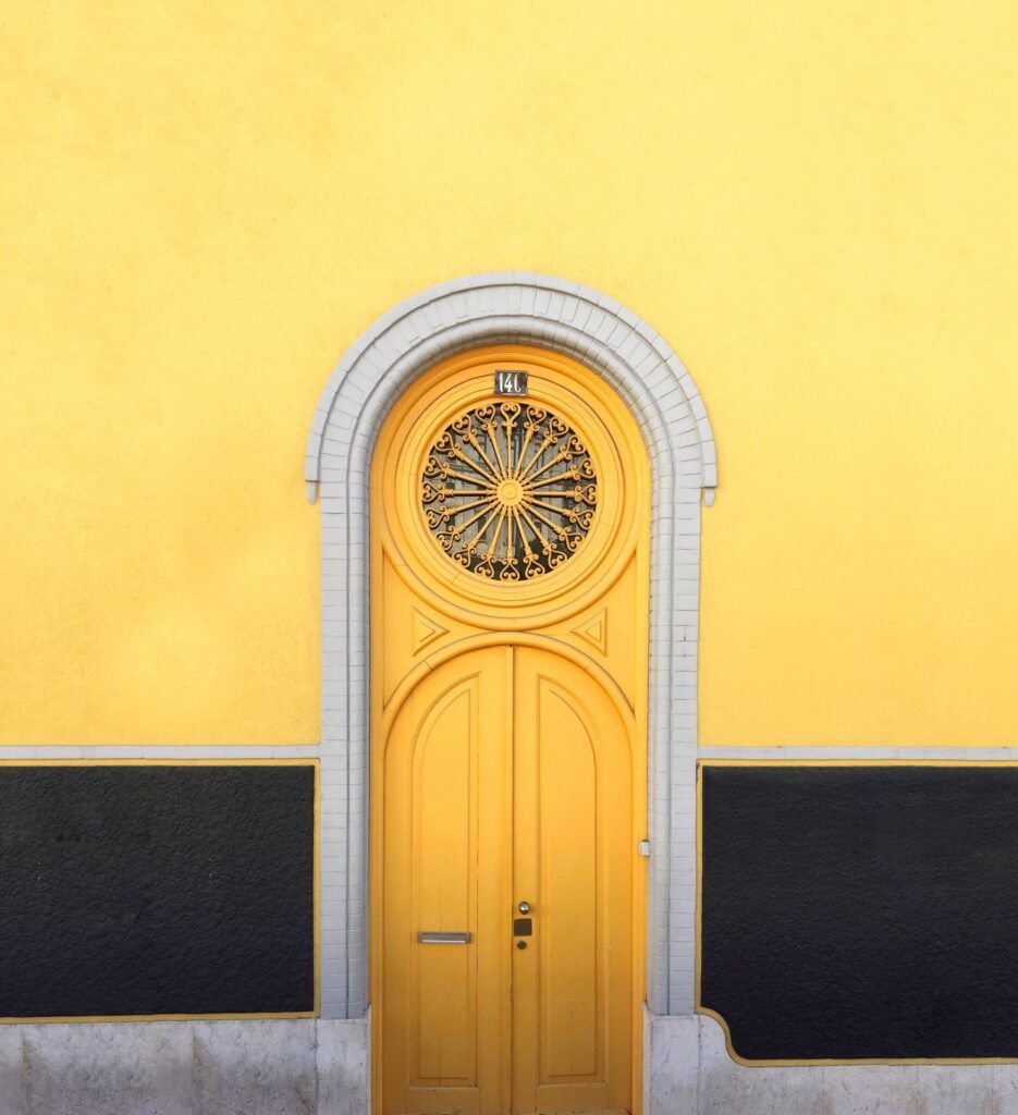
One of the simplest methods of dramatic color photography is to contrast any color against the colors black or white. The image above makes use of this concept – yellow contrasting with black.

Using contrasting colors is an easy and superior method of getting your color images noticed. The image above uses contrasting colors. What are contrasting colors?
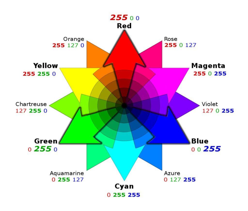
Graphic by Kent DuFault
The image above is an RGB color wheel. This is the color wheel primarily used in digital photography. Painters use a slightly different color wheel called the RYB color wheel. That wheel has been around a lot longer since the art of painting has been around a lot longer.
Sometimes you’ll see references to both wheels, and either one is fine.
Key Lesson: Contrasting colors occur when they are on opposite sides of the color wheel, except for black and white, which contrast with every other color on the wheel.
Study the image above for a moment. It has the colors red, cyan, and white. All of them are in contrast to each other!
Another tried and true method of color is known as monochromatic color. This color scheme occurs when most included colors are from the same side of the color wheel. The color wheel can be divided into two halves, with one side being cool and the other being warm.
Key Lesson: Cool hues give viewers the impression of darkness, mystery, or cold temperatures. Warm hues give viewers the impression of lightness, happiness, or warm temperatures.
Did you ever wonder why movies set in warm climates, such as Mexico, are always tinted orange, and films set in Moscow are always tinted blue? Now you know!

Another color method is known as a color wash. The original image above likely appeared nothing like how it’s presented. The photographer gave it a warm color wash. A color wash changes all the hues of the original.
Isn’t it interesting how something perceived as dangerous, like a jellyfish, is almost inviting when displayed in a warm color?
Key Lesson: Contrasting colors are bold and visually pleasing. Color can set a mood or a feeling based on the hue and where it appears on the color wheel. Contrasting colors appear on opposite sides of a color wheel. Photographers can reference the RGB or the RYB color wheels. The colors black and white will contrast with every other color.
Light and Shadow: Two of the Major Players in Photography
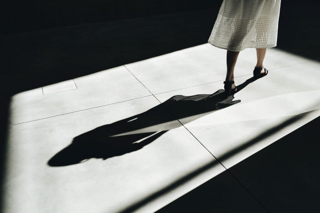
There is always a lot of discussion in photography circles about light. And while I love light, I consider myself a bit of a shadow guy. I think shadows tell a great story while leaving something to the imagination.
But one thing is for sure. Light and shadows are intrinsically tied together. If you have one, the other is lurking around somewhere.
I think shadows tell a great story while leaving something to the imagination.
Key Lesson: Shadows can often be used as leading lines. The image above is a perfect example of that technique.

On days when there isn’t a lot of light, or the light isn’t exactly pleasing to create a bright, happy picture, shadows can save the day with mood and mystery.
Use light and shadows to direct viewers’ eyes to a subject area. Then, let their imaginations fill in the blanks.
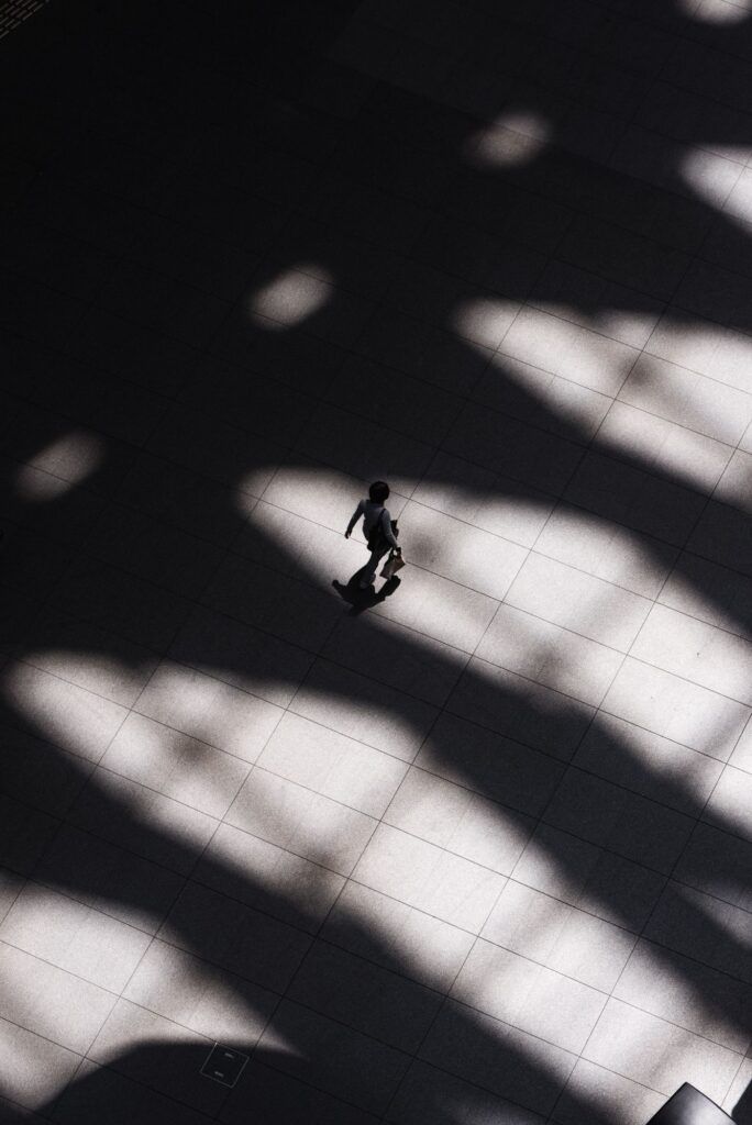
An equal amount of light and shadow can create a sense of balance in a picture.
Leaving your subject obscured in shadow creates drama. People love drama. This has been a favored technique among street photographers for several years now.
Key Lesson: Light and shadow are vital players in a photographic composition. They can be played off of each other to create a compositional path. Shadows are often used as leading lines. Leaving a subject in an entirely shadowed situation with a lit background can add drama and mystery to a shot.
Recommended Reading: If you’d like to improve your composition skills for better images, grab a copy of Photzy’s best-selling premium guide: Advanced Composition.
Self-Check Quiz:
- Name the seven necessary skills, also known as the Seven Key Principles of photography.
- What skill helps us identify and make sense of the visual world around us?
- Name a type of photography other than nature where you will often find patterns.
- Name the two types of balance.
- Which type of balance causes feelings of uneasiness?
- What is the eye-closing technique, and how does it benefit you?
- What is negative space?
- What should negative space always do for the photo composition?
- Which grouping number is proven to be the best?
- What do portrait photographers have to do when confronted with large groups?
- Why is closure important?
- What two colors contrast with every other color?
- Name a mood that can be created by shadows.