For photographers, particularly new photographers just beginning their journey in the field, composition quickly reveals itself to be an inescapable term. It’s a term that has no doubt been drilled into your head by a photography instructor or by every photography article or book you’ve ever read or by your photographer friend who won’t shut up about it. This composition thing just won’t go away!
Composition is everything. No matter how many different “official” definitions you come across or how many different ways some online photography guru tries to explain it to you, it all boils down to a matter of visual appeal. You can have a sharp, noise-free image of the coolest subject in the world and it will fail to garner the attention you want for it if it is poorly composed.
Of course, this doesn’t mean that focus and exposure are unimportant — it would be a mistake to think so; the technical aspects of photography still matter and play key roles in crafting a good photograph. While we rely on our cameras to some extent to handle things like metering and autofocus, things like composition and subject matter are left entirely up to the photographer’s mind and the photographer’s eye. The camera cannot assist us with these matters.
Exposure, focus, and subject matter notwithstanding, the hallmark of memorable photos is thoughtful composition. But if talking about the elements of photography in terms of “good” and “bad” belies the subjectivity of the art form, how then do we in fact determine what is good or bad?
Understandably, composition is an intimidating topic for some, a mystifying topic for others. But it doesn’t have to be either of these. Composition doesn’t have to be something that keeps you up at night.
"Composition is an intimidating topic for some, a mystifying topic for others."
Instead, we can look to some of the classic guidelines of composition to learn what works and why. Many centuries before any of us were born, artists — namely, painters — figured it all out. They determined how the placement of a subject best impacts the larger scene. The compositional guidelines that worked in generations past work just as well today. But in the true artist’s spirit, we don’t have to stop there; we don’t have to remain content with working within strict boundaries. We learn the “rules” and what they mean so that we can become better equipped to break those rules.
Start with a Question
Before worrying too much about specific rules and guidelines of composition, the most important thing you can do is ask yourself a question: “How do I want the viewer’s eyes to navigate my photo?” How a viewer looks at an image is a vital factor in determining how they perceive and interpret an image, so it’s up to the photographer to construct the scene in such a way that faithfully represents what they intend to convey.
The guidelines below will help you achieve exactly that.
Rule of Thirds
The most basic of compositional guidelines, the rule of thirds, suggests dividing an image into thirds — both horizontally and vertically — and placing important visual elements at or near these imaginary boundaries.

By applying a ratio of 1:1.618 (the “golden ratio”) instead of the equidistant parameters of the standard rule of thirds and getting creative with the placement of important visual aspects, you’ve instantly opened up several alternate techniques.

The Golden Spiral


The Golden Rectangle

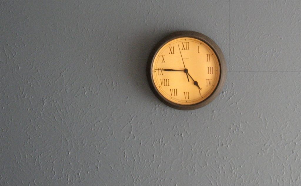
Geometry
One of the reasons using naturally occurring geometry is such an effective composition technique is because shapes are easily identifiable and relatable to the viewer. Everything around has some kind of shape: buildings, houses, gadgets, land formations. Exploit the shape of things around you so that the viewer’s eyes will go where you want them to go.
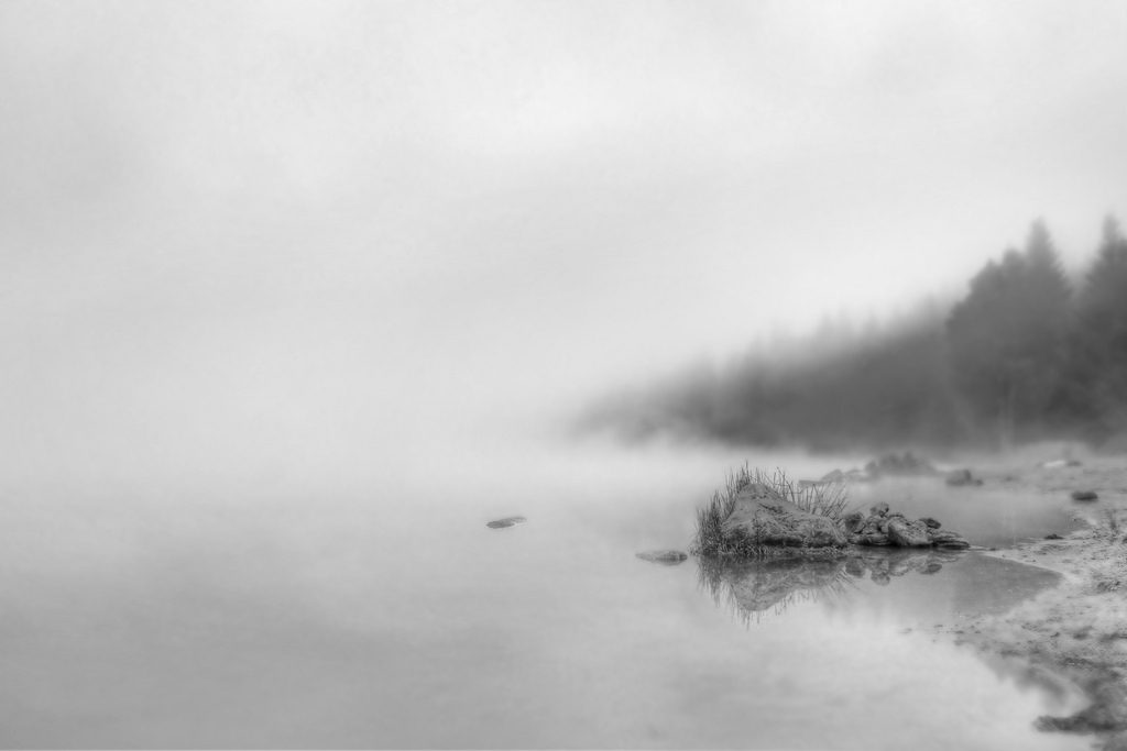
Framing
This technique uses naturally occurring elements to frame a subject and isolate it from the rest of the image. It can also help provide a visual boundary to the edges of a scene, thereby curbing the natural tendency of the eye to wander off the frame.

Leading Lines
Whether straight or curved, implied or geometric, the human eye tends to be drawn into an image via lines; similar to what the framing technique does, lines keep the viewer’s eyes from simply wandering aimlessly around a photo.
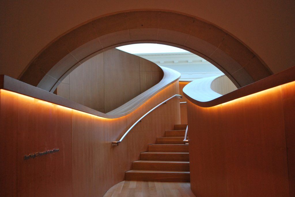
Filling the Frame
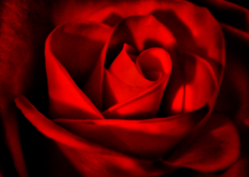
Not to be confused with crowding the frame, filling the frame is simply the process of giving the subject a position of prominence in the frame and greatly minimizing (or eliminating) the impact of whatever may be in the background. It’s an easily achieved composition method that can pack a visual punch.
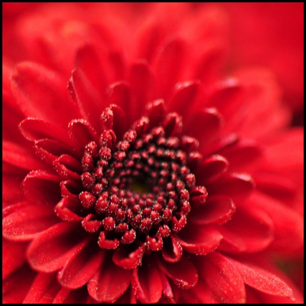
Photo by TumblingRun
Symmetry
If you have a strong point of interest and a scene/subject that lends itself to it, creating a symmetrical composition can result in some striking imagery. Symmetry can be created numerous ways, from grouping identical subjects to including strong reflections.

Patterns
Whether the result of nature or the work of human hands, patterns exist absolutely everywhere in the world. Use patterns to bring a sense of rhythm to an image.

Balance
A balanced composition isn’t necessarily about symmetry. Balance, in this case, refers to the presence of a secondary point of interest that serves as something of a counterpart to the main subject; something to fill in the blanks, to provide a counterweight, to balance the image.

Orientation
Whether your photo is vertical or horizontal can go a long way in determining how the shot is perceived by viewers. One orientation isn’t better than the other, but every photographer tends to use one more than the other. Depending on what you’re shooting, a vertical format may allow you to frame the subject more tightly; vertical images also provide the viewer with an easy “up and down” visual journey.

Horizontal images, on the other hand, feel more natural, more like the way we see the world around us.

Conclusion
Did you happen to notice anything interesting about the above compositional styles and their accompanying photographic illustrations?
The “rules” and images could easily be mixed and matched; there’s more than one photo here that fits more than one of the rules of composition. That’s the nature of art — art is what you make it.
Furthermore, the guidelines listed here don’t encompass the entirety of compositional approaches; for instance, color and perspective (shooting from up high or down low) can also be used as forms of composition. You might also find a way to combine more than one technique in an image. All of this, in turn, is likely to push you toward what is perhaps the ultimate goal of creative minds: breaking the rules of art in order to create art.
"If something works for you, by all means use it. But in your quest to create art and establish your own style, you shouldn’t feel obligated to stick to any particular rule."
There are plenty of artists and people with an interest in art who subscribe to the idea that, like photographer Bruce Barnbaum proclaimed, “Rules are foolish, arbitrary, mindless things that raise you quickly to a level of acceptable mediocrity, then prevent you from progressing further.”
Use composition rules to establish some foundational knowledge; use them to get in some good practice. Then get over them. If something works for you, by all means use it. But in your quest to create art and establish your own style, you shouldn’t feel obligated to stick to any particular rule.
So, then, what is composition? Once again, Bruce Barnbaum says, “[Composition is] an arrangement of the parts of a work of art so as to form a unified, harmonious whole.”


