
Coloring is one of the most significant ways to express yourself as a photographer. It’s a signature of every one of us. You know how people say that your clients should recognize your work even without your name on it? There are many ways to make it possible: lighting, posing, locations, atmosphere, editing… and the whole industry is now pushing us to make a choice about our color scheme. The truth is, it’s hard to find “the one,” and it’s even harder to stick with it as your signature style. But don’t worry, the magic behind the color chemistry is that you can just experiment and have fun. Join me today on the way to the pastel kingdom!
Today, we’ll cover:
- what makes pastel colors so popular,
- to what extent you should plan your first pastel photoshoot, and
- tips and tricks for the best results.
Recommended Reading: Want to create memorable, fascinating, and impressive color photographs? Grab a copy of Photzy’s premium guide: Rich and Vibrant Color Photography Volume 1.
Photograph by Ľudmila Borošová
Pastel Colors: What Makes Them So Special?
Do you remember the feeling of coming to the classroom and finding out that all your friends are obsessed with a TV show or a new trend all of a sudden? Well, I feel that’s kind of how pastel colors became a thing. To be honest, I fell in love with this color scheme from the first time I saw an artist using it, but it’s completely understandable if it’s not your cup of tea. For decades, photographers were tied to only using black and white or traditional coloring. As the inner need to differentiate individual work was rising, more and more unique schemes emerged. In cinematography, artists like Wes Anderson became popular and introduced art we weren’t used to seeing.
Coloring is one of the most significant ways to express yourself as a photographer.
I believe that one of the reasons why pastel colors rule the world now is that our daily life consists of an overwhelming amount of bright and saturated colors popping out from everywhere we look (mostly from marketing). The beauty of pastel colors is preserving the colors but making them less aggressive, while setting a melancholic mood. It’s also an escape from reality, because there aren’t many places to actually experience such a palette with your own eyes.
Of course, there are many brilliant photographers using pastel colors for contemporary art and/or to support their minimalism, but in this guide I will focus on the fashion portrait aspect.
Let's Start: What Are My Expectations?
My dominant colors are pink, violet, and green. Photograph by Ľudmila Borošová
Ask yourself a question: What colors do I want to be dominant in the picture? This is a great starting point, because your location and outfit choice will depend on this small detail. You can also influence the way you take pictures during a photoshoot. Do you want to focus on one or two colors only and create an interesting contrast? Or would you prefer simply working in a multicolor environment? What I usually do is have this in mind and adjust to the location with the mood.
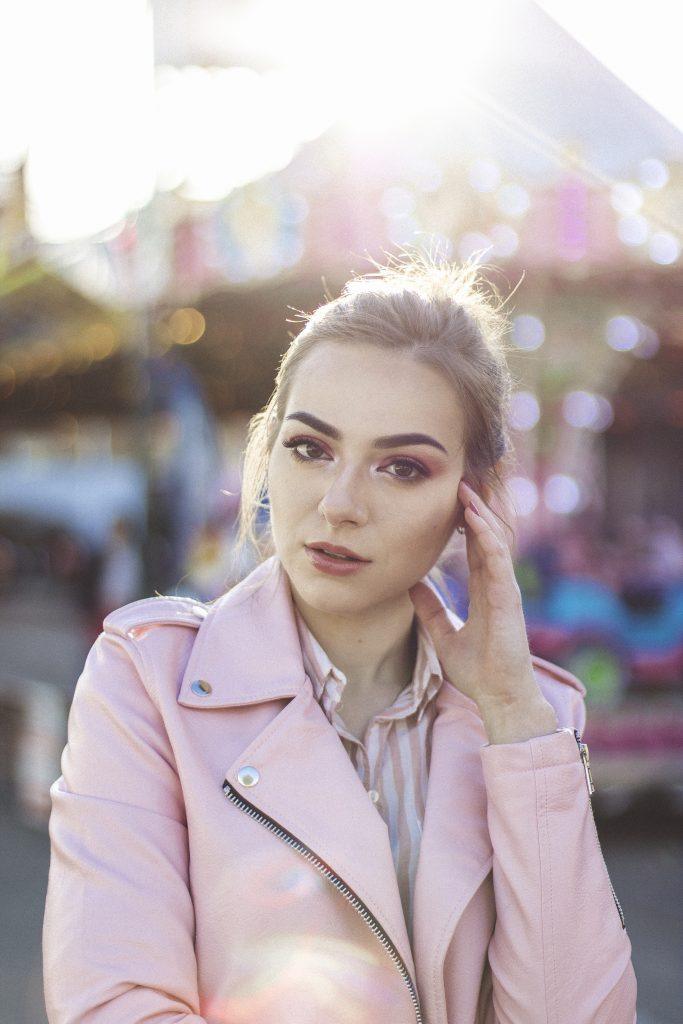
My dominant color is pink. Photograph by Ľudmila Borošová
You are already decided about your colors, but what mood do you want to use your pastel art for? Fresh? Dreamy? Glam? Melancholic? Minimalistic? It’s crucial to have the basics of your shoot planned out. And by basics, I really do mean basics. I often lay out only the mood expectations and location suggestions. You often don’t need anything else.
Here, white and pink are both dominant, because I used them equally. Photograph by Ľudmila Borošová
I find it very hard to meet my expectations if I over-plan every small detail, especially when you’re just starting out, as it can lead to many disappointments. Just go with the flow on the spot and I’m sure it will bring you beautiful results. That’s where you can take advantage of the real situation, whether it’s light conditions or other details you didn’t know when you were planning it out in your living room. Just have the mood/vibe in the back of your mind!
Photograph by Ľudmila Borošová
Photograph by Ľudmila Borošová
Compare these two photographs (above). Do you feel like one photo is dreamier and the other one a bit more melancholic?
Especially for pastel photoshoots, the right location choice is a major part of success. If you’re into minimalism, I suggest considering simple pastel backdrops. Finding the right color sometimes takes as much as a few clicks online. If you are more into budget ideas or don’t have any space inside, try driving around your town and marking down colorful walls in your area. You can also experiment with a DIY blanket and dye it your favorite color. With lower apertures, even that can make magic!
Are you patient enough? I suggest waiting for the annual fair in your area. I must admit that for me it was the perfect location to get out of my comfort zone and go pastel, and I’ve been doing it every year since! It’s such a good, natural source of all the different colors waiting to pop, especially when you have these festivals only a few times per year! Mark it down in your calendar – you won’t regret doing so.
Tip: If you’re willing to travel to get some beautiful pastel vibes on your images, you should add La Muralla Roja in Spain to your travel list. Not only that, many cities all around the world offer unique locations. Wherever you travel, it’s a new opportunity to discover something new. For example, have you ever heard about the Redhill MRT Station in Singapore? I bet you can find your own MRT in your city – just get ready to explore!
Recommended Reading: Want to create memorable, fascinating, and impressive color photographs? Grab a copy of Photzy’s premium guide: Rich and Vibrant Color Photography Volume 1.
Talking to Pastel: Secret Ingredients
When we compare ourselves to other photographers, we often only see their result and want to know the perfect recipe to copy it as fast as possible and make it ours. But the truth is, the way someone achieved their business outcome may not work for your product. Educate yourself and try out combinations of various factors to create your own personal recipe for success.
Don't Be Afraid to Reach Out
Photograph by Ľudmila Borošová
If you find the perfect model for your shoot – whether it’s someone with colorful hair, crazy outfits, or just a vibe you like – don’t be afraid and ask them “out.” Let them know your concept. Maybe they are willing to model for you! And if not, I’m sure they would be happy to recommend a friend who would be perfect for your idea, or some places where you can borrow similar clothes.
But the truth is, the way someone achieved their business outcome may not work for your product.
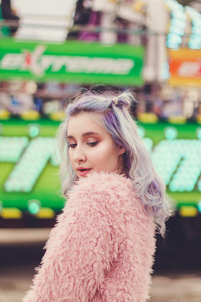
For my fair photoshoot, I chose this model (above) both because of her interesting hairstyle and wardrobe. I also collaborated with a local makeup artist and made sure she understood the concept. It’s easier to achieve the final look when you already have as many pastel elements as possible in the picture.
Adapt to the Situation
I find this the most crucial element. When you’re already on the spot shooting, use at least a third of your energy to analyze what could be used as your dream pastel background! You will help the colors to be “pastel” a lot later in post-processing, but you need a good base in your RAW picture to start with. Using the example of my fair photoshoot, I used various types of backgrounds to create different effects.
Using Shapes in the Background to Your Advantage

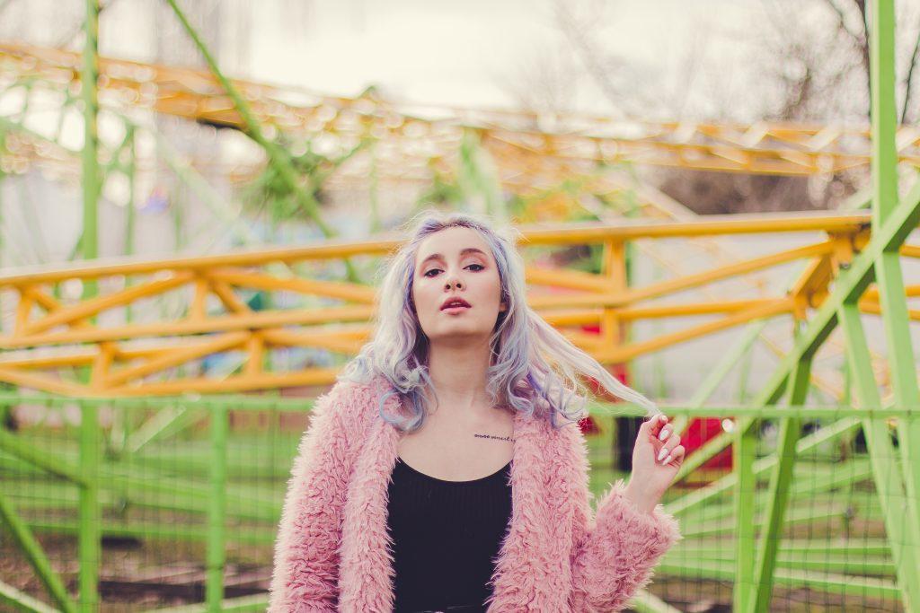
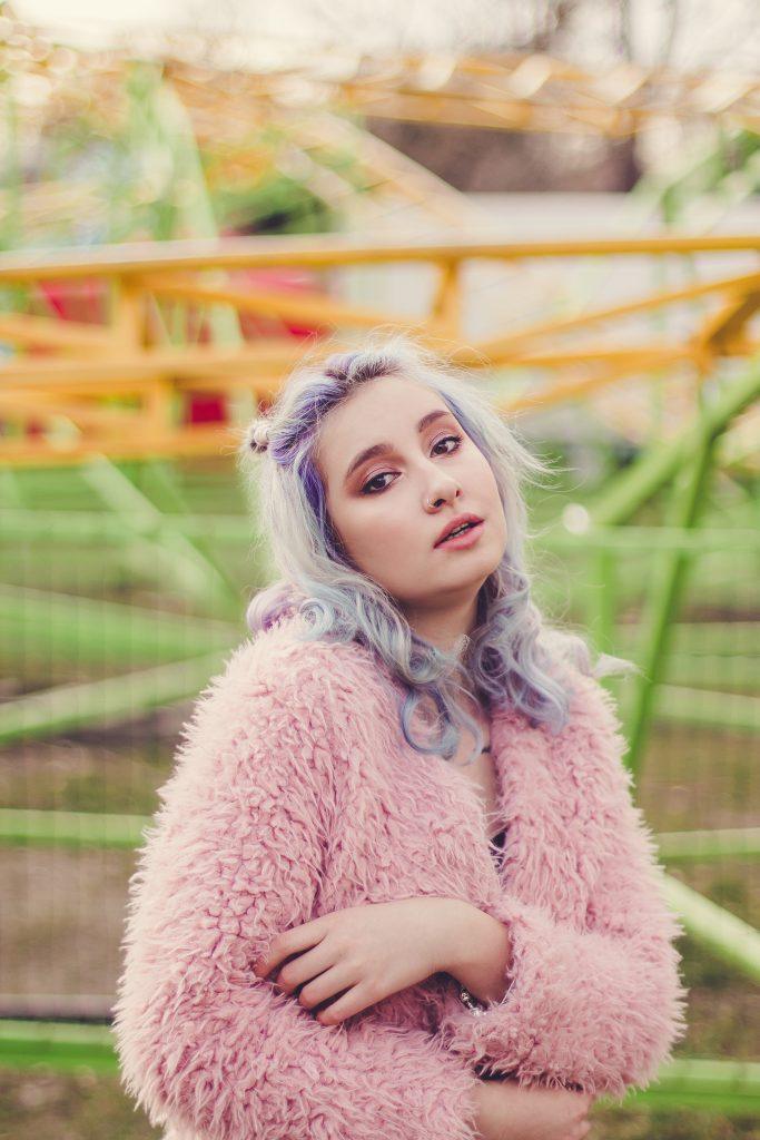
Photograph by Ľudmila Borošová
As you can observe, what makes the photo above interesting is the chaos of the lines in the background. The model is standing right in the middle, as all the rollercoaster lines disappear further into the distance. It’s minimalistic and playful and includes pastel colors in the background already.
Using the Background to Complement the Story

Photograph by Ľudmila Borošová
Play with the background bokeh in a way that your viewer can still identify the location as the background story. Even though the model is still a bit more important, it would be a shame to blur the carousel harder. With this f-stop we still kept all the important shapes visible.
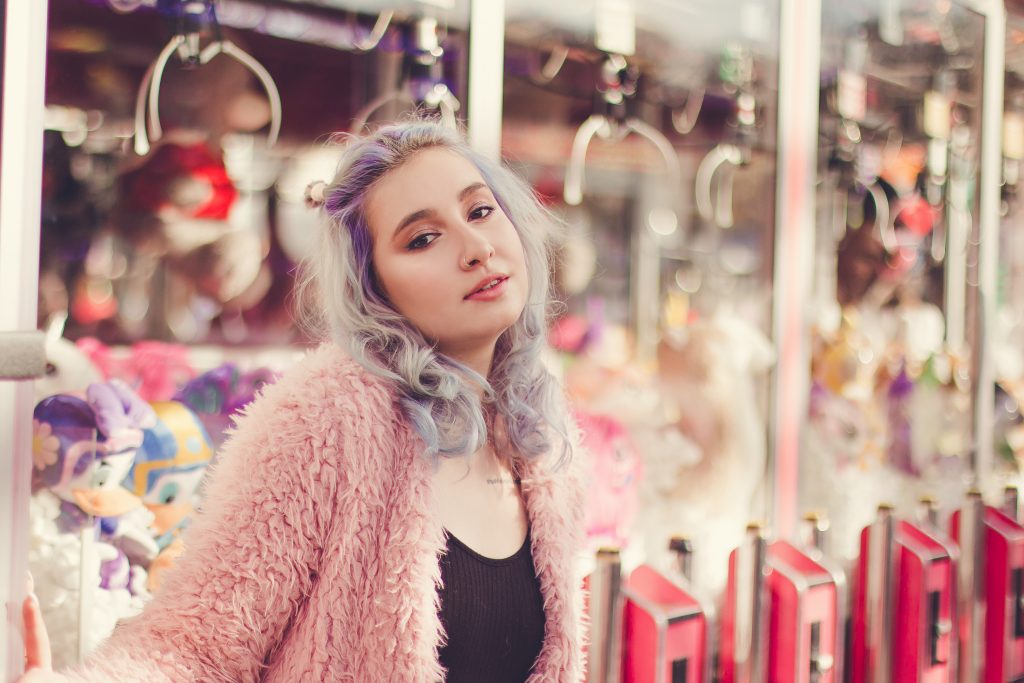
Using Closer Objects for Interaction

Photograph by Ľudmila Borošová
Lean towards different small stands, walls, or windows – suddenly the backdrop comes alive. I love shooting a bit from the side, so the background closer to the model is a bit more focused.
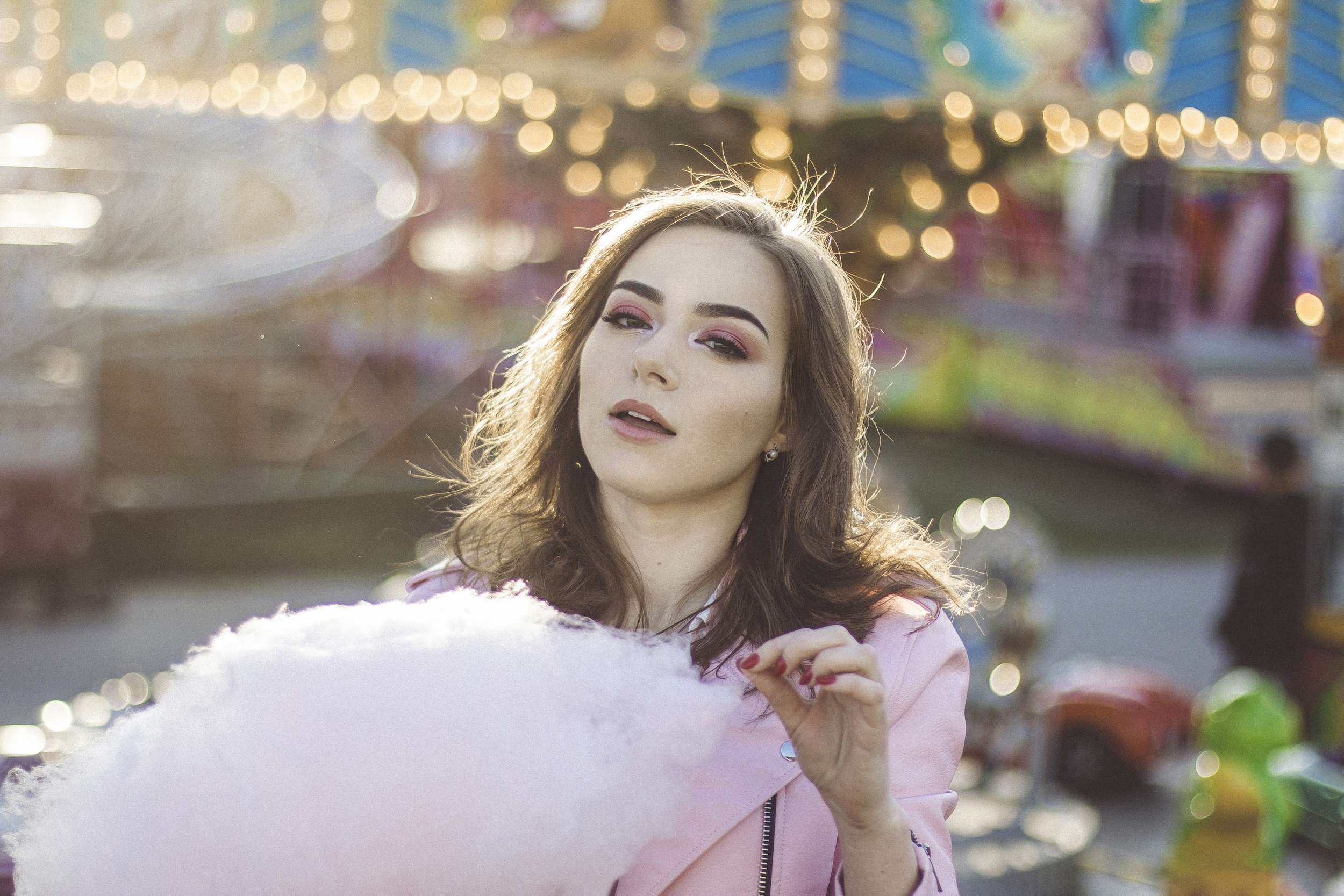
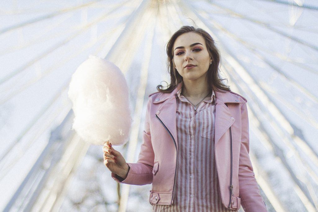
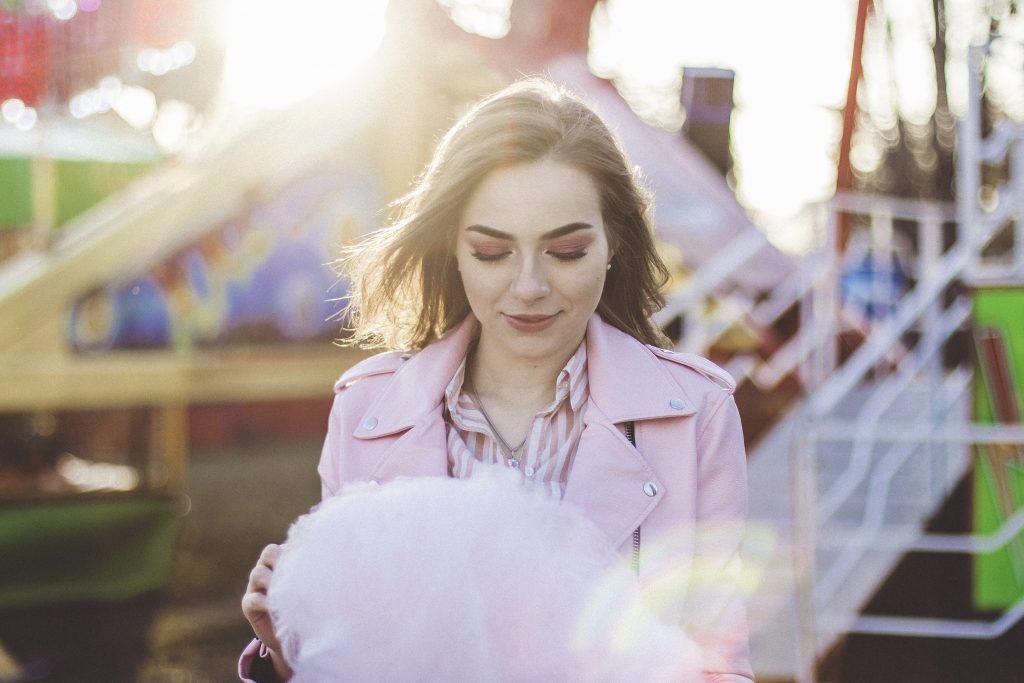
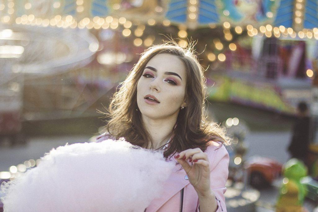
Using Pastel-Colored Props
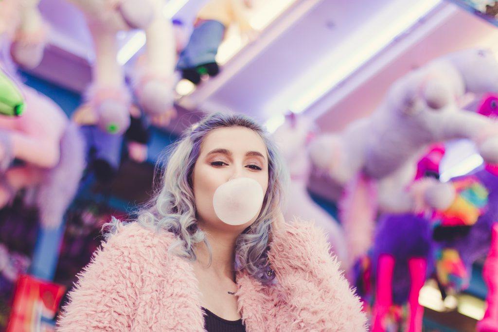
Photograph by Ľudmila Borošová
Whether it’s bubble gum or cotton candy, it’s a cheap way to sparkle up your photos with some pastel props.
Photograph by Ľudmila Borošová
Recommended Reading: Want to create memorable, fascinating, and impressive color photographs? Grab a copy of Photzy’s premium guide: Rich and Vibrant Color Photography Volume 1.
Using Bokeh for Backgrounds You Wouldn't Enjoy Otherwise

Photograph by Ľudmila Borošová
I saw some “pastel” potential in this location and didn’t want to let go! However, it didn’t fit in my colors as much as locations before. Because the cars were used by customers, I wanted to eliminate the chance of catching a person in the background, so I used a lower aperture and it helped with the shapes of the various lights in the back.
Learn How Lightroom Presets Work
When I edit, I split my work between Lightroom and Photoshop, starting with applying the right preset in Lightroom. That’s right! If you’re just starting out, there is no need to dive into the complicated world of making your own. Go step by step. First, you should find the one preset you really enjoy and which would suit your ideal mood!
For this photoshoot, I also used a preset created by someone else and I don’t mind using it for the majority of my work, because I am always very satisfied with the colors it brings out! Using someone else’s preset doesn’t mean blindly applying it all over my images. There is some science behind it, and all pictures will be affected differently. Learn what your preset does by playing with it!
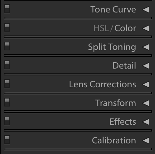
Screenshot by Ľudmila Borošová
Do you see those little on/off switches on the left? You can always turn them ON and OFF to see how each section affects your edit. It’s an effective way to deepen your preset understanding with a little bit of fun!

Photograph by Ľudmila Borošová
Let’s use this image (above) as an example of HSL/Color adjustments. First of all, there are eight colors you can develop according to your preferences. With all of them, I made sure to keep my saturation levels below 0, and sometimes even negative. Since red and dark blue weren’t a part of most of my pictures, I kept them on neutral levels. With orange, I pushed the saturation down and luminance up a bit. Why? Orange is mostly dominant in the pictures as the main skin color. Imagine this same picture but with very saturated skin colors, resulting in all the imperfections popping out. The pastel color palette in this photoshoot is asking for a bit of a paler look – that’s why there’s a need for the adjustments. Yellow and green are the colors of the background, so I desaturated them just a little bit and chose my balance on the right side of the hue sliding bar. I did the same with the hue in purple and magenta, but without touching the saturation. Those were the colors dominant on the model, so I wanted them to differ from the background with a little bit more saturation. At the end, I adjusted aqua only very slightly.

Photograph by Ľudmila Borošová
As you probably noticed, I subconsciously divided the colors into these categories:
- Neutral – Colors not present/dominant in any part of the picture
- Skin – Colors affecting the skin tones of my model
- Colors dominant in the background
- Colors dominant in the picture
- Others
This kind of philosophy worked for me in achieving the preferred colors. Even if I started with a preset, I made slight adjustments to suit the picture. But to make a pastel edit work, I needed to have suitable RAW images. If I used very aggressive colors during the shoot (e.g. red), it could be much harder to eliminate them in post-processing. I planned the colors, mood, and location and experimented on the spot with the background choices in order to work with similar colors all the time. Find a location which can make your work ten times simpler by already having the right colors. Then go out and shoot! Now you have some of the basics needed, so only by going out to the streets will you find what works for you.
Self-Check Quiz:
- Is there a maximum limit on how many colors should be dominant?
- What are the key factors you should focus on in order to not over-plan your work?
- Can you name any different ways you can work with the background?
- Do you need to create your own presets for a pastel photoshoot?
- Is it acceptable to tweak presets? Why?
- How can you find out the way presets affect pictures?
- Can you divide colors in your photography?
- How can you make your work a lot easier?
- Create a mind map of your ideas. Write down five adjectives to describe your ideal pastel photoshoot mood.
- To each adjective, write one possible way to achieve the result.
- Walk or drive around your area and write down five possible locations with pastel walls.
- For each of the places, write down the dominant location color and the ideal color you could use as a contrast (e.g. for the outfit).
- Find a new preset you’d like to try out. There are many free resources. Try to properly understand how it affects each of your pictures.


