


Color balance is an important aspect of editing photos, so they look as natural as what you have photographed. Often, it’s not a problem because most photos are made with a single light source or lights of the same color temperature. Other times, the balance or white balance needs to be adjusted in post-processing.
Here is what we will cover in this article:
- The temperature of light
- How to properly set up your camera
- The aesthetics of color temperature
- Color balancing a single light source
- Why you want to be creating your pictures in camera RAW
- Adjusting white balance (WB) in Lightroom
- Color balancing multiple light sources
- The importance of creating natural-looking light
Recommended Reading: After learning about camera settings, improve your photographs by understanding how light works! Grab a copy of Photzy’s premium guide: Understanding Light Book One.
Poor lighting can provide challenges when you want your photos to look as natural as possible; for example, when the light is low or there are mixed light sources of different color temperatures.
Within Lightroom, there are some great tools that you can use to edit the color balance of your photos. When you’ve taken photographs in poor lighting conditions, some parts of your compositions might be colored differently. This can be because the light temperatures are not consistent among the lights affecting what you are photographing.
This is more common with electric light sources. LED, tungsten, fluorescent, and other lights give off light of assorted temperatures. These can make things they illuminate look unnatural colors in photos.
Light Temperature and Camera Settings
Our brains adapt shifts in color produced by diverse light sources, so they mostly look natural. When you look at lights, you may not realize they may be cool or warm light. In your photographs it becomes clear.
Having the white balance set correctly for the temperature of the light you are photographing is important. I generally leave mine on Auto White Balance as the camera gets it right most of the time when there’s one light source.
When you look at lights, you may not realize they may be cool or warm light. In your photographs it becomes clear.
Whenever there’s more than one light source and they are different temperatures, this causes a problem for the camera. One or more of the lights will be rendered with a color cast in your photos. In these circumstances, it becomes necessary to postprocess your photos to correct the color balance.
Another challenge is that the appearance of light and its color temperature is somewhat subjective. By editing color temperature to rigid technical rules, your photos may end up looking too cool or too warm. You have to choose what you think looks best and the color balance that looks good for each photo you edit.
Color Balance With a Single Light Source
There are times when the auto white balance setting does not provide a natural looking color tone in your photos. Othertimes, you may forget to manually adjust your white balance setting when the lighting changes.
Balancing color temperature in Lightroom is fairly straightforward when there is only one light source and the image is saved as a RAW file. Shifting color temperature on a jpeg file is much more limiting because these files are compressed and contain less data.
Key Lesson: Saving your images as RAW files when you’re taking pictures gives you far more scope for correcting white balance when editing. You can adjust the white balance even when the camera settings are incorrect.
Jpeg files contain far less data, so you are very limited in the amount you can adjust the white balance. If you’re used to saving jpeg files, switch to saving RAWs and jpegs when the lighting conditions are challenging. This will help you when you’re not sure if you are getting a satisfying white balance.
White Balance in Lightroom
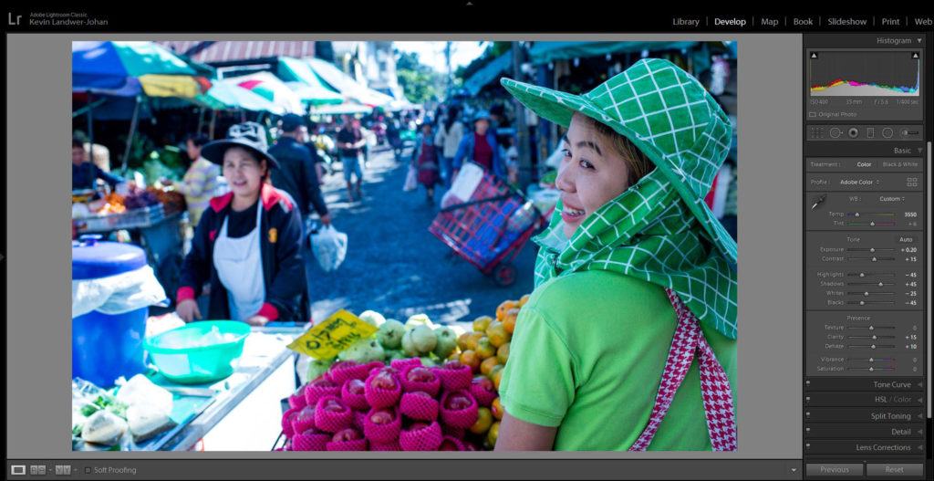
Photograph by Kevin Landwer-Johan
In this image, the white balance appears too cool. The woman’s skin tone does not look natural and the pavement has a distinct blue tone to it.
Near the top of the Basic Panel in Lightroom you will find the section for adjusting the color balance in your photos. This has an eyedropper and two sliders, one for Temperature and one for Tint.
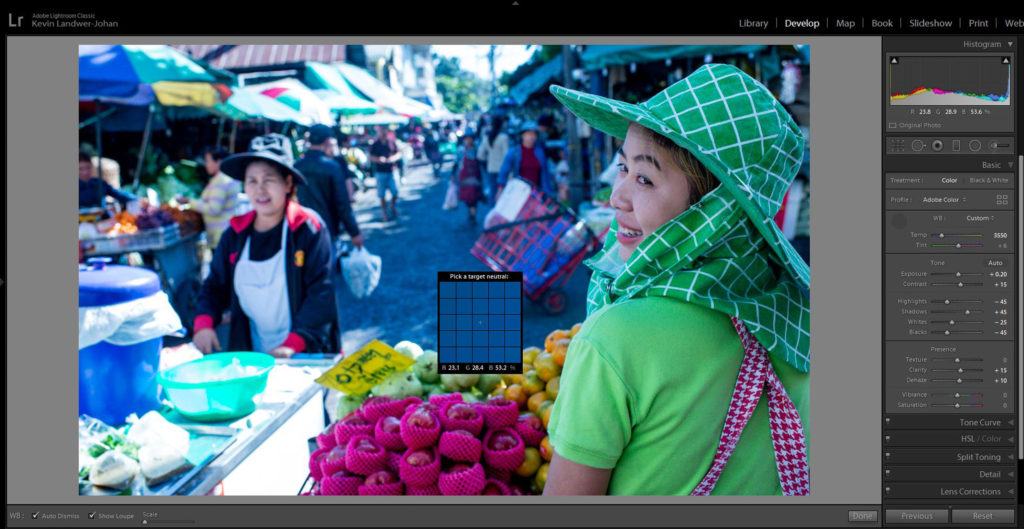
Photograph by Kevin Landwer-Johan
Use the eyedropper to start the process of correcting color balance in your photos. Click on the eyedropper icon and select a neutral tone in your photo. White or gray usually work best.
Here I have chosen to take a sample from the pavement. I could have taken it from the apron of the woman pushing the cart, but I am not sure if her apron is white or light blue.
Key Lesson: I did not take the sample from the cart she is pushing, even though it’s white. Because the white surfaces of her cart are in the sun and are overexposed, they contain no color data. Taking a sample in an overexposed part of a composition will not help. You must take a sample from a well-exposed and neutrally toned part of your image.
Click on the area you have selected. You will see the color temperature of your image change.

Photograph by Kevin Landwer-Johan
After using the eyedropper, you may notice the change is a little extreme, as in the image above. The eyedropper action has resulted in the photo being too warm. Lightroom has overcompensated.
Recommended Reading: After learning about camera settings, improve your photographs by understanding how light works! Grab a copy of Photzy’s premium guide: Understanding Light Book One.

Photograph by Kevin Landwer-Johan
When this happens, use the slider to correct the color balance so it looks the way you want it to. As I mentioned earlier, this is somewhat of a subjective process and differs from image to image. There is no true set formula. In the image above, I dragged the slider a little more towards the left.
Key Lesson: Whenever you are color balancing an image with people, look carefully at the skin tones. Aim to have skin tone looking as natural as possible.
Yellow or blue color casts on skin make a person look sick and are usually not a good look in a photograph.
Here I have tweaked the result of using the eyedropper so there’s a little more yellow. The fruit vendor’s skin tone looks natural and the pavement surface no longer looks blue.
With a single light source, color balance is relatively straightforward. Now, let’s take a look at how to balance color when you have light sources of different color temperatures affecting your photos.
Color Balance With More Than One Light Source
Lightroom provides good tools for balancing color when you have two or more light temperatures. Balancing color well can be challenging in this type of image depending on the subject and how the light sources affect it.
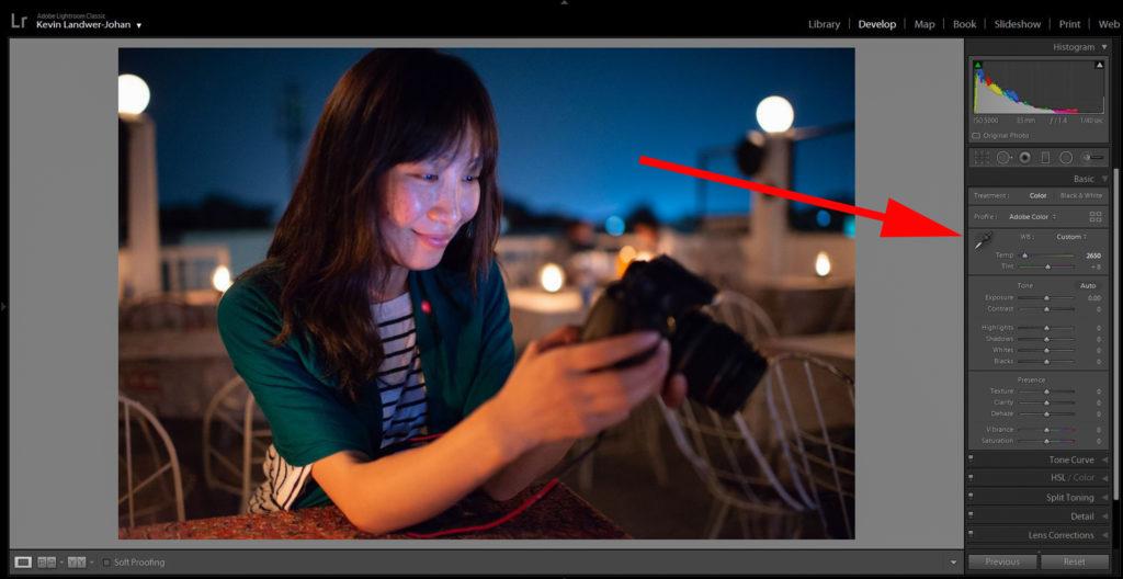
Photograph by Kevin Landwer-Johan
Here I have a photo of a friend being lit from a warm-colored light as the main source and additionally from her camera monitor. The phone’s monitor is producing a cooler light, shining mainly on her face.

Photograph by Kevin Landwer-Johan
I started by using the eyedropper to take a sample from her white dress where it’s lit only by the warm light. Her arm then looked a bit too blue, so I used the slider to add a little more yellow. My aim was not to get a totally neutral skin tone, but one that looks natural enough in the warm light.

Here is the uncorrected result, which is very blue. Photograph by Kevin Landwer-Johan.
Then I selected the Adjustment Brush and painted over the area affected by the light from her camera monitor. To be able to see where I was painting, I adjusted the Exposure Slider, so it was all the way to the right. Once I had painted the area, I then moved the slider back to zero.

Photograph by Kevin Landwer-Johan
With the Adjustment Brush tool still selected, I then moved the Temp slider to warm up the cool light from the camera monitor.
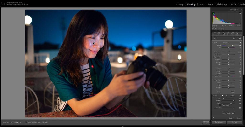
Photograph by Kevin Landwer-Johan
Being able to paint in areas of a composition with the Adjustment brush gives you a large degree of control over the color balance in your photos. In this image there are only two light sources I wanted to correct. You can use this same method in photos that have many color temperatures affecting them.
Recommended Reading: After learning about camera settings, improve your photographs by understanding how light works! Grab a copy of Photzy’s premium guide: Understanding Light Book One.
Aim to Create Natural-Looking Lighting
Whatever the circumstances you’re photographing in, when you post-process, aim to render your images so the color balance looks natural. If you deplete all the color from a light source, your photos can tend to look somewhat anemic.
Pay careful attention to whites that are not overexposed. Check your histogram to make sure you have white areas that are not blown out, as these will give you a more accurate reading. Avoid using the eyedropper on overexposed areas as you will not get a helpful result due to the lack of color information. Gray areas are also good to use for a sample.
Whatever the circumstances you’re photographing in, when you post-process, aim to render your images so the color balance looks natural.
When photographing with stage lighting, where there are many strongly colored lights, often it’s best to leave the colors alone. Where the color cast is very strong, you may not be able to effectively balance it in Lightroom.
Good stage lighting is designed to be part of whatever the performance is. Leaving it uncorrected will render the most realistic-looking photos.
When you have people in your compositions, try to get their skin looking as natural as possible. This can be challenging. I prefer to leave some of the color temperatures of the light source as it makes the colors in a photo look more real.
As with so much of photography, color balance is subjective. Make it look the way you want it to. Understand how you can manipulate color temperatures in Lightroom. This will help you create more realistic-looking photographs.
- What can cause incorrect color balance in your photos?
- What is the best file format to use when saving your photos if the lighting is poor?
- What tool is best to start with when balancing color in Lightroom?
- What is the main slider you can use to adjust color balance caused by poor lighting?
- What do you need to be careful with when color balancing photos of people?
- Which tool can you use to help balance color in photos with more than one light source?


