Knowing how to apply color adjustments to your travel photographs is important. This is because your camera may not always capture colors as you see them. There are two ways to make modifications to your color photos. You can set your camera to control them when you are saving your photos as jpegs, or you can manipulate them with software like Lightroom when you are saving your photos as RAW files.
In this article, I will cover how to make color adjustments to RAW files using Lightroom. As with all things in this software, there are many methods you can use to reach the same results. I will share with you the techniques I have found to be most useful.
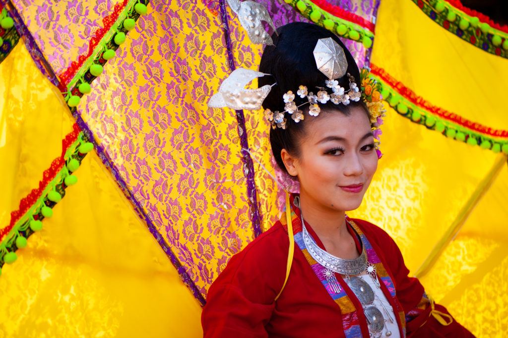
Photograph by Kevin Landwer-Johan
In this article, you can learn about the following:
- Why you need to make color adjustments
- Setting your white balance
- Global and local color adjustments in Lightroom
- Using the Lightroom Adjustment Brush
- Why make color adjustments?
Recommended Reading: If you want to learn how to enhance your photos and create better images, grab a copy of Photzy’s premium guide: Ultimate Guide to Fundamental Editing.
Sometimes the colors in a photo just look wrong. This can be a result of an incorrect white balance setting on your camera. Your photo may have a bluish or yellow cast to it. You’ll usually want the colors to look natural.
When you travel from country to country, the light can change. Geographic location and seasonal changes can affect the look of daylight. Whether you’re downtown in a megacity or out on highland steeps, the light will look different. Hues of color will alter with changing light. In photos taken at the same location in the hot, dry season, colors will not look the same in photos taken during the rainy season. Dry, dusty conditions cause light to refract differently than in a humid atmosphere. By using Lightroom adjustments, you can balance colors so they look the way you want them to.
Sometimes the colors in a photo just look wrong. This can be a result of an incorrect white balance setting on your camera.
Your intent for how you want each photo to look will guide you on the color adjustments you will make. Having an idea of how you want the colors in your photos to look is an important first step.
Adjusting the color of a photograph can change the feel. You can enhance the mood of an image by how you adjust the colors. You might add blue toning to a sad photo or boost the saturation of the reds and yellows to add a happy feeling.
Well-adjusted color is particularly important for photos of people. A skin tone that contains an unnatural color cast can make a person look sick. Aiming to get natural-looking skin tones requires an understanding of how to use the color adjustment tools in Lightroom well.
Often, colors in travel photos used commercially on websites and in brochures contain rich, vibrant colors. They are enhanced and manipulated to make travel more alluring.
Why Raw Files Are Better to Make Adjustments to in Lightroom
When you set your camera to save images as RAW files, all the data the sensor captures is contained in the file. Using jpg, the file is compressed and data is discarded.
When manipulating a RAW file, you have all the data to work with so changes can be made without the risk of compromising quality as easily as with jpg files.
If you have taken photos when your white balance setting was incorrect, it’s easy to adjust the color in Lightroom on a RAW image. This is because the full depth of information in the file is retained. With a jpg file, you can make some adjustments but certainly not with the same flexibility as RAW files.
White Balance Adjustments
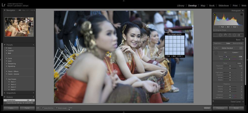
Eyedropper used to correct white balance. Photograph by Landwer-Johan
Typically, I have my white balance setting on auto. Most of the time the tone of the light looks correct. If you set your camera’s white balance to one of the presets, then it’s very easy to forget to change it when the lighting conditions change.
Using the eyedropper tool in the Basic Panel in Lightroom is a good first step to change the white balance. Click the eyedropper icon and then click on an area of your photo that is white or should look white. I do find that it’s not always 100% to my liking so further minor adjustment with the Temp slider is needed.
To the left of the eyedropper, you will notice it has a dropdown menu for white balance presets. I have not found these to be helpful. Often, they produce poor results. I find the combination of the eyedropper and manual adjustment will create better-looking color in photos.
When there is no white area to use the eyedropper on, use a gray part of the photo. If this is not possible, you can adjust the Temp slider until the white balance looks the way you want it to.
The Tint slider is used to adjust the balance between green and magenta tones in your photos. This can be quite subtle. It’s not a tool you will need to adjust often, but don’t overlook it. Minor adjustments to this slider can have a significant influence on how your photo looks.
Key Lesson: When making adjustments to the white balance, I am most interested in skin tones and having them look natural. I find it easier to see when skin tone looks natural than when white looks white.
Using the Hsl/Color Panel to Adjust Colors in Lightroom
Once you’re satisfied with your white balance, you can then pay attention to making localized changes to the colors in your photo. This can be achieved in many ways. You can choose to manipulate certain colors or areas of your photo. In this panel, you can manipulate your travel photos so they look more vibrant and full of life.
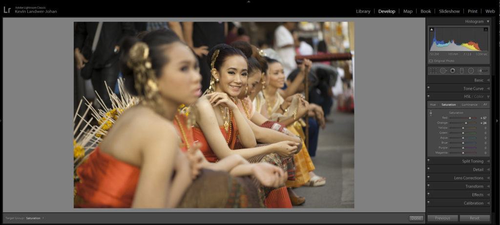
Saturation added to red and orange ranges. Photograph by Landwer-Johan
Using the HSL/Color Panel in Lightroom you can work with individual colors. When opening this panel you’ll see plenty of options, and this may be confusing at first. Once you have a little understanding of how this panel works, you have a lot of control over the way colors are displayed in your photographs.
With the Hue window open you will see that you have sliders for each color. Pick a prominent color present in your photo that you want to adjust. Now move the slider left and right until the hue of that color is looking the way you want it to.
Similarly, with the Saturation and Luminance windows, you can control how this color looks. Dragging these sliders to the left and right adjust the intensity of the color you are working with.
Experimentation is key to finding the balance you have intended. This is why it’s important to know how you want your photo to end up looking.
Key Lesson: Avoid adjusting any of the sliders to their extremes. Doing so can cause the integrity of the image file to begin to break down. When this happens there can be visible artifacts and color shifts that are not intentional.
Recommended Reading: If you want to learn how to enhance your photos and create better images, grab a copy of Photzy’s premium guide: Ultimate Guide to Fundamental Editing.
Split Toning and Tone Curve Adjustments
The Split Toning Panel has tools that allow you to control the color of the shadows, mid-tones, and highlights independently of each other. You can use them to correct color or to adjust it to create the mood you desire.
Using split toning to adjust the colors in your travel photos can be more subtle. Manipulating the tone of only the shadows in a photo for even slight changes can affect the feeling in the picture. Adding warmth to the shadows can introduce a more positive expression without appearing to alter the image much at all.
Manipulating the tone of only the shadows in a photo for even slight changes can affect the feeling in the picture.
There is no right or wrong way to make these changes. As it is with any color adjustments you make, it is up to the intention you have and how you want your photo to look.
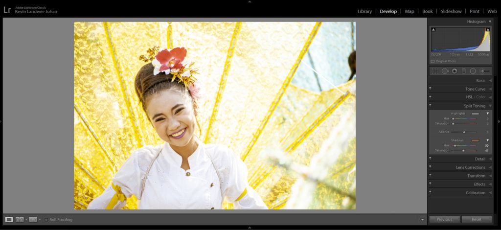
PShadows altered to warm her skin tone. Photograph by Landwer-Johan
Key Lesson: When making split tone adjustments, consider the light in each photo. What is the natural look the lighting produces in the picture? What is the prominent color in the photo? Start with this color and introduce it when using the split toning sliders.
Tone curve adjustments are made in similar ways, but with a curve control tool rather than with sliders. You can control the light, mid and dark tones together, or you can adjust the red, green, and blue channels separately.
The individual color channels work on complimentary colors. These are as follows:
- Red and cyan
- Green and magenta
- Blue and yellow
When you experiment with the curves, you will see more or less of the complementary color as you make your adjustments.
I do not use the tone curve so much. When I do, it’s generally to make alterations to the bright and dark areas in all channels together.
Altering Color in Local Areas With the Adjustment Brush
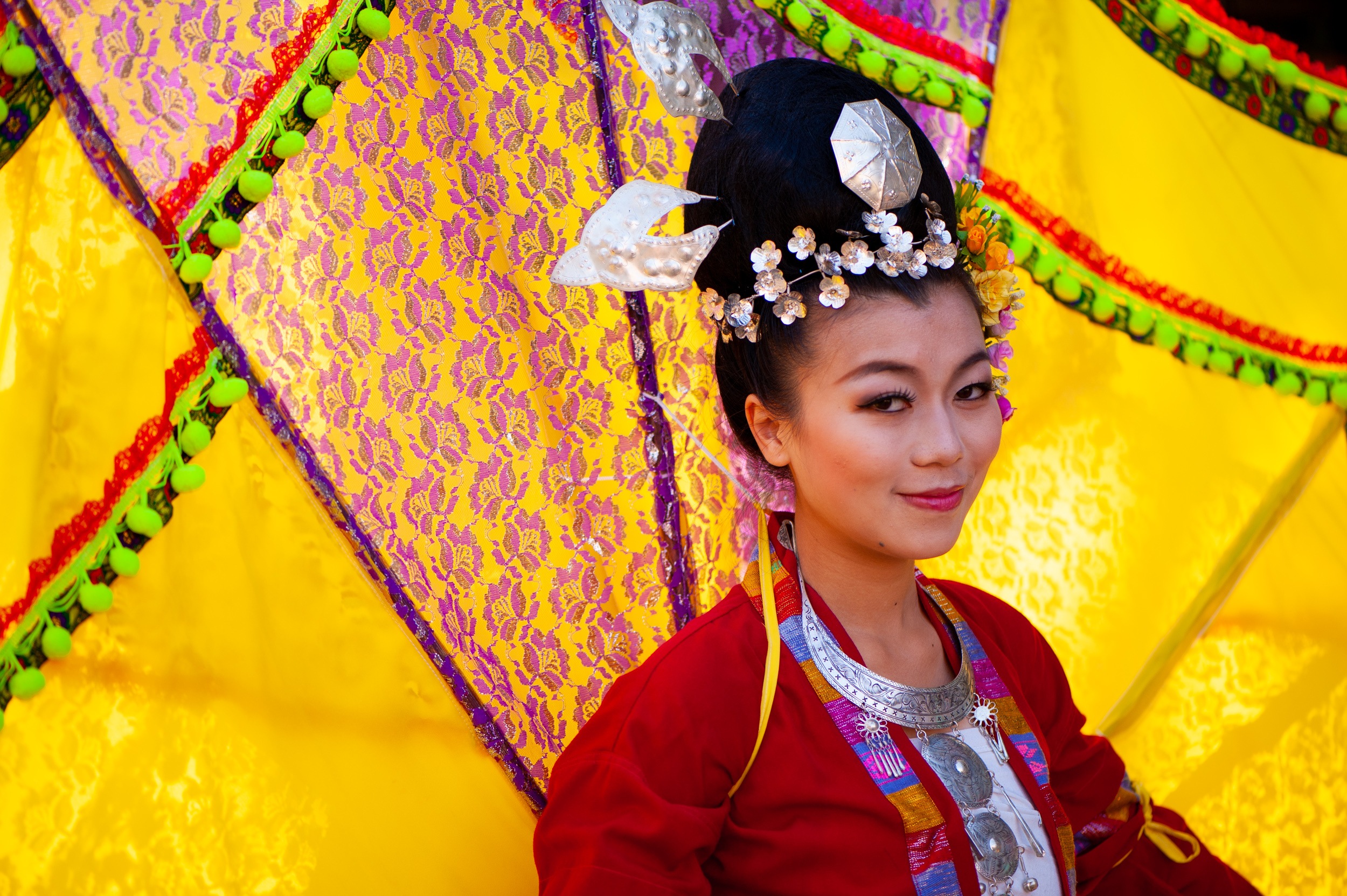
Global color adjustment made but unaltered by the Adjustment Brush. Photograph by Landwer-Johan
The Adjustment Brush in Lightroom is a powerful tool that allows you to control how the color looks in certain areas of your composition. If you’re used to working with brushes in Photoshop, it may take some getting used to. The Adjustment Brush functions differently but affords you more control. You are also working in a non-destructive environment in Lightroom, so any changes you make do not need to remain permanent.
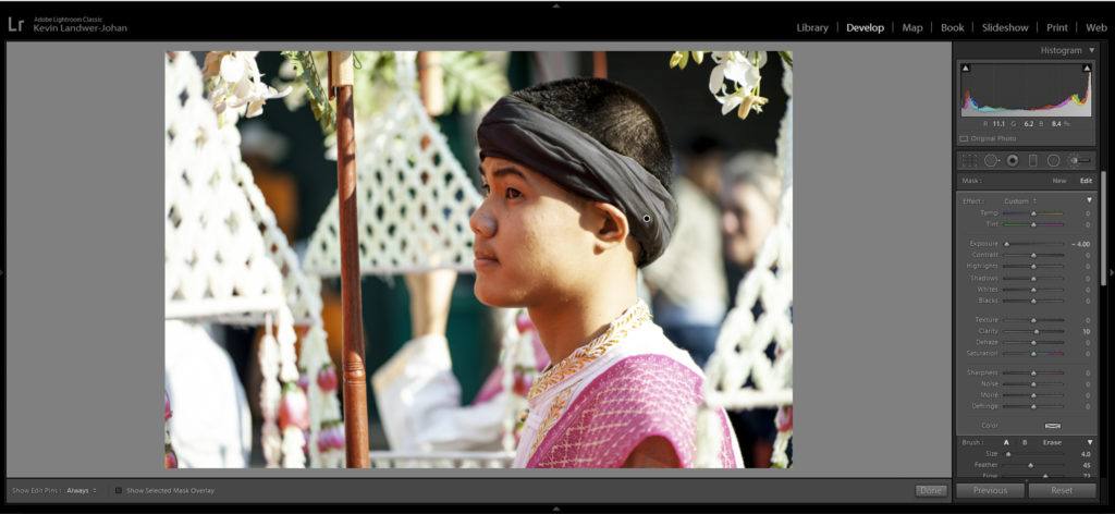
Headband brushed with the exposure reduced. Photograph by Landwer-Johan
When you click the Adjustment Brush icon, a drop-down window appears with lots of options for how you can control what the brush does. I set the exposure slider to be either very dark or very light. This allows me to clearly see the effect of the brush as I paint. Then I can paint over the areas in which I want to make adjustments to the color. Once I have my areas selected, I then zero the exposure slider.
Now it’s possible to make color adjustments with the various sliders. You can also influence the color of the selected areas by clicking on the rectangle labeled ‘Color’ which is below the main panel of sliders. Here you can add an overlay of color to the selected areas.
By making good use of the array of sliders in the Adjustment Brush window, you have endless options. You can control many aspects of the way your photos look, not only the colors.
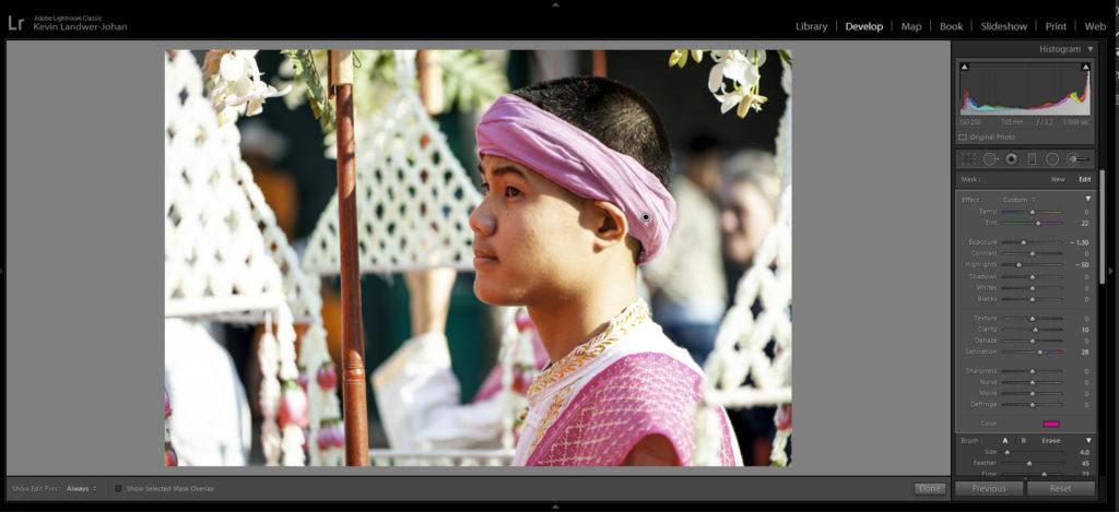
Color adjustments made to the headband. Photograph by Kevin Landwer-Johan
Key Lesson: Manage the use of your brush well. In the bottom portion of the Adjustment Brush window, you will find controls for how your brush responds. Managing the Size, Feather, Flow, and Density allows you to have a high degree of control. Here you also have the option to include more than one brush and also an eraser.
Recommended Reading: If you want to learn how to enhance your photos and create better images, grab a copy of Photzy’s premium guide: Ultimate Guide to Fundamental Editing.
Conclusion
As with all of the photography, your intention will guide you in the color adjustments you make on your travel photos. The stronger the idea you have in mind for how you want the finished picture to look, the more decisive you can be. You will arrive at your goal more quickly.
Experimentation is key when you are not sure how you want the colors in your image to appear. Try using the various techniques I have outlined in this article. The more you practice, the more you’ll learn how the controls in each panel respond.

Photograph by Kevin Landwer-Johan
Self-Check Quiz:
- Does your camera always capture colors the way you see them?
- Do you have more control when adjusting the colors in a jpg file or a RAW file?
- What is a good first step in adjusting the white balance?
- Does white balance affect skin tones?
- Is it good practice to adjust sliders in Lightroom to their extremes?
- What three aspects of an image can you control with split toning?
- What kind of colors do the individual channels in the tone curve work on?
- What is the best tool in Lightroom for making color adjustments to local areas in your photos?