


Imagine this familiar scenario: you’ve had a productive and enjoyable day out shooting — a couple of landscapes and cityscapes, some architecture shots, a bit of street photography, a handful of portraits, whatever floats your boat. You have finally completed the task of getting those shots off of your memory card and into your photo organizer/image editor. You’ve culled together all your keepers. Now it’s time to process these shots. Hopefully you have established an effective workflow to make post-processing less stressful, but for some photographers there is one question that seems to arise with each post-processing session:
“Should this image be color or black and white?”
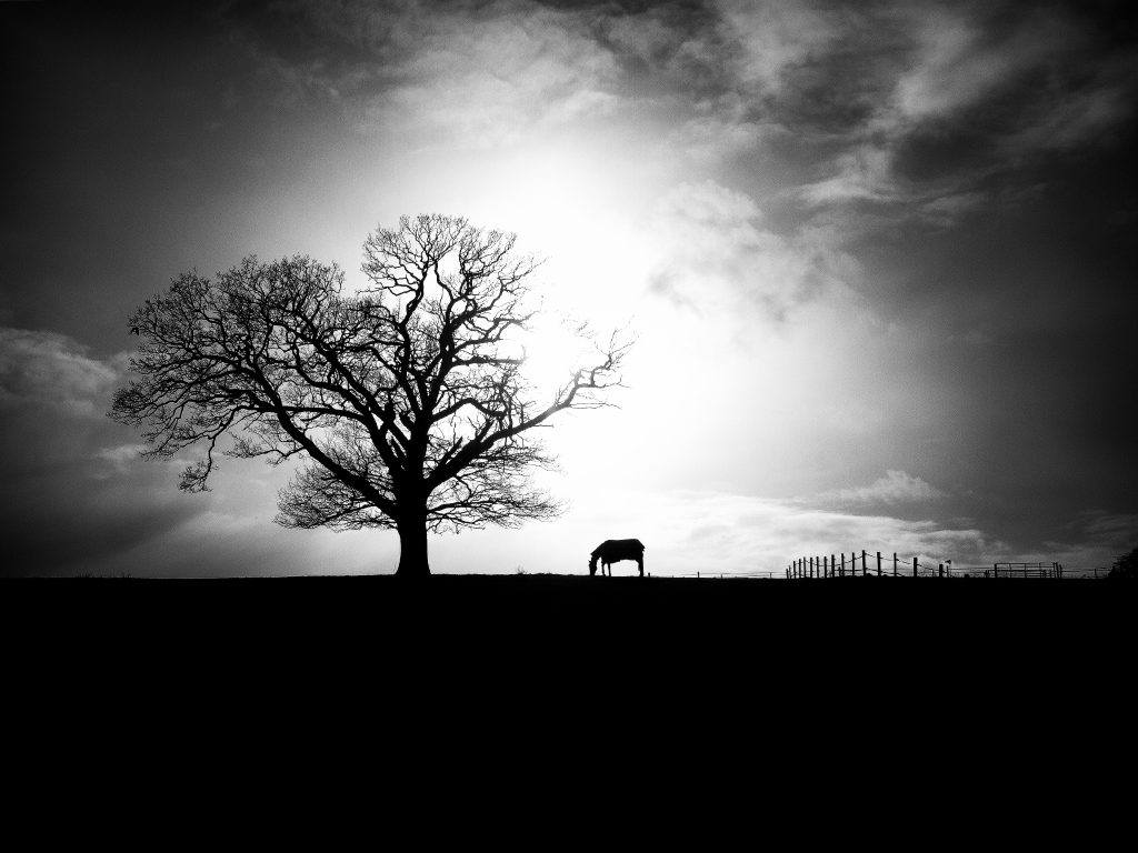
Photo by Nick Page
Back when film was the only photographic medium available, photographers had to make similar decisions. The difference was it was in their best interest to arrive at a final decision before they even went out to shoot. The correct film had to be used, of course. Sure, one could shoot on color film and decide later if they wanted a black and white image, but that just meant more time in the darkroom. But if the shot was captured on black and white film, well, that was the end of the story.
We now have the luxury of being able to decide on the exact chromatic qualities of our photos after we’ve taken them. That’s the easy part. What’s not always so easy is determining whether an image should be presented in color or black and white. There is no objectively right or wrong answer to this, but there are some basic principles to keep in mind that can help you with your decision.
We now have the luxury of being able to decide on the exact chromatic qualities of our photos after we’ve taken them.
Black and White vs. Monochrome
The terms “black and white” and “monochrome” are often used interchangeably. Such usage isn’t always incorrect, but there is some nuance that should be addressed. A monochrome image is one that consists of varying tones of one “color.” The images we commonly refer to as being black and white are indeed monochromatic, but this is just one of many ways to make a monochrome image. These photos (Image A and B) below are examples of images that are monochromatic, yet not black and white.

Image A. Photo by Michael Miller

Image B. This photo has a cool bluish tone, therefore not black and white. Photo by Jason Devaun
Black and white images, as they are typically created in digital photography, consist of pixels that vary across the image from black to multiple shades of grey to white, as exhibited in this photo of a flower (Image C) and the photo a man reading (Image D).
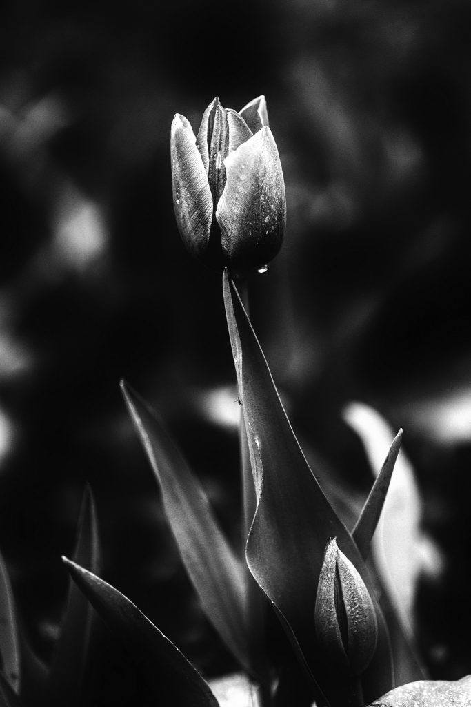
Image C. Photo by Jason Devaun
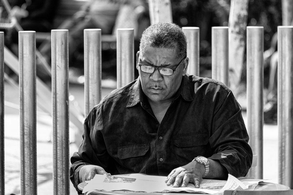
Image D. Black and white photos do not have color hues or tones. You will only see black, white, and different shades of grey. Photo by Jason Devaun
When trying to choose between black and white and color, ask yourself the following questions.
What Role Does Color Play in the Photo?
This is certainly a subjective criterion, but is something that should be a priority in your decision making process. It’s easy to conclude that color is always important. If we see in color, why shouldn’t photos be in color? The fact is, color can sometimes be a distraction. On the other hand, there are times when color is vital. A landscape photo that prominently features a rainbow is something that you would probably want to present in color, as the rainbow plays an important role in the scene, and a black and white rainbow isn’t much to look at. If the essential strength of the image does not rely on color, converting it to black and white will allow you to emphasize other visual or atmospheric qualities of the image. Additionally, if your photo is marred by especially washed out colors or strong backlighting that can’t be satisfactorily fixed in post-processing, converting to black and white may be able to salvage the shot.
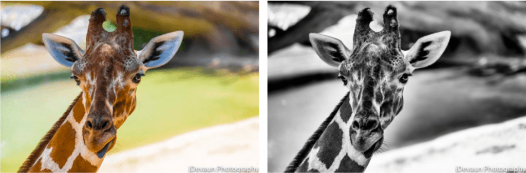
Which one looks better, the one in color or black and white? Try to observe if the the colors are distracting or if it plays an important role in the shot.. Can you see any advantage of the black and white version? Photo by Jason Devaun
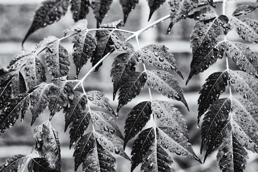
Are there Prominent or Interesting Textures in the Photo?
Texture is an important aesthetic component in all forms of art, from music to painting to photography. We commonly relate texture and physical touch, but this association is only one way of conveying texture. When dealing with photography, for instance, texture is conceptualized through sight rather than touch. We look at a subject like a lizard or a tree or a stone and we imagine what those things feel like — rough, bumpy, smooth, jagged. Images in which texture plays a central role benefit greatly from being converted to black and white, as black and white tends to emphasize texture, allowing the viewer to more easily appreciate what the subject “feels” like.

Photo by Jason Devaun
Do you Notice the Presence of Stark Contrast or Distinctive Light/Shadows?
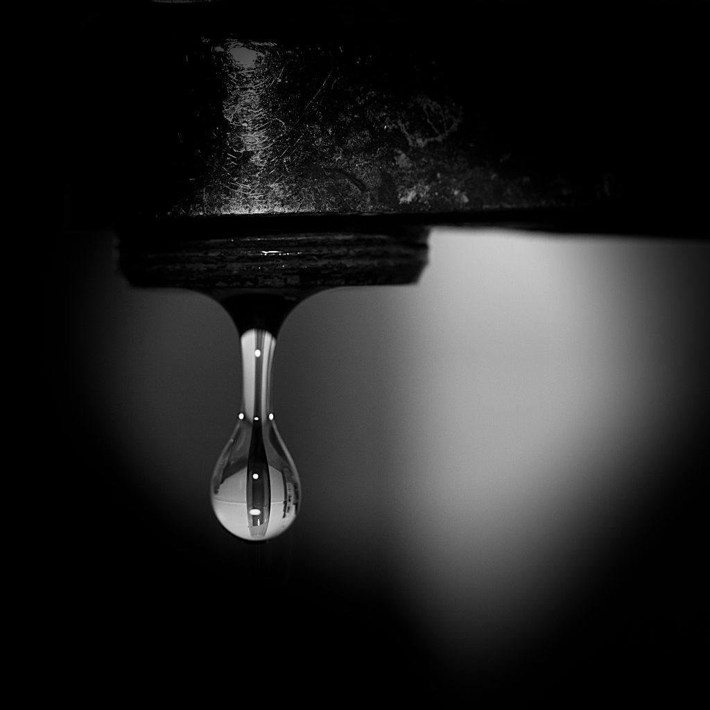
Photo by Jason Devaun
Take a look at the play of light and shadow in this photo. By converting it to black and white, emphasis was given to the tonal difference on the leaves and each droplet of water. Do you think this photo will be as effective in color?
Photo by Jason Devaun
What Mood Do You Wish to Communicate?
Similar to texture, mood and atmosphere are somewhat abstract ideas that can be communicated through photography in creative ways. When you look at a photo showing strong clouds, falling rain, wet streets, and people carrying umbrellas, you are struck with a particular feeling. You know what it’s like to walk in the rain and are suddenly transported, mentally, to that place. The photo has done its job of conveying a certain mood. Black and white photography works especially well for creating dreary or dramatic moods. If you want to create a somber or mysterious atmosphere around a portrait subject, the right lighting combined with a black and white conversion is the way to go.
Recommended Reading: To get a deeper understanding of the factors that affect your decision to convert a photo to black and white or not– Take a look at our best selling guide, Advanced Composition. Here you will learn more about color placement, contrast overlap, compression and many other advanced elements of design.

Photo by Jason Devaun
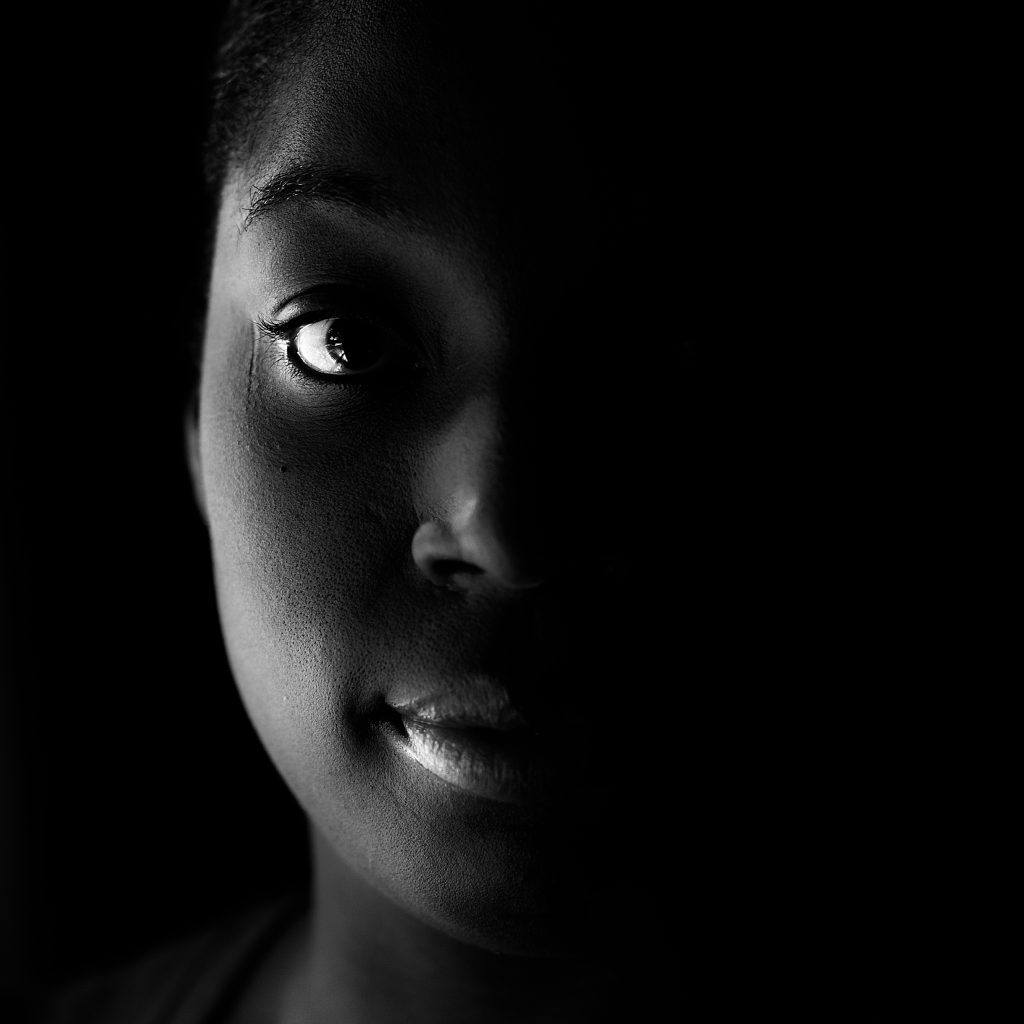
Photo by Jason Devaun
Final Thoughts
It is important to emphasize the subjectiveness of this issue. There are photographers who work almost exclusively in color, and those who work almost exclusively in black and white. Many more, however, fall somewhere in the middle and produce both color and black and white photos.
Using black and white can be effective when color is a distraction.
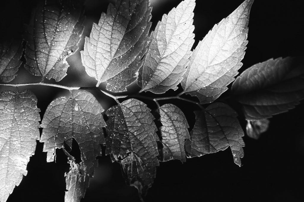
Photo by Jason Devaun


