

Post-processing is an art form. Some photographers not only show us what the world looks like but also what it feels like. You look at their images, and the reality appears to be a darker place or one filled with hope and light. One way to achieve this feeling is by altering the colors in your image. The effect is called split toning (or color grading), and you can do it in Lightroom.
Most photographers are familiar with global color changes like white balance and saturation. But we will look closer at targeted color changes using the Split Toning tool, now called Color Grading.
Photographers use Split Toning to create a cinematic or artistic look.

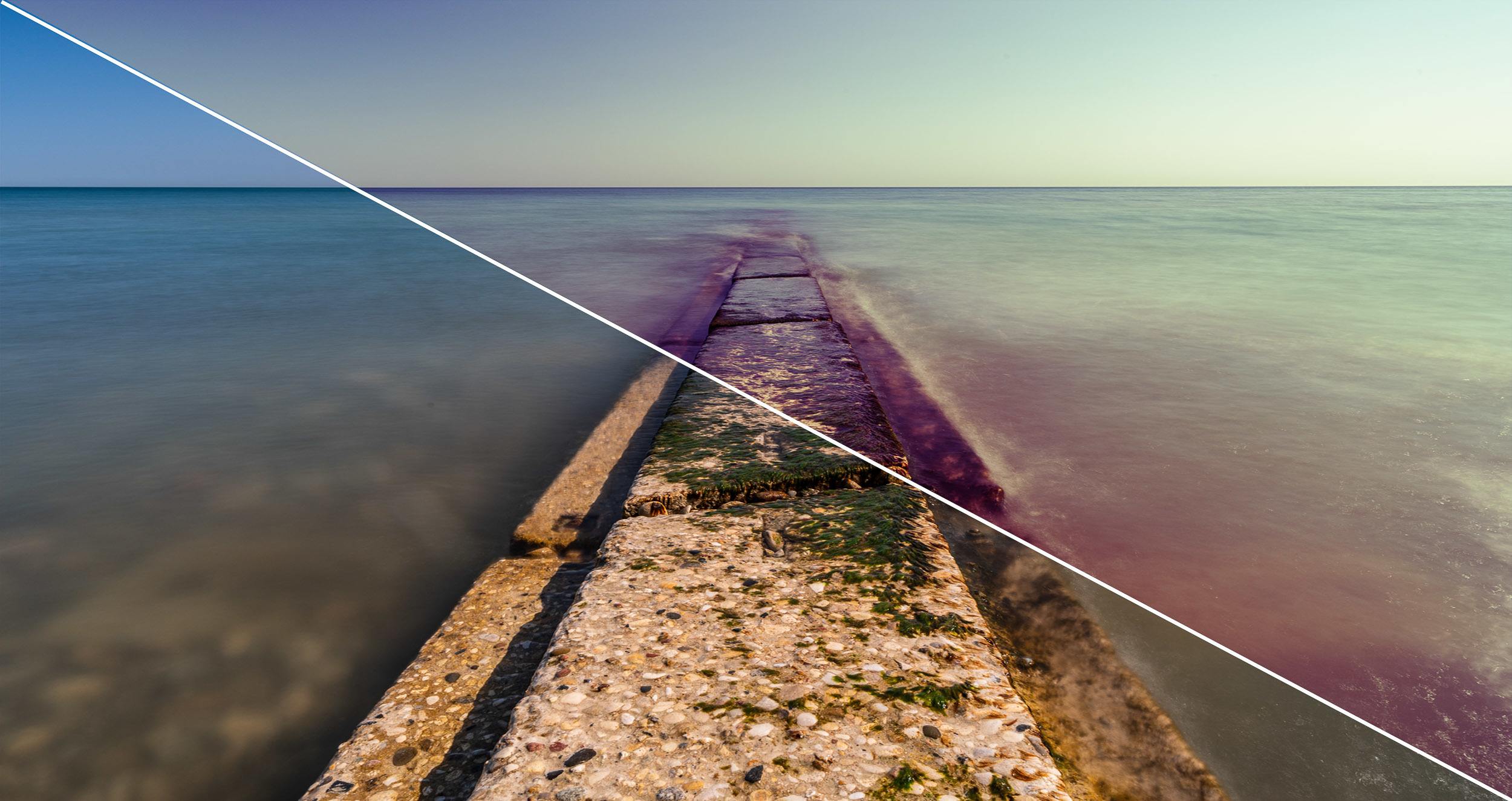
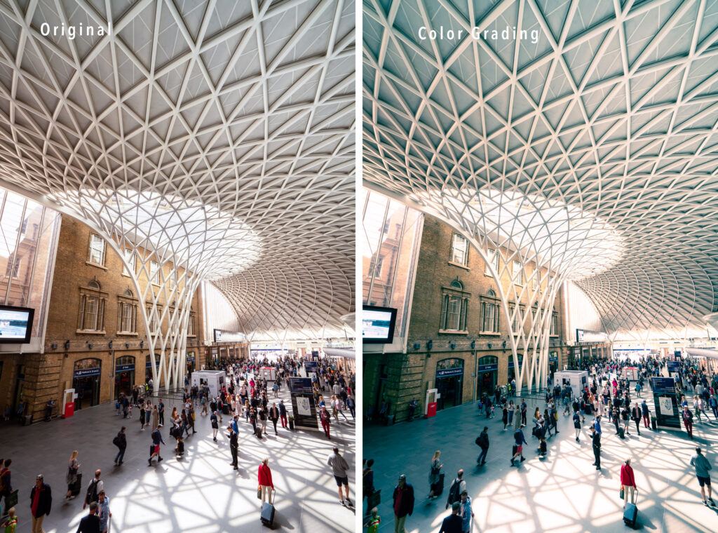
Before and after comparison. The image on the right was toned using Lightroom’s Color Grading tool. I adjusted the colors in the mid-tones, highlights, and shadows separately. Photograph by Jenn Mishra
If you have never used the Split Toning panel in Lightroom, you are in for a treat. It is a subtle tool and one that photographers often ignore. We will explore what this tool does and how it has changed in Lightroom version 10. In this version, Adobe has given Split Toning a new name: Color Grading. There are some new features to go along with the new name.
What we’ll cover:
- Overview of color grading tools
- Comparison of Lightroom’s Split Toning and Color Grading tools
- Explore ways to use Color Grading in your images
Recommended Reading: Want to create memorable, fascinating, and impressive color photographs? Grab a copy of Photzy’s premium guide: Rich and Vibrant Color Photography Volume 2.
What Is Split Toning?
Split Toning “splits” the tones in your image. It separates the shadows and highlights and lets you selectively change the colors in these tonalities.
Many tools in Lightroom let you adjust colors in your image. You can warm or cool the light with a white balance. You can change the saturation and the vibrance of the colors. The HSL/Color panel lets you adjust the hue, saturation, and luminance of individual colors. But these tools act globally on your image. All the light is either warmed or cooled. The colors are more saturated or less.
Split Toning means that you can add a warm, yellow tone to your highlights and a cooler, blue tone to your shadows. The sunlight feels warmer, and the shadows seem deeper. This emphasizes the contrast in your image.

This image has yellow and orange added to the mid-tones and highlights. Blue is added to the shadows. The yellows warm the lighter colors, and the blues deepen the shadows. Photograph by Jenn Mishra
This tool also allows you to remove a color cast in the original image. For instance, green grass casts a tint onto a white shirt, or blue skies reflect on a building. Counteract the colorcast with the opposite color. Photoshop’s Color Balance adjustment panel shows the color relationships. Cyan counters red, magenta counter-balances green, and yellow softens blue. This is based on color theory. These colors lie opposite each other on the color wheel. We will talk a bit more about color theory later in the guide.

Screenshot of the Color Balance adjustment panel in Photoshop. Screenshot by Jenn Mishra
In Lightroom version 10, Adobe changed the name of the tool that splits tonalities from Split Toning to Color Grading. In Lightroom CC, the Color Grading tool is located within the Color panel. Color Grading looks and functions differently in the new version. Let us take a look at the past and present split toning tools in Lightroom.
Comparing Split Toning Tools
To understand the changes Adobe has made to Split Toning, let us take a look at what the tool looked like in Lightroom version 9. If you are familiar with the earlier tool, you can skip ahead to Color Grading to see the changes.
Split Toning Version 9
Before version 10, the Develop module in Lightroom contained a Split Toning panel. The tool was divided into Highlights and Shadows sliders with a Balance slider in the middle.

Screenshot of the Split Toning panel in Lightroom version 9.4. Screenshot by Jenn Mishra
The Hue sliders changed the colors of either the highlights or shadows in your image. The Saturation slider lets you adjust the strength of the effect. Holding the Option (or ALT) key while adjusting the sliders showed you a preview of the change. Not seeing the effect applied to the image immediately may have led some photographers to ignore this tool.
What might be confusing was the numerical value next to the Hue sliders. Moving across the color spectrum was not adding more of a hue, it was changing the hue. The Saturation slider made more sense. Sliding Saturation to the right added more of the chosen color.
Not seeing the effect applied to the image immediately may have led some photographers to ignore this tool.
The Balance slider allowed you to adjust which was more prominent: shadows or highlights. Moving the slider to the left told Lightroom to consider more of the image as a shadow. Moving the slider to the right told Lightroom to consider more of the image highlights.
The slider interface could be difficult to use when you wanted to target a particular shade. I always found it easier to click on the colored box in the upper right. This opened a window with a rainbow of colors at different strengths. Click anywhere on the window and the color was applied. Drag up for more saturation or toward the bottom for less. This interface lets you adjust hue and saturation simultaneously. It also automatically applied the preview to your image without using the Option key.
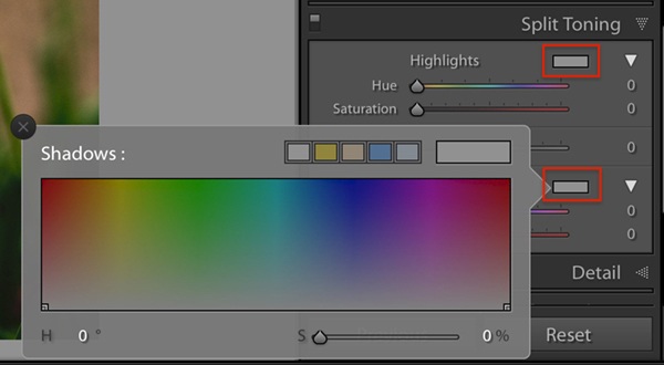
Screenshot of the pop-out window of the Split Toning panel in Lightroom version 9.4. Screenshot by Jenn Mishra
I preferred to interact with the Split Toning tool using this pop-out box. I might not have been the only one. The new Color Grading tool in Lightroom 10 hides the sliders and takes this interface to a new level.
Color Grading Version 10
The new version of the tool is called Color Grading. In Lightroom Classic, this tool is located in the Develop module. In Lightroom CC, the tool is part of the Color panel. The principle is the same as Split Toning, but the look is different. There is also a lot more functionality.

Screenshot of the Color Grading tool in Lightroom version 10. Screenshot by Jenn Mishra
In this new version, you can control highlights, shadows, and mid-tones individually. The Hue and Saturation sliders are hidden and replaced by three color wheels. Each has a target point in the center. To control the hue, drag the target towards the edge of the circle. Spin the target around the color wheel for different hues. The exact color appears in a marker outside of the circle. The closer you move the target to the edge of the circle, the stronger the color effect.
The sliders under each color wheel control luminance. This is another way of adjusting the relative brightness of the individual tones in your image. The idea is similar to the Highlights and Shadows sliders in the Basic panel, but the result is different. Toggle the eye icon in the lower right of each color wheel to see your image with and without the color tint.

Screenshot of a color wheel in the Color Grading tool showing the target point, the luminance slider, and the eye icon. Screenshot by Jenn Mishra
The Color Grading screen shows three color wheels for mid-tones, shadows, and highlights. But I find the target a bit small and difficult to control. You can enlarge each color wheel by clicking on the icons along the top of the Color Grading panel. There is an icon for shadows, mid-tones, and highlights. There is a fourth option for global adjustments, which we will talk about in a moment. The enlarged color wheels are easier to control and add options that are not available on the default screen.
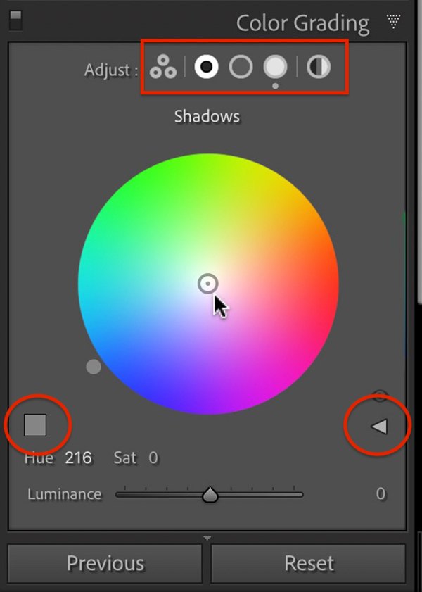
Screenshot showing enlarged shadows color wheel with additional options. Screenshot by Jenn Mishra
The unlabeled square above the Luminance slider opens the presets. These are the same presets included in the previous Split Toning version of the tool, but you also have an eyedropper. Drag the eyedropper over the scene to select a color already included in your image. Lightroom will automatically tone to that color.
The enlarged color wheels are easier to control and add options that are not available on the default screen.
If you liked the sliders in the previous Split Toning tool, they are still here. Click the triangle icon on the right side of the panel and the familiar sliders appear.
The Global Toning option (icon on the far right) is new to Color Grading. This changes the overall tint of your image. It is similar to the idea of adjusting the white balance temperature and tint. This tool uses a different algorithm than white balance so the results may be different.
Adobe has taken the Split Toning tool and made it much more elegant and powerful. There is a lot of functionality packed into a simple panel. Let’s put it to work and see how Color Grading can change the look of your images.
Recommended Reading: Want to create memorable, fascinating, and impressive color photographs? Grab a copy of Photzy’s premium guide: Rich and Vibrant Color Photography Volume 2.
Color Grading Your Images
A lot of color grading is your preference. I suggest finding the color that you want first by moving the target to the edge of the circle. When you have found the hue, drag the target towards the center to reduce the effect. A little color goes a long way. I aim for a just-perceptible color tint. Saturation is often lower than 10%, but let your creativity guide your choices. Let us talk about a few popular color grading combinations. But first, some color theory.
Color Theory
In the new Color Grading tool, color wheels replace the flattened rainbow format in the previous Split Toning tool. Laying the hues out in a color wheel helps you make decisions based on color theory. At its core, color theory is about which colors look good together. A full discussion of color theory is beyond the scope of this guide, but understanding a few color relationships will help you effectively use the tool.
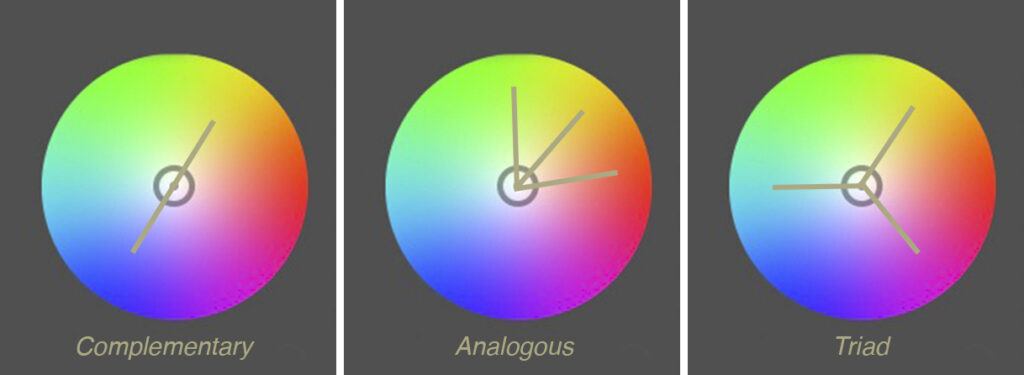
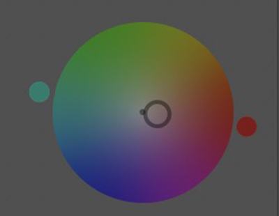
Three common color relationships. Complementary colors are opposite each other on the color wheel. Analogous colors are next to each other. A triad relationship divides the color wheel three ways. Screenshot by Jenn Mishra
Complementary colors work well together. These colors are opposite each other on the color wheel. A common recipe for Split Toning is to warm the highlights with yellows and cool the shadows with blues. Analogous colors also work well together. These colors lay next to each other on a color wheel. For instance, yellows and greens work well together. Other color relationships also work well especially if you have three color combinations.
Let us see some of these color relationships in action using the Color Grading tool and explore common Split Toning combinations.
Warm Highlights-Cool Shadows
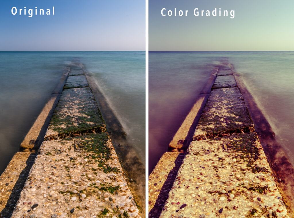
Comparing the original image with one toned in teals and oranges for a cinematic feel. Photographs by Jenn Mishra
Warming highlights and cooling shadows are a popular Split Toning recipe, especially for outdoor and nature photography. Yellow and blue lay opposite each other on the color wheel. The highlights are warmed, giving them more of a sun-kissed look, while the shadows are cooled. This is the feel of the scene even if it is not a faithful representation of the light.
The combination is pleasing because it uses a complementary color combination. Another popular complementary Split Toning combination uses teals and oranges (just a shade different from the brighter blue and yellow). This creates a cinematic feel to your images.
Warming highlights and cooling shadows are a popular Split Toning recipe, especially for outdoor and nature photography.
The recipe for this color combination is:
- Mid-tones: Hue = 195, Saturation = 21, Luminance = 36
- Shadows: Hue = 205, Saturation = 86, Luminance = -12
- Highlights: Hue = 34, Saturation = 53, Luminance = 61

Color wheel showing complementary color relationship for cinematic effect. M = mid-tones, H = highlights, and S = shadows. Screenshot by Jenn Mishra
Sepia
The Color Grading tool also works on images converted to black and white. When you convert an image in Lightroom, the color information is still in the image and will change when you adjust colors. You can use the Color Grading tool to create a sepia-toned image by using shades of orange and brown.

Comparing the original image with one toned in oranges and browns for a sepia effect. Photographs by Jenn Mishra
For this image, I toned only the mid-tones and shadows. The recipe for this color combination is:
- Mid-tones: Hue = 44, Saturation = 83, Luminance = 0
- Shadows: Hue = 22, Saturation = 50, Luminance = 0
- Highlights: Hue = 0, Saturation = 0, Luminance = 0

Color wheel showing analogous color relationship for sepia effect. M = mid-tones, and S = shadows. Screenshot by Jenn Mishra
Counteracting Unwanted Tint
You can also use the Color Grading tool to counteract an unwanted tint in your image. This happens sometimes when photographing people. Something in the environment – green grass, for instance – can add a bit of color to the skin. Counteract the color cast with the opposite color on the color wheel.

Comparing the original image with one toned to counteract a green tint. Photographs by Jenn Mishra
Something in the environment cast a greenish tint onto my model. I looked for the color of the tint that I wanted to remove. Then I selected a color opposite it on the color wheel. This adds color to the model’s face, but the difference should be very subtle, almost undetectable. Push it too far, and your model will have a red face.
Color wheel showing the green tone I identified as the unwanted green tint and the color opposite used to counteract the tint. Screenshot by Jenn Mishra
Add Color Interest
Comparing the original image with one toned in yellow, green, and magenta for color interest. Photographs by Jenn Mishra
Color Grading is great for adding color interest to a photo. This scene has a nice line, but the colors are not very interesting. One option is to change the image to black and white. Another is to add color tints using the Color Grading tool. In this image, I added shades of yellows to the highlights and mid-tones and magenta to the shadows. I also brightened both the mid-tones and highlights and darkened the shadows for extra contrast. This combination is unique to this image, but it falls roughly into what is called a split-complementary relationship in color theory.
The recipe for this color combination is:
- Mid-tones: Hue = 61, Saturation = 21, Luminance = +56
- Shadows: Hue = 295, Saturation = 58, Luminance = -48
- Highlights: Hue = 78, Saturation = 77, Luminance = +35

Color wheel showing color relationship for the above image. M = mid-tones, H = highlights, and S = shadows. Screenshot by Jenn Mishra

Original sunrise image before Color Grading. Photographs by Jenn Mishra
Color Graded sunrise image. Photographs by Jenn Mishra
Here is the same scene at sunrise. The colors are more interesting, but I can use Color Grading to bring out the feel of sunrise. I added orange to the sky where we would expect it and deepened the blues of the water. I also added a little green to the mid-tones. I let my eye guide my choices, but the color choices fall roughly into a triad relationship in color theory.
The recipe for this color combination is:
- Mid-tones: Hue = 130, Saturation = 7, Luminance = -7
- Shadows: Hue = 216, Saturation = 31, Luminance = -43
- Highlights: Hue = 28, Saturation = 36, Luminance = +25

Color wheel showing triadic color relationship for the sunrise image. M = mid-tones, H = highlights, and S = shadows. Screenshot by Jenn Mishra
Recommended Reading: Want to create memorable, fascinating, and impressive color photographs? Grab a copy of Photzy’s premium guide: Rich and Vibrant Color Photography Volume 2.
Creative Altered Reality
So far, we have been looking at altering colors in a realistic sense. But you can also create altered realities that have nothing to do with the colors in the real world. Use whatever color combinations that look good to you.
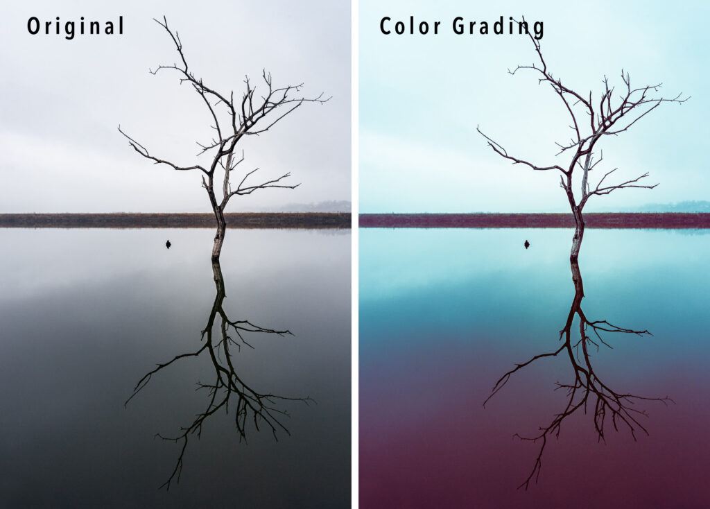
Comparing the original image with one toned in teals and magentas to create an altered reality. Photographs by Jenn Mishra
I went a little crazy with the colors in this scene. For both the mid-tones and highlights, I used a shade of blue for the shadows, a magenta. These are roughly opposite on the color wheel, so the colors feel in harmony even if they bear little resemblance to the real world.
The recipe for this color combination is:
- Mid-tones: Hue = 198, Saturation = 70, Luminance = +11
- Shadows: Hue = 342, Saturation = 59, Luminance = +14
- Highlights: Hue = 184, Saturation = 29, Luminance = +44
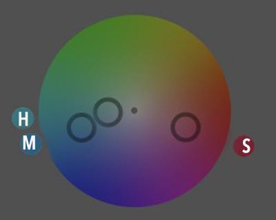
Color wheel showing color relationship for tree image. M = mid-tones, H = highlights, and S = shadows. Screenshot by Jenn Mishra
Summary
The Color Grading tool in Lightroom version 10 allows you to adjust colors in highlights, shadows, and mid-tones separately. This tool has been renamed from Split Toning found in previous versions of the software. It is not just the name that has changed – the tool has been reconceptualized and is more powerful.
Color grading is another way of adding contrast to your image. Many photographers use Color Grading to create their unique style. The new tool is formatted as a color wheel to encourage the use of color relationships. With this tool, you can add interesting colors, warm highlights, and cool shadows, create a cinematic effect, or a sepia tone. Color Grading is one of the most flexible and creative tools in Lightroom.
Self-Check Quiz:
- What is the new name for the Split Toning tool in Lightroom version 10?
- What does Split Toning do to your image?
- What does the Balance slider do in the Split Toning tool?
- How does the new Split Toning tool in Lightroom 10 differ from the earlier tool?
- The new Split Toning tool is laid out in color wheels. How does this help you select colors?
- What does the slider under each color wheel do?
- What is a complementary color relationship?
- Describe one way to use a complementary color relationship when Split Toning your image.
- How can you use Split Toning to create a sepia-toned image?
- How can you use Split Toning to counteract an unwanted tint in your image?
Assignment:
Choose an image from your catalog. Create different versions of your photo by going to the Photo drop-down menu and selecting Photo > Create Virtual Copy. Explore the new Color Grading tool in Lightroom. Try each of the recipes I used in this guide. Then try your own combination of colors. Try different color relationships like complementary or analogous colors.


