

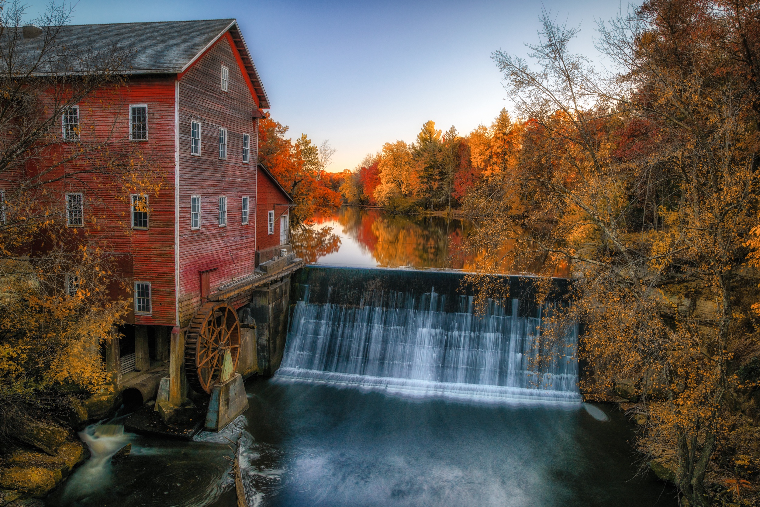
Autumn is arguably the best time of year for landscape photography, in terms of color. While the other seasons alter landscapes in their way, none are as pleasing as experiencing leaves changing color and falling to the ground – obfuscating normal details in warm orange and red glow. One of my absolute favorite experiences is walking into an open field or a river clearing, and seeing the golden-yellow, orange, and red leaves mixed in with evergreen trees. The combination of the scenery and cool air is a wonderful gift from Mother Nature.
As photographers, all this colorful inspiration hits us immediately, and at times it can be overwhelming. When that happens, it’s important to look for details that enhance our images, rather than blasting our camera sensors with color, which isn’t necessarily a bad thing.
The goal of this guide is to get you prepared for photographing autumn landscapes with a focus, no pun intended, on using the gifts of autumn to improve your images. Specifically, we’re going to cover the following:
- The biggest challenge of autumn photography
- Shooting the familiar, with an autumn twist
- Creating the shot you want
- Editing tips for autumn photography
- Using the HSL panel in Lightroom to tweak the color
Recommended Reading: Want to create memorable, fascinating, and impressive color photographs? Grab a copy of Photzy’s premium guide: Rich and Vibrant Color Photography Volume 1.
The Biggest Challenge of Autumn Photography
Let’s say you’ve just arrived at your favorite park, stream, or what-have-you, and fall is in full swing. The sun is out, the birds are chirping, and the breeze flowing across your face is just cool enough to be refreshing. You’re ready, camera in hand, to get started on your photo session. You inhale a deep breath, close your eyes, smile to yourself, and take in the moment. When you open your eyes, you realize there’s an unanswered question: where do you begin?
The first, and maybe the biggest challenge is not a technical one, it’s simply fighting the desire to capture as much color as we can in a single frame. Initially, my first fall landscapes were vast expanses of colorful trees that bisected the frame horizontally across the center. There was as much sky as the foreground, and neither was particularly interesting. From there, I switched to small details, such as the texture of leaves on the ground, a single leaf on a rock, or a leaf in a stream. I think you get the idea.

I must get all the colors! Photograph by Tomas Alvarez
The challenge I illustrated above isn’t a challenge if those are the only types of images you are interested in creating. For me, I found those two extremes (maximal and minimal) to confining. I needed to figure out a way to enhance my favorite subjects with the colors of autumn.
Key Lesson: Autumn is all levels of inspiring, and while there’s no harm in trying to capture all the color, the best photos will use elements of autumn to convey the season without overdoing it.
Shooting the Familiar, With an Autumn Twist
Through practice and intention, I’ve stepped away from my attempts to capture autumn images by incorporating the colors of the season into my normal style of shooting. That may sound confusing, but it means the story of the image isn’t derived from color; rather, the story of the image is derived from my intended subject, enhanced by autumn color. On the surface, this may seem obvious, but it was an evolution.
Let’s look at a couple of examples. Waterfalls are my favorite subjects to shoot, so prepare yourself to see a few waterfall shots in the examples.

Hidden Falls is frequently photographed. Using leaves as the subject allows me to push the waterfall into the background. Photograph by Tomas Alvarez
I was once asked by a fellow photographer, at an art fair, about creating images in areas that are frequently photographed, and how she could put her spin on it. The answer I provided was a variation of what I describe above.
Through practice and intention, I've stepped away from my attempts to capture autumn images by incorporating the colors of the season into my normal style of shooting.
My suggestion was to use autumn leaves, or some other seasonal condition, as the primary subject, then orient the frequently photographed subject to be in the background. Viewers will instantly recognize the background, but because of the subject’s orientation, their attention will be drawn to the foreground.
The image above is an example of both of the concepts I discussed above. The leaves are composed as the subject, and the waterfall is in the background. In this case, I used an aperture that would keep the background mostly in focus, giving the viewer a sense of place. If this location was familiar to you, there’s enough information to ascertain where this image was created.

Photograph by Tomas Alvarez
The other takeaway from this image is the lack of dominating autumn elements. There are leaves in the foreground, but if you removed them from the frame, the image would still stand on its own.
Key Lesson: In the autumn, it’s possible to create unique images in popular places by shifting the location of the main subject and using the colors of the season to draw the viewer’s attention.
Creating the Shot You Want
If this guide is going to get controversial, this is the section. As photographers, we seek to document the world as it is, imperfections and all. Sometimes, though, as artists, we long for perfection in an image, and we are reluctant to change the scene, hoping that we’ll find a composition that fits our vision. This is sometimes a long and frustrating process.
I’d like to take the time, now, to permit you to stage the scene you want to photograph. After all, it is your vision. I wish I could say I always felt cavalier enough to create a scene, but it took a process of letting go of what I thought of as traditional photography. It took some time, but ultimately, staging scenes had zero impact on anything significant in terms of my artistic creativity. If anything, it empowered me to create a truer sense of personal style.

Photograph by Tomas Alvarez
The road pictured above is another setup shot. As a friend and I were driving down a road, seemingly in the middle of nowhere, the hills along the way provided some opportunities to create images with fantastic leading lines and vanishing points. The main issue was a lack of foreground interest. As you can see, we had plenty of options to choose from along each side. A quickly thrown handful of leaves provided enough foreground interest to lead you deeper into the image. Full transparency: I have been asked, only once, if those leaves were staged. “Definitely!” Was my response. Again, your vision is all that matters.
Key Lesson: Staging a scene to photograph may feel taboo, but it is an easy way to ensure you can convey the story of your image.
Recommended Reading: Want to create memorable, fascinating, and impressive color photographs? Grab a copy of Photzy’s premium guide: Rich and Vibrant Color Photography Volume 1.
Editing Tips for Autumn Photography
Editing images containing autumn elements is pretty straightforward. There are some things to watch out for while you are editing.
Too Much Warmth
When adjusting the white balance slider, you’ll see that a warmer image will, in the beginning, start to look more appealing. It is easy to go overboard with warmth, though. The white balance slider will also have an impact on the overall brightness of the image.


Too warm (top image). White Balance adjusted appropriately (bottom image). Photographs by Tomas Alvarez
Try sliding the white balance to the right – toward the warm side – and watch the histogram as you move. You should have seen that the histogram representation of your image also moves to the right. The same thing happens when you move the white balance slider toward the cool side. As you move the slider to the left, the histogram data moves right.
I would suggest adjusting your white balance enough to keep the color of the supporting elements in your image true, and then adjusting the colors of the specific elements with the HSL controls, which we’ll cover in a moment.
Oversaturation
We all love a good, colorful, photograph. Bright colors, especially fall colors, have something about them that makes us feel warm inside. Too much color is a turnoff. The feeling I get, which errs on the side of being overly dramatic, is that my eyes are burning from all the color. The colors of autumn are quickly over-done by the saturation slider. If the other elements in the image are dull – let’s say rocks or something typically not bright in color – then grabbing a handful of the saturation slider will saturate everything which may not be desirable.

Yikes! This is a good reminder of how far I think I’ve come. Photograph by Tomas Alvarez
Key Lesson: You can process autumn photos like you would any other. Just watch out for trying to boost color via the white balance or saturation sliders.
Using the HSL Slider to Tweak Colors
An easy way to add and shift the colors of photographic elements is by using the HSL slider in Lightroom. The HSL panel is broken down into three distinct areas: Hue, Saturation, and Luminance. The Hue area shifts the designated color in a given range. The Saturation section allows adjustments in the range of no saturation to over-saturated. The Luminance sliders impact how bright the colors will be in an image. Think of the luminance sliders as mixing in white or black into the selected color.

Screenshot by Tomas Alvarez
Our autumn photos will have a lot of orange, yellow, and red elements in them, so those are the colors we’ll be looking at when adjusting the sliders. For the experiment below, select an image to use. When you are done, reset the image to return the color to its previous state.
In the hue section, move the orange slider to the left. You’ll see that anything orange has now shifted to magenta, and it likely looks terrible. Double-click the name of the slider you just moved to reset it. Next, try the yellow slider. Try shifting the slider to both ends. You should see that you can shift the yellows to almost green, or almost orange. You will probably also see a smaller section of your image change.
Too much color is a turnoff. The feeling I get, which errs on the side of being overly dramatic, is that my eyes are burning from all the color.
Let’s do the same experiments with the two other sections. Shifting the orange or yellow saturation slider to the extremes yields a lot of colors or no color. When shifting the luminance sliders, we get a near-white or a flattened, muddy representation of the color. What I’m hoping you get out of these experiments is that color can get out of hand quickly, so the slider adjustments should be made in tiny increments.
Take a Break, Then Review
Using the HSL sliders you can tweak the colors of autumn elements in your images, but it can get out of hand quickly. I would advocate you incorporate a break-review process when editing your images. When you feel you have completed the editing process, take a break for a couple of hours. Come back to your images with fresh eyes. Review your edits. Do you still like the images with your previous edits, or do they still need some work?
Key Lesson: Using the HSL Panel in Lightroom will allow colors to be fine-tuned. This is particularly helpful when photographing autumn landscapes.
Recommended Reading: Want to create memorable, fascinating, and impressive color photographs? Grab a copy of Photzy’s premium guide: Rich and Vibrant Color Photography Volume 1.
Final Thoughts

Photograph by Tomas Alvarez
As photographers, we find immense inspiration from the colors of autumn. While the colorful landscapes are awe-inspiring, it is imperative, for good photography, to use the elements presented by autumn to help us tell better stories through our images. Hopefully, through this guide, you are now better armed to use the seasonal elements to your advantage when creating compelling images, even of oft-photographed places.
Happy shooting!
Self-Check Quiz:
For the questions below, think of your favorite place to photograph.
- How can you incorporate the colors of autumn to enhance your photo?
- How can you provide a sense of place, without making the main feature of your location the subject of your image?
- What are your thoughts on staging a scene to photograph? Does it bother you? Does the staging ultimately matter to the art created?
- What is a typical editing mistake? How can it be avoided?
- If you wanted more yellow in your image, how could you go about adding more into your photograph?


