Complementary colors. You have probably heard the term before but never really paid attention to it, because it did not matter. You’ve had enough on your plate already. No need to add more to it while learning about reciprocal rules of photography, getting sharp pictures, shooting moving subjects, exposure, post-processing, etc.
Now you’ve conquered that. Well done!
Just like anything else in life, though, you know that there must be more to photography and you ask yourself, ‘Where to next?’ Or maybe you’re asking, ‘What more can I do to make my images pop?’
Well, one of the things you may want to look into next is the combination of colors. What makes one of two almost identical images look more attractive than the other? The answer lies in the way the human brain interprets colors, or perhaps rather the combination of them. Some color combinations make an image pop, or create a ‘light’ mood. Other combinations simply fail or create a subdued or ‘dark’ mood.
The secret to the successful use of color combinations lies not only in knowing when to use them, but also in when to avoid them, based on what mood you’re trying to achieve.
What you will learn in this article:
- What are complementary colors?
- Reasons for using complementary colors.
- How to use complementary colors.
- What complementary colors are not.
- A look at the two primary color wheels for photographers: RGB and RYB.
- A few case studies/examples.
Recommended Reading: Want to create memorable, fascinating, and impressive color photographs? Grab a copy of Photzy’s premium guide: Rich and Vibrant Color Photography Volume 1.
The Color Wheel
Believe it or not, the color wheel was created by Sir Isaac Newton in the mid-1600s as he was experimenting with the flow of light through a prism. The wheel was refined (perhaps ‘reclassified’ or ‘redefined’) thereafter by artists, photographers, and other users thereof, depending on what it was intended for.
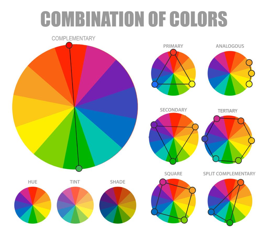
It basically comprises of the color combinations seen here (diagram above).
There are two color wheels that are primarily referenced by digital photographers. The two are the RGB color wheel and the RYB color wheel. (Above is an RYB color wheel.) It is important to note that these two wheels approach color differently, and as a result have different complementary color schemes – all of which work perfectly in your photography!
The secret to the successful use of color combinations lies not only in knowing when to use them, but also in when to avoid them, based on what mood you’re trying to achieve.
The following complementary color schemes are of importance to us in this guide:
- Complementary color schemes combine any two colors on opposite sides on the color wheel.
- Double complementary or tetradic colors schemes use any two sets of complementary colors together (refer to the ‘Square’ diagram in the illustration above).
Reasons for Using Complementary Color Schemes
There are various reasons for using complementary color schemes.
The Colors Are Highly Contrasting
Complementary colors are highly contrasting: one of them from the ‘warm’ side of the color wheel (red, yellow, and anything in between) and the other from the ‘cold’ side (green, blue, violet, and anything in between). They accentuate each other without sacrificing color balance.
They Create Multiple Points of Interest
Because of the fact that complementary colors highlight each other, they create multiple, visually appealing points of interest which engage the viewer’s eye.
Key Lesson: The vibrant look of complementary color combinations may not always be what you’re looking for. Sometimes it may be necessary to reduce the vibrance/ saturation/hue of one (or both) of them in order to avoid ‘competition’ between them, to create a specific mood.

A nice example of using an equal amount of warm and cold colors within an image. Photograph by Christian Wiediger
Things to Keep in Mind in Using Complimentary Colors
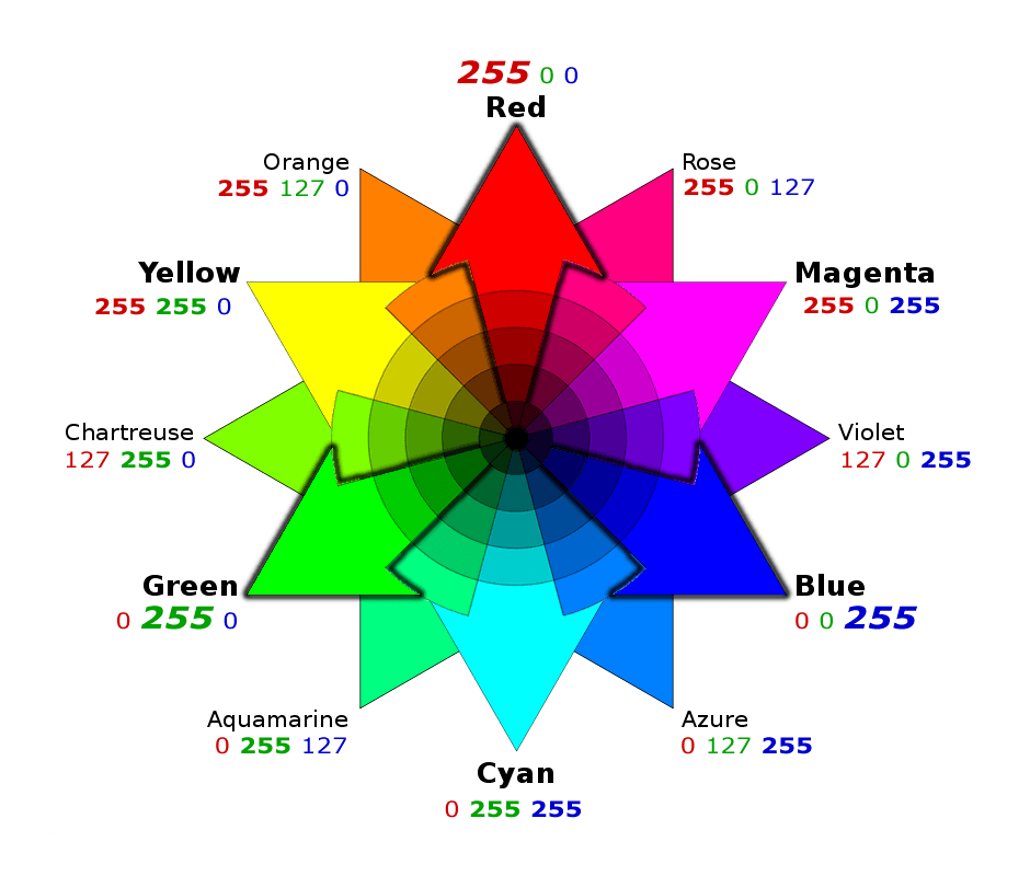
For your comparison, here is an RGB color wheel.
I know, this is not always something you have control over. If you see a bunch of red and green buildings together, you can’t move them around until they fit into your idea of ‘good usage’ of complementary colors. The modern era provides us with powerful tools to recompose our images in post-processing – or crop out undesired sections – until we have the exact color balances we’re looking for.
- Don’t use an equal amount of each color. Use one color as the background and the other as the accent. The color you use least will create strong points of interest.
- Use different hues, shades, and tints. Different hues, shades, and tints of one or more of your chosen colors (or color families) will add more interest.
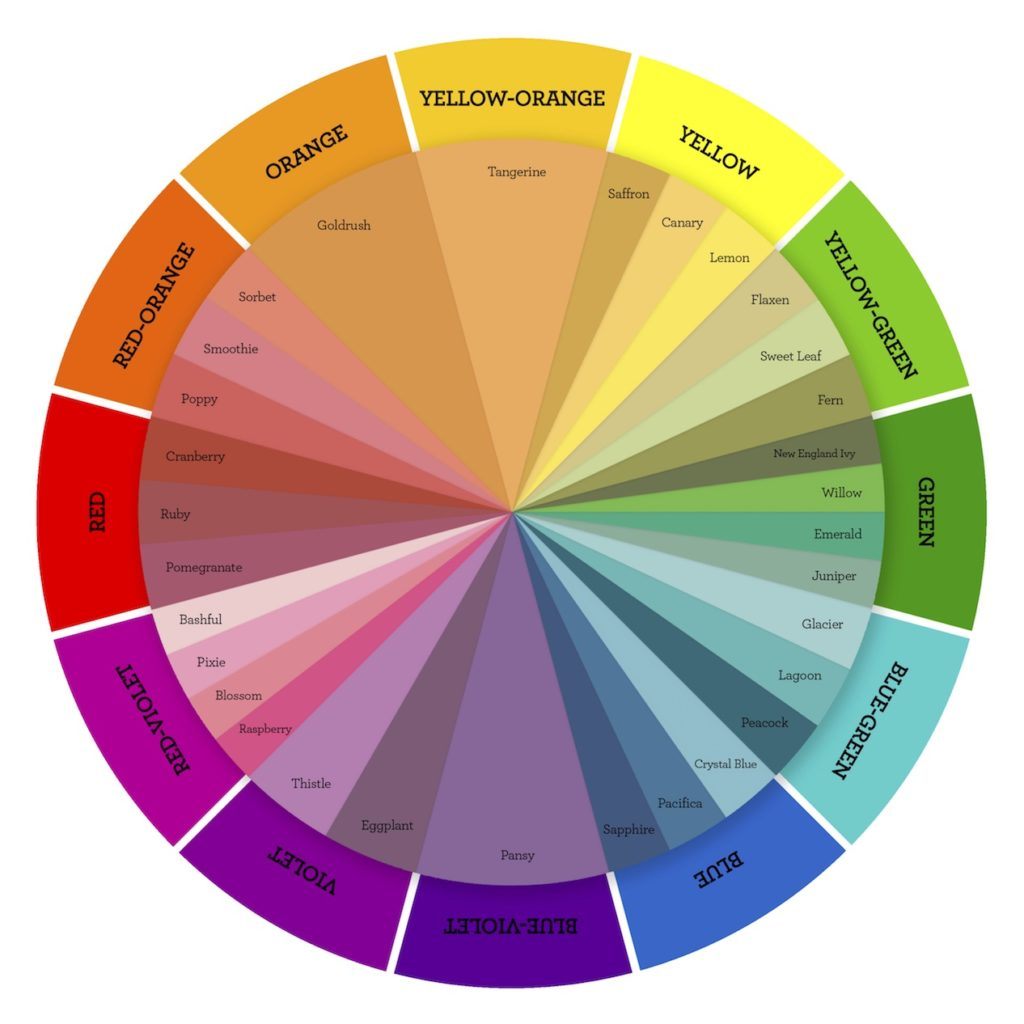
- Combine split complementary colors. In this case you combine one of your complementary colors’ two adjacent colors with its complementary color. For example, instead of using red and green together, you use red plus the two colors next to green: bluegreen and yellow-green or one of its hues (refer to the color wheel above).
The extended wheel chart as used by closetomyheart.com will give you an idea of which hues are achievable as well as which colors are complementary to them. By the way, this printable color wheel is available for free. You can download it from their website.
Key Lesson: You do not have to use exact complementary colors to produce a visually stunning image. Play around with various hues, shades, and tints of each to increase interest. Go one step further and combine split complementary colors.
You can also produce visually appealing images using rectangular complementary color schemes (for example, violet + orange together with blue + yellow) or square complementary color schemes (for example, blue + red-violet together with orange and yellow-green).
Case Studies
Let’s look at a few examples of why some complementary colors work well together. Some of them may not have been created by man, but they certainly serve well as toindicate why they are pleasing to the eye.
Example 1

Photograph by Tobie Schalkwyk
Example 2
Photograph by Tobie Schalkwyk
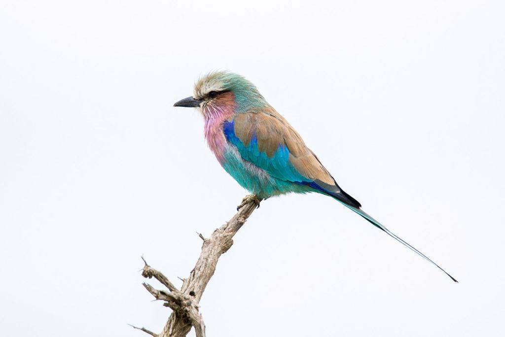
The beautiful Lilac-breasted Roller. In this case, a touch of warm brown is contrasted against just about the full range of cold color hues (derived from green, blue, and violet). It’s extremely pleasing to the eye, to put it mildly!
Example 3

Photograph by Tobie Schalkwyk
Take note of how the touch of heat (red shirt) creates a point of interest against a cold (blue and green) background. Maybe this stage manager knew something about combining split complementary colors?
Complementary colors highlight each other, they create multiple, visually appealing points of interest which engage the viewer’s eye.
Example 4
Example 5

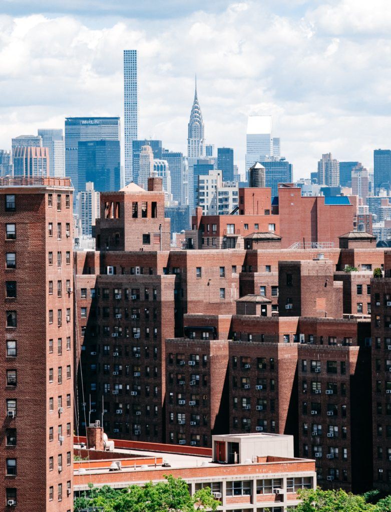
A great example of using different hues of blue-green against its complementary color: red-orange. This photographer must be a real-life artist with the brush because he/she knows all about complementary colors!
Recommended Reading: Want to create memorable, fascinating, and impressive color photographs? Grab a copy of Photzy’s premium guide: Rich and Vibrant Color Photography Volume 1.

Conclusion
Colors are a photographer’s main tool to create stunning images. Sure, black and white has its purpose in creating mood, but so do colors – but even more so! Complementary colors simply work well together to create areas of interest and to keep your viewer’s eyes glued to your images.
Use them in abundance, and use them cleverly. They will never let you down!

Self-Check Quiz:
- What are complementary colors in terms of the color wheel?
- What are complementary colors in terms of color tones?
- Name (any) three warm and (any) three cold colors.
- Name two rules for making complementary color combinations more interesting.
- Name two reasons for using complementary colors.
- Name two complementary color combinations.
- They are on opposite sides of the color wheel.
- The one color is from the ‘warm’ color spectrum and the other from the ‘cold.’
- For example: Warm: red, yellow, orange. Cold: Green, blue, purple.
- Don’t use an equal amount of each color, use different hues and tints.
- Create contrast, create different points of interest.
- Red + Green, Blue + Orange.
Observation Assignment:
Go through your photo collection. See if you can find at least one example of each of the following:
- Excellent combination of complementary colors in terms of color.
- Excellent combination of complementary colors in terms of quantity (uneven amounts create points of interest).
- The opposite of one and two above. Could you have done something different or was it out of your control?
For example, with a studio shoot you can actually ask your models/subjects to arrive with specific color combinations in terms of clothing or props. With a wedding group image, you do not really have control over that. With a still life, you can control what background color you use together with your subject (or not).


