


Color is everywhere in photography (unless, of course, you’re shooting in black and white), and understanding how to use it correctly is an essential step in your photographic journey. Color theory is something every art student will be familiar with, but it seems to sometimes be a little overlooked in photography. So in this guide, I’ll explain color theory to you and look in detail at the color wheel. Color can be such a useful tool for evoking emotion, so it’s worth understanding how to utilize it.
Here’s what we’ll cover:
- The color wheel
- Emotions
- Color schemes
- Color variables
- Tips for experimenting
- A quick list of helpful tools
Recommended Reading: Want to create memorable, fascinating, and impressive color photographs? Grab a copy of Photzy’s premium guide: Rich and Vibrant Color Photography Volume 1.
The Color Wheel

The Color Wheel
Key Lesson: Based on the RYB color system, which painters use, this is the most common color wheel. Its primary colors are red, yellow, and blue, and when you mix these you’ll end up with the secondary shades of orange, green, and violet, combining these results in one of six tertiary colors: red-orange, yellow-orange, yellow-green, blue-green, blue-violet, or red-violet. Of course, as photographers, we’re more used to the RGB (red, green, blue) system used in camera technology and computers. But when I’m talking about color theory, I’ll be referring to the traditional artistic color wheel.
Emotions
Although obviously not set in stone, different colors evoke different emotions in a viewer. Here are my thoughts on a few of the most common stains:
- Blue – cold, trust, sadness, serenity
- Red – passion, anger, energy
- Orange – warmth, happiness, enthusiasm
- Green – calm, natural, balanced
- Yellow – cheerfulness, friendliness
Color Schemes
As I’ve already mentioned, using the color wheel can strengthen your imagery and add interest. Let’s look at the six most commonly used color schemes.
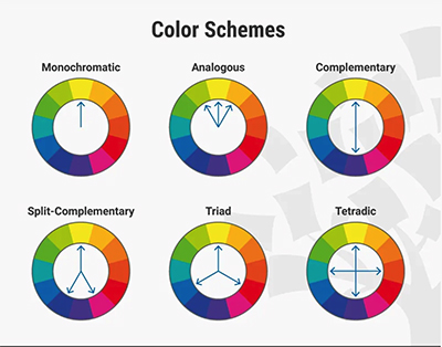
Color Schemes
Monochromatic
A monochromatic color scheme uses one of the twelve colors on the color wheel with different tints, shades, and tones. In this scenario, tint refers to adding white to a color, or shade, adding blacks and tones, or adding gray. Using one color throughout an image with just a combination of gray and black notes can bring a sense of harmony and calm to an image or be used to create a bold and dramatic statement shot. It’s all about using the single color you choose to create a mood that’s appropriate to it.
Analogous
Analogous color schemes use three colors that sit next to each other on the color wheel. It’s a useful technique to create a sense of flow in an image and is a scheme that’s quite often found naturally in nature. Try picking one dominant color and use the other two in a more supporting role. Or you could try the ’60-30-10’ rule often used in the design, whereby the main color (which will usually be a primary or secondary color) takes up 60% of the space, the supporting color (secondary or tertiary) 30%, and the final color 10%.
Complementary
Perhaps the simplest color scheme to use, complementary colors are those on opposite sides of the color wheel (e.g. red and green or blue and orange). When you combine the two, you’ll provide contrast in your images, as well as a pop of color. Complementary colors can be very dramatic and can help make one color look more active.
Complementary colors can be very dramatic and can help make one color look more active.
Split Complementary
Split complementary color schemes are a variation of a complementary color palette. You select your base color, for example blue, but instead of selecting orange opposite, you’ll use the two colors on either side of the orange. The colors will still complement each other, but the resulting image should be a little softer than a straight complementary image.
Triad
Triad or triadic color schemes use any three colors that are evenly spaced around the color wheel (for example red, yellow, and blue). Using a triadic color palette produces vibrant images that are bursting with contrast. This is because the three colors work in harmony to bring out the tones in the others. In the majority of situations, you’re best off using the three primary (red, yellow, blue) or secondary colors (orange, violet, green). Using too many tertiary colors tends to produce a more ‘muddied’ image that doesn’t have enough contrast and color to ‘pop.’
Tetradic
This is the trickiest of the color schemes to get right, as it uses four colors. You might also hear it referred to as a ‘double complementary’ scheme, as it includes two sets of complementary colors. So you could, for example, use orange and blue alongside green and red. This is probably the scheme that’s easiest to get right in a controlled environment such as a photographic studio or at home where you have control over the colors you include in your image.
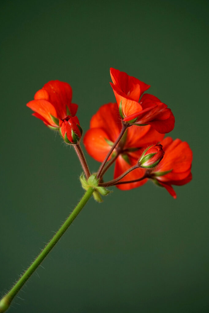
This a perfect example of the use of two complementary colors to produce a beautifully balanced image. Photograph by Güner Deliaga Sahiner
Color Variables
Understanding color variables alongside color theory will help to give you images with accurate balance and harmony. There are three basic variables (also called components) of color: hue, value, and saturation.
Hue
If we’re colloquially talking about color, we’re really talking about hue. Red, yellow, blue, green, etc. are all examples of hues. To simplify things greatly, a color’s hue is determined by light frequency. Red has a lower frequency, blue has a higher one, and green is in the middle. You’ll often find hues measured in degrees using a similar color wheel to the ones we’ve already talked about. By tweaking one hue in an image, you can easily evoke a completely different feel to your image and different emotional responses in your viewers.
Value
A color’s value refers to how light or dark that color is. So white is the lightest, black is the darkest, and all other colors fall in between. When you’re working with a single hue (color), it’s comparatively easy to see the difference between high-value and low-value colors, and the most successful images tend to have a range of different values in them that are still similar enough to create the balance and depth needed. Of course, when you add in more colors and start using more complicated color schemes, it can become trickier to spot variations in value. I find the easiest way to practice this is to convert your images into black and white. If there’s too much middle gray, you’ll be lacking in tonal contrast.
Saturation
Also known as intensity, saturation measures the purity of a color. But what is color purity? A heavily saturated color has no gray mixed into it. The more gray you add, the more desaturated a color becomes. In painting, a common technique to desaturate color is to mix it with the opposite color on the color wheel. Vibrant and bold colors that are heavily saturated will grab a viewer’s attention and also help an image to ‘leap’ off the page. But of course, this isn’t always the look you want in an image. Desaturated colors produce gentler images and can be used to convey a softer, ethereal, or nostalgic feel to a viewer.
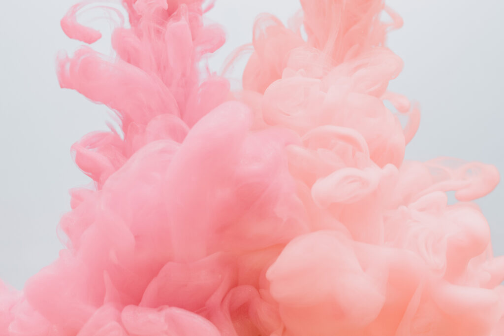
Pale pink provides a desaturated look that gives this abstract image a gentle and soft feel. Photograph by Pawel Czerwinski
Tips for Experimenting
There are many ways to start using color theory and far more than I could cover in one guide. Here are a few tips to get started:
- Look for natural combinations in nature: An easy way to experiment with the color wheel is to look for it in nature. For instance, you could look for complementary colors such as a red rose against green grass or leaves.
- Colored lighting: Play around with color that’s under your control by using colored lighting. You can buy colored gels to use over your flashgun (or studio lights) or experiment with colored bulbs in a household light. When out and about, a neon sign on a building or in a shop window can add a splash of color.
An easy way to experiment with the color wheel is to look for it in nature.
- Be surreal: Color theory can reward a surreal approach when working with colors that aren’t entirely natural. The infra-red film, for example, creates an unusual color palette, and this can easily be recreated in post-production. Bold, unnatural colors can emphasize your use of the color wheel.
- Use your favorite color: Take your favorite color and use it as a way to challenge yourself when you’re out shooting. Use this color as your primary color and place it in different genres (landscape, urban, portrait, architecture, etc.) whilst employing different color schemes to balance it out. You could even make this color into your signature style.
A Quick List of Helpful Tools
- Shoot in RAW: This gives you the most control over your colors in post-production.
- Calibrate: Make sure your monitor has been calibrated correctly so that the colors you’re seeing on your screen are a true reflection of how they look in real life. Make sure you edit in a well-lit room as well, so you can see things clearly.
- Polarizing Filter: Carry a polarizing filter in your kit for when you’re shooting color. It helps to increase vibrancy in color images and reduces glare, meaning you’ll spend less time tweaking things in post-production.
Recommended Reading: Want to create memorable, fascinating, and impressive color photographs? Grab a copy of Photzy’s premium guide: Rich and Vibrant Color Photography Volume 1.
Conclusion
Color theory can add so much to color photography and, although it may look complex, understanding it is actually a logical process. It’s worth taking the time to get to grips with.

Self-Check Quiz:
- What are the secondary colors?
- What emotion is green associated with?
- What is an analogous color scheme?
- What is saturation also known as?
- Which filter is useful for practicing color theory with?


