Using Primary Colors for Visual Impact – Free Quick Guide

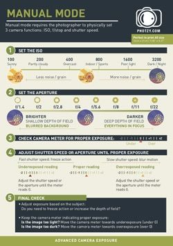
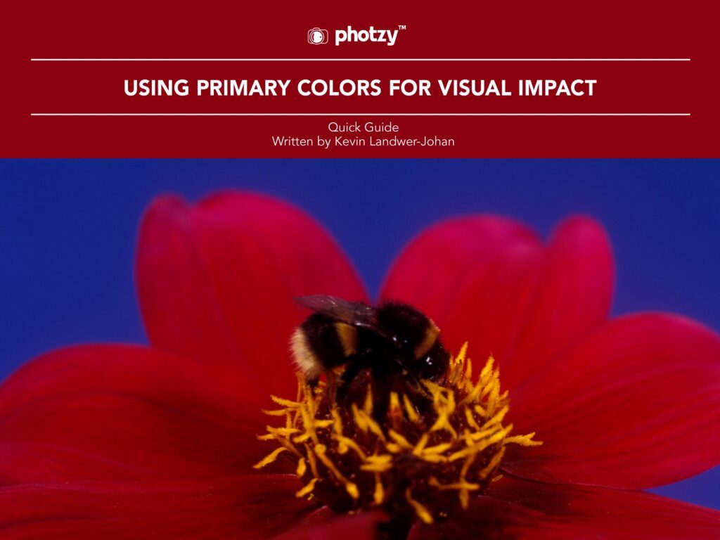
How much attention do you pay to primary colors when taking photographs? Possibly not enough.

Primary colors are foundational to any visual art form. Be it a painting, package design, or photograph in any genre, primary colors are, well, primary! The better you use them in your compositions, the more powerful your pictures can be.

Careful consideration of how you use primary colors can help guide viewers through your photos.

Here is what you will learn in this guide:

  • What are the primary colors?
  • What are complementary colors?
  • What is a color wheel?
  • The impact of the color red
  • How the color blue sets a mood
  • Why the color yellow makes us happy
  • The importance of paying attention to primary colors in a scene
  • How to work with primary colors in a composition
Grab your guide below!

Photo Credit: Kevin Landwer-Johan


Popular posts:

15 DSLR Photography Exercises to Master Your Camera

15 DSLR Photography Exercises to Master Your Camera

Knowing your way around a DSLR camera is always a challenge when you haven’t learned it hands-on!

Today, I have a comprehensive training guide that should help: Check it out here

Inside, you’ll find 15 step-by-step photography exercises to master DSLR camera fundamentals like exposure, sharpness, metering modes, white balance, focusing and a whole lot more.

All you need is your DSLR camera and just a little bit of motivation to get started (no excuses!)

Take a look now

Or click below, to get a sneak peek on the next page...

→ Next Page

Join 215,000+ Photographers

Get Fresh Tutorials & Inspiration:

Free Photography eBooks

Free access to our library of 250+ downloadable (pdf) tutorials on everything you can imagine.