I know many of the Photzy followers are also Lightstalking.com members. If you’re not, you may want to consider it. A lot of good information is shared and passed around both on the Lightstalking blog as well as in the forums.
One of the forums on Lightstalking is titled; “The Shark Tank.”
The Shark Tank has a simple concept. You upload a photograph and all the other members get a chance to critique it. This is not one of those forums where everybody pats everybody else on the back telling him or her how great everything is. No. You get a response from member photographers (many of whom have a lot of experience, but not all) who are going to give you the straight scoop on your image.
That’s where this Quick Guide began.
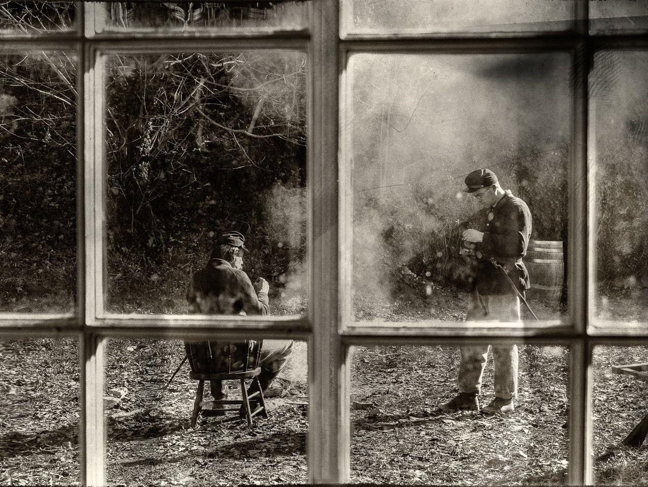
One of the Lightstalking members, Choctawjake (his real name is George), uploaded a photograph to The Shark Tank, which he had titled “Campsite.”
Here is that photograph.
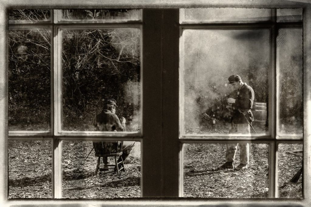
Figure 1: Photograph by George Silvas
George took this photograph in Harper’s Ferry, West Virginia, at a Civil War reenactment. He then did some post-production magic using the following NIK filters: Silver Efex Pro and Analog Efex Pro. The filters gave George “the antique look” that he had pre- visualized for his picture.
When the critiques started posting, most of the members liked the image—with the exception of one element.
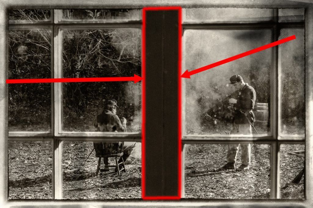
Figure 2: Photo Illustration by Kent DuFault
The two window frames formed a large, black, rectangular area right smack in the middle of the picture. It was obvious why The Shark Tank found it obtrusive. It was far too dominant in the composition. You really could not see past it to the men in the background. The window had been intended to be a tool of composition called “a frame”. In this case, it’s literally a frame. However, that large black area disrupted the flow of the shot.
When I posted my comment in The Shark Tank, I told Choctawjake that it would be a fairly easy fix in Photoshop to reduce the size and dominance of that central area. I also told him that if he weren’t sure how to accomplish that, I would do it for him.
He gave me permission, and I went to work.
Then, after viewing my initial final edit, I came to a conclusion. I felt that it could be even better, so I added something else to the edit.
I shared both versions with George and The Shark Tank. The general consensus was that the second version was the best.
George was happily surprised, and he wondered if I could show him how I did it. I told him that I could write a Quick Guide and share it with everybody.
He gave me the permission to do that.
Before I get into the nitty-gritty of how I completed the edit, I want to tell you that my initial edit on George’s photograph from the beginning all the way through to completion took less than three minutes.
I tell you that because developing your editing skills are just as important as your photography skills. In this case it’s more important, because Choctawjake could not shoot his pre-visualized image any other way than through that window—and that is what the window looked like.
Developing your editing skills are just as important as your photography skills.
I think you’ll be surprised by the major difference in the viewing pleasure that this subtle edit makes.
Let’s get started…
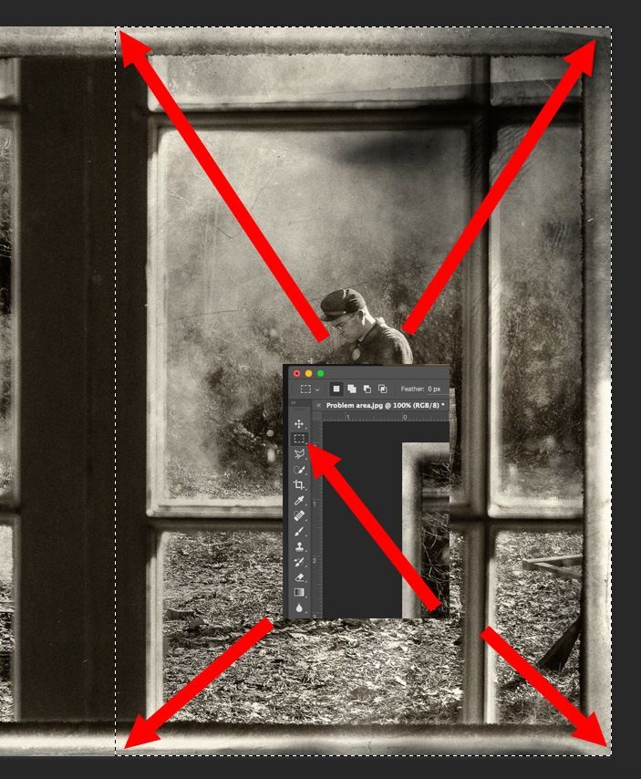
Figure 3: Photo Illustration by Kent DuFault
Using the rectangular selection tool, I selected the right half of the image (see above). I want you to pay special attention the left side of my selection. Take notice that the area of the black rectangle that I included in my selection is approximately the same width as the other, lighter, struts of the window frame. You’ll see why that was important in a moment.
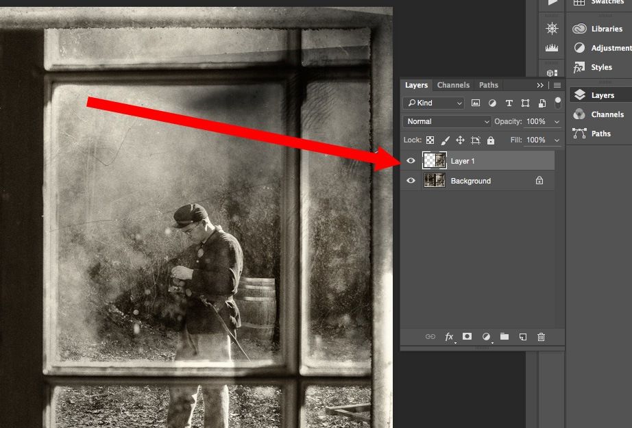
Figure 4: Photo Illustration by Kent DuFault
After making my selection I did a “Copy” or “Command C” on my Mac computer. I then “Pasted” or “Command V” that copied section onto a new layer called “Layer 1”.
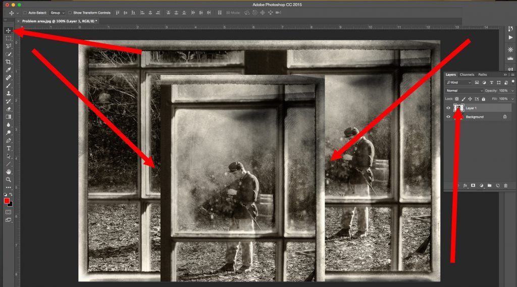
Figure 5: Photo Illustration by Kent DuFault
Using the “Move Tool” I dragged the pasted portion of the image on Layer 1 to the center of the “Canvas” so that you can clearly see the outline of it.
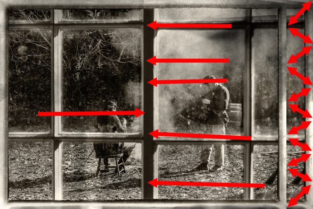
Figure 6: Photo Illustration by Kent DuFault
I then dragged the image data on Layer 1 back into position so that it was aligned with the background layer at the top and bottom. Then I dragged it to the left until it covered up the entire dark rectangular area (that we want to get rid of). This is where the width of the dark area that we kept in the original selection becomes important. Notice that the center, upright, strut is now about the same width as the other struts in the window frame. You’ll also notice that we have some overhang on the background layer to the right. We will take care of that in a minute.
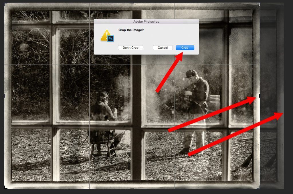
Figure 7: Photo Illustration by Kent DuFault
Using the “Crop Tool” set to “Unconstrained” we begin on the left. We set the crop box as full frame from top to bottom. Then we drag the crop box to the right until we get to the outside of the frame from our repositioned section of the picture (that would be the second arrow from the right). The first arrow from the right shows us the area that we are going to crop off of the picture.
After we crop the image, we are going to merge the two layers. This is done in the “Layers Palette” using the “Drop Down Menu” in the upper right. You can choose “Merge Down” if Layer 1 is currently selected, or you can choose “Merge Visible” or “Flatten Image” which, at this point, would all accomplish the same task. I always use “Merge Visible” because I like doing the “Key Command” on the keyboard, which is “Command/Shift/E” on a Mac.
If you go back and look at Figure 7 (above), you’ll notice that there is a distinct line of demarcation at the top of the frame. The bottom of the frame blended nicely. We are going to get rid of that line of demarcation by using the “Clone Tool.” I keep my “Tool Bar” on the left side of my “Work Space.” The clone tool is the ninth tool down from the top. I’m going to use a brush that is 35 pixels, with the hardness set at 10% and the opacity at 100%. Thirty-five pixels will make the brush just a little bit smaller than the width of the frame we are trying to fix. The hardness is set to 10% because I don’t want a hard edge line—but I also don’t want my work to feather out past the boundaries of the frame itself. I’m going to take my sample from position 1.
Then, I’m going to position my brush just to the left of that line. I will work my way from left to right along the frame, looking to make sure that I don’t create “Artifacts” and that my cloned area blends nicely.
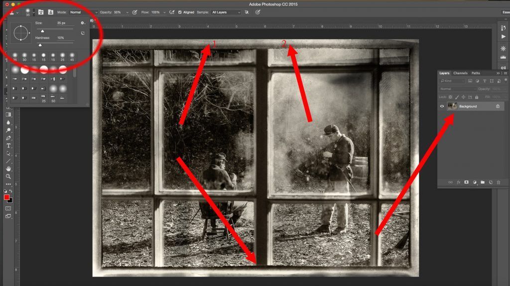
Figure 8: Photo Illustration by Kent DuFault
It may be difficult for you to see in this guide, but I can see this on my monitor. There is a visible line along the black strut where the new layer pasted over the old layer. It was caused by a slight variation in the level of black between the new layer we created and the original background layer. It’s very subtle, almost invisible, however we want to do our very best to create a believable edit. I’m selecting the “Blur Tool” on the left from the Tool Palette.
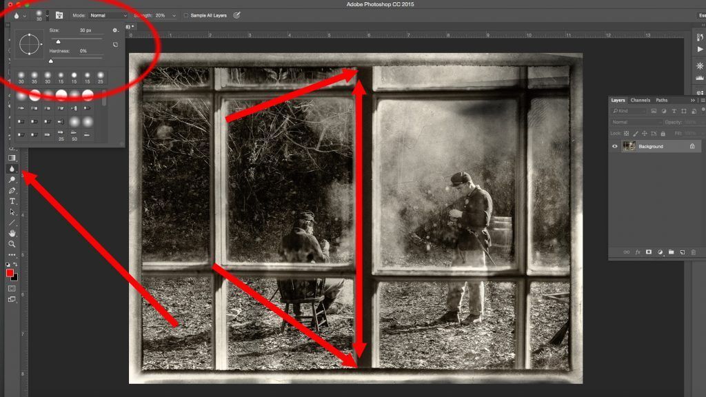
Figure 9: Photo Illustration by Kent DuFault
I’m setting the strength at 20%. I have found that with the “Blur Tool” and the “Sharpen Tool” it’s best to use a low setting on the strength, and then build up the effect by going over the area you’re working on several times. I’ve chosen a brush size that is almost the width of the black strut, only this time I’ve changed the “Hardness” of the brush to 0. The reason for that is I don’t want the brush to bleed over the edges of the strut. The line I described is so light that it only took one stroke of the brush to eliminate it. I started at the top and slowly dragged the brush to the bottom.
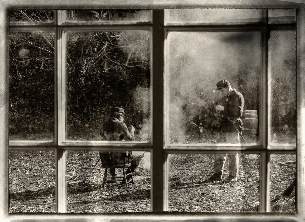
Figure 10: Photo Illustration by Kent DuFault
Figure 10 (above) is the original final photograph that I was going to create for George. If you go back and look at his original image, you will see that the center upright strut now carries much less weight in the composition.
However, as I looked at the photograph, I realized there was still a problem. The dense black color, along with the strong rectangular shape, made it still too dominant in the composition. The viewer’s eyes just did not want to move past it to the men in the background.
I decided to change the tone value of the center strut to match the other struts. Let me show you how I did that.
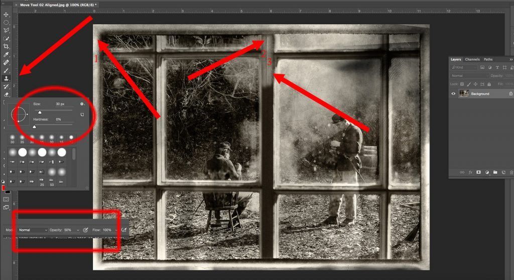
Figure 11: Photo Illustration by Kent DuFault
I am going to use the “Clone Tool” to change the tone value of the center strut. However, I don’t want to entirely change the shape of the center strut. That could be done to make it match the other upright struts perfectly; but that would be a much more complicated edit, and it wasn’t important that it match the shape exactly. All I’m trying to do is tone the strut down so that it doesn’t become an eye snag, and it looks real.
Recommended Reading: By the way, if you’re unfamiliar with composition, I have written two books on the subject. They are available at Photzy.com. These two books delve deeply into the subject of composition, and they explain such principles of composition as eye snags. Check it out here: Understanding Composition and Advanced Composition.
Okay, so we’re going to change the tone values but not the shape of the upright center strut. I chose the “Clone Tool”. I set the “Opacity” to 50%. This setting will draw some tone values from my sample area without completely changing the center strut. Again, I’m working with a small area and I don’t want my changes to bleed off of the strut so I set my “Brush Size” to 30 pixels and the “Brush Hardness” to 0. I’m making my selection from the frame area on the left; I’ll start at position #1. The “Clone Tool” will be placed first at position #2 (on the center strut), and I’ll drag the clone tool all the way from top to bottom. Then, I’ll do it a second time starting at position #3 and dragging downward. I’m sure that you can see that there is a hard line that formed between our two passes down the strut. We will fix that by changing the “Hardness Setting” on the brush to 40. We will then take our sample at the top of the strut just to the left of the one we are working on, and we will drag the clone tool from top to bottom on that center strut following the hard line.
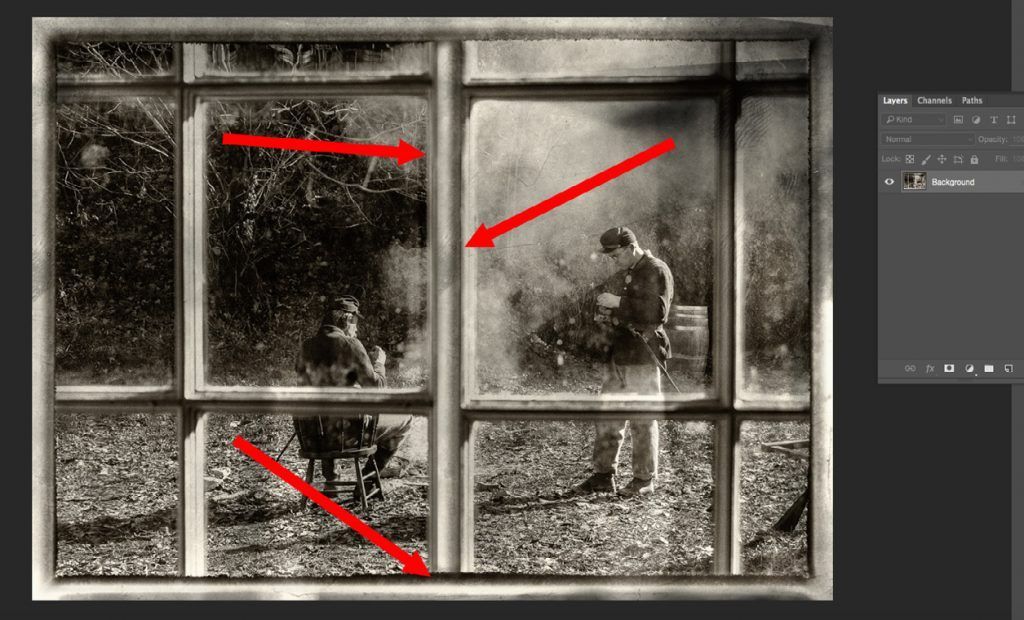
Figure 12: Photo Illustration by Kent DuFault
One of the key attributes of a good photo retoucher is paying attention to the details. Little telltale signs that a photograph has been edited are called “Artifacts”. When I finish an edit, I always study the image for artifacts. There were three artifacts when I finished my last changes on the center strut.
One of the key attributes of a good photo retoucher is paying attention to the details.
At the top arrow, there was still a visible hard-edged line that was several inches long. The second arrow points to a white spot. This being a “Grunge” photograph, that wouldn’t be a problem except for one thing. It’s an exact duplicate of the white spot on the left side of the frame where I took my samples. Finally, at the bottom, I over-ran the strut and bled my cloning into that dark horizontal line that runs along the frame. To fix these artifacts, I did the following. I used the “Blur Tool” to blur out the hard-edged line. I used the “Clone Tool” to remove the white spot on the center strut. I used the “Clone Tool” to sample another part of the frame at the bottom and then cleaned up my overrun area.
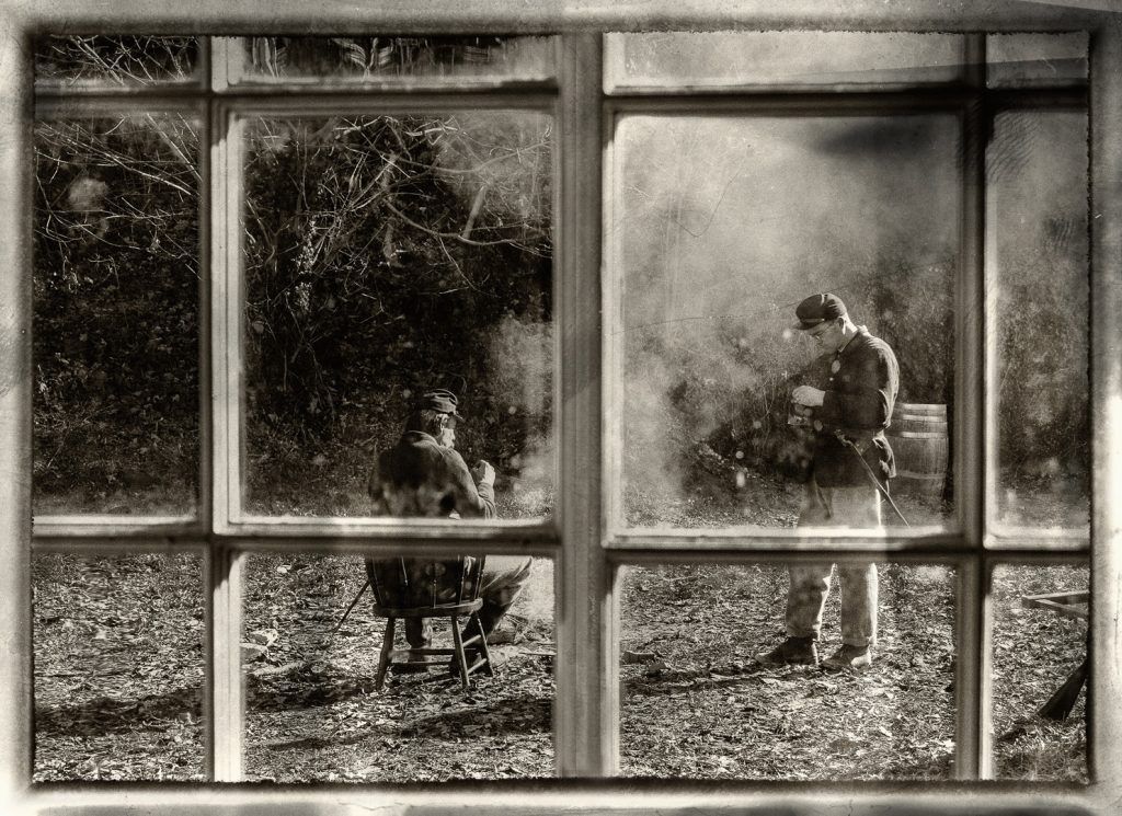
Figure 13: Photo Illustration by Kent DuFault
Here (above) is the final image. As you can see, the center strut now matches the rest of the window frame. The effect is that it now blends and no longer draws attention away from the men.
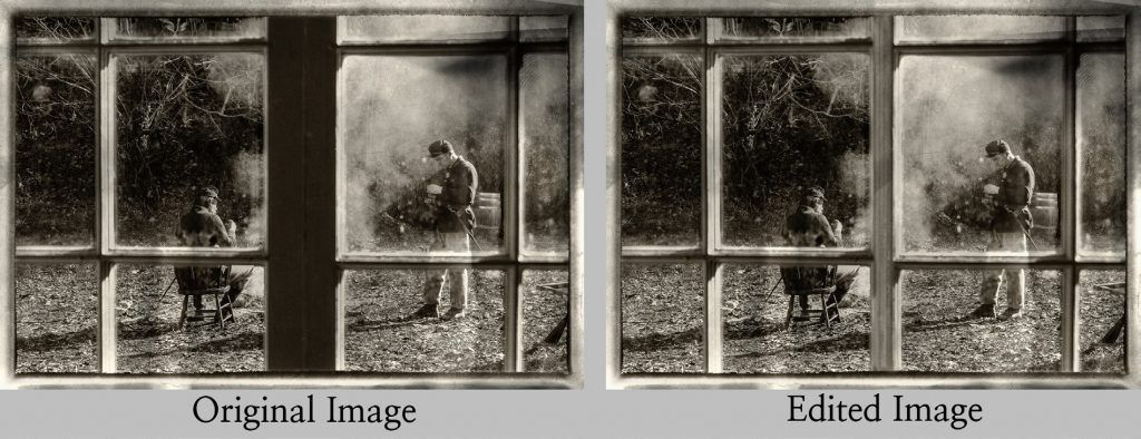
Figure 14: Photo Illustration by Kent DuFault