Why The Color RED Made Me a Better Photographer

New / Noteworthy
EDITOR’S NOTE: If you’re looking for a quick way to learn the basics of photography take a peek at our popular cheat sheets: The Snap Cards. If you missed out on your set last time, they’re available again and on-sale right now.
I want some attention!
I want people to notice my photography.
I want my skills to be recognized.
It’s true isn’t it? We all crave attention.
You want your photographs to get noticed. I get it. So do I.
Photography is a challenging medium. No one will ever really master it completely. Like all art; it is constantly evolving.
When you think about “famous” photographers- for example: Avedon, Muench, Wolfe, Leibovitz, McCurry, Penn, Newton, Benson, Warhol, Newman, Bailey, Adams, Winogrand, and countless others… Had they completely mastered the medium? Or, did they simply get noticed?
Many world-renowned photographers will often say the medium cannot be mastered.
Is it conceivable that while Arnold Newman was shooting his world-famous portrait of Igor Stravinsky sitting at a piano- that perhaps Joe Middleclass conceived that same photograph, at the same time, in some un-exotic location?
Sure it’s possible. Getting noticed is where it’s at, especially in today’s online world. Getting noticed is what will elevate you, as a photographer, among your peers.
That brings me to a story that I really wanted to share with you, and that story initiated the thought behind this post.
For the last eight months, I have been very active on a photography “contest” website. They have ongoing contests, and you can enter as many as you want. As you attain a certain number of votes in a contest- you can earn an achievement, which adds up to your “rank” within the community.
I started doing this for fun, but it quickly turned into an obsession.
(That’s what my wife calls it.) It became my personal goal to earn the highest rank possible. Yes, I wanted my photographs to be noticed.
Many of you, that are active on the forums on Lightstalking.com, probably are at least familiar with my name. For those that aren’t- I take my photography very seriously. I’ve been doing it a long time. I worked as a professional photographer for a number of years.
One of my favorite aspects of the photographic medium is composition.
Oh man… I can rattle on about composition at length.
But, I digress.
You want to know why the color RED made me a better photographer
Take a good look at this-

This is a screenshot of my profile page on the photography contest website. These are the first ten contests that I entered.
Now, in order to understand this, you need to know how the contest achievements work. The lowest contest achievement is Popular, followed by Premier, then Skilled, then Elite, and the highest level is All Star (which I didn’t even attain in my first ten attempts).
You could say that my ability to get noticed (at this point) was pretty low.
So… I began to study who was winning and why?
Something very unusual came to light! (Photographic pun intended.)
If you’re reading this- the next sentence should be very important to you. Composition is nothing more than working with the psychology of the mind. It’s the ability to ‘lead’ your viewer into seeing, and feeling, what you want them to see and feel.
You can study composition for years, and you’ll never understand all of it. It’s that complicated, but it’s also that much fun. It’s one aspect of why photography is such a great outlet for all of us, and it allows us to be recognized, because none of us sees the world in the same way. (Any photo critique can attest to that.)
So, back to the contests-
I studied the leader boards in earnest, and I noticed something unusual.
Before I reveal that to you. Let’s look at how my revelation began to affect my results…

Here is a screenshot of ten contests from ‘after’ I had my revelation, and I began to put that knowledge to use.
Looking much better! Wouldn’t you agree? I was finally getting noticed.
I want you to really listen up. I’m sure you want to achieve a higher level with your photography. That’s why you’re reading this blog post. I see this all the time with photographers, especially new photographers; they aren’t really sure about the composition of their photograph- what’s working and what isn’t?
Now, as I said earlier, I’ve been shooting a long time. I’ve studied composition for decades. I’ve even written two books on the subject. (If you’re interested- you can check out those books here.)
You would think- that I would have easily known what I’m about to reveal to you. But, I didn’t. It didn’t click…
I cannot take complete credit for the ‘realization’ that occurred as a result of my studying these contests.
I have to give partial credit to my wife- who also happens to be a graphic designer.
Here is what I noticed about the leaderboards on these photo contests.
I said this to my wife over dinner one night:
I’ve been studying the leaders on those photo contests, and I noticed something strange. Any image that has the color RED in it garners way more votes. It doesn’t even seem to matter whether the image is that good or not, or what the subject matter is!
A few days after saying this to her, she wrote me an email. She had been doing some studying of her own about graphic design, and she came across an article about composition in graphic design.
Here is what she sent to me-
- Color
Warm colors advance into the foreground and tend to weigh more than cool colors, which recede into the background. Red is considered the heaviest color.
Red is Considered the Heaviest Color
While composition is nothing more than working with the psychology of the mind, the elements of a composition are similar to a road map or a puzzle- and each element has visual weight.
The more ‘weight’ an element of a composition has- the more likely a viewer will be drawn to it, linger on it, remember it, and react to it. (And I guess vote for it!)
Knowing that fact- and knowing that the color RED is the heaviest color- gives us a lot of visual clout. Wouldn’t you say?
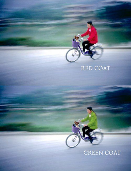
Photo by Kent DuFault
The top photograph, with the red coat, has received a 52% vote ratio on the contest website. In other words, 52% of the people who looked at this photograph- voted for it. In the bottom photograph, I changed the color of the coat to a vibrant green. It’s your call. Do you think it would have acquired the same percentage of votes? I don’t!
Stands to reason, if you want to become a better photographer? If, you want to become noticed, plan on putting the color RED into an image whenever you can!
Let me share with you some recent contests results after my revelation about the color RED- (as well as some other issues with composition that I began to implement into my submissions…)

Look at that! 9 out of 10 times the images entered into those contests reached All Star level-

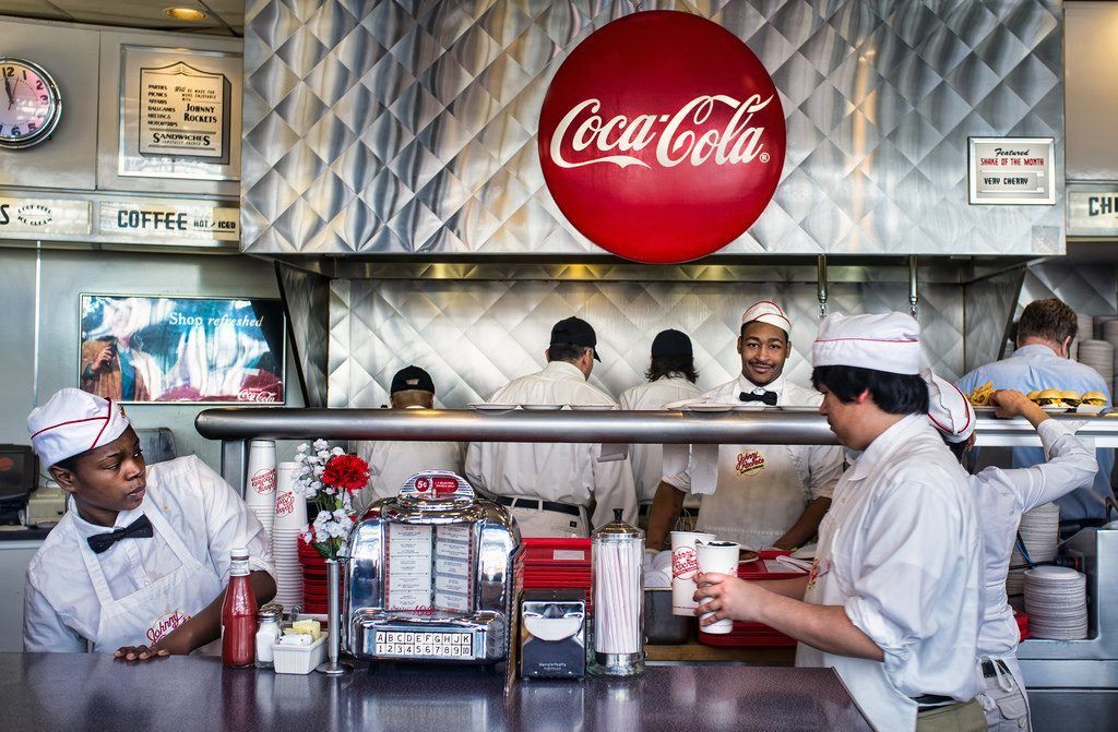
Photo by Kent DuFault
This photograph has received a “Yes” vote ratio of 64%. 64 out of 100 people that viewed it- voted for it! Did you happen to notice that two major brands are making use of the color RED?
Yeah! Now we’re talking.
The Color RED is a really powerful weapon in your photographic arsenal.
However- remember- that alone may not be enough.
There are many photographs that I see around the Internet, where the photographer utilized only one aspect of composition. That rarely works. Sometime it works- but rarely- it usually takes at least three elements of composition to create a solid map for the viewer. And the visual weight of each element must be carefully considered.
There is obviously way too much information on this subject to be written here in this blog post.
But just to give it some perspective- here are some other considerations to visual weight…
- The size of an element in comparison to other elements within the photograph
- Contrast– light tends to attract more than dark… however dark can be heavier dependent on the balance of the image
- Position – an element positioned higher in a composition tends to carry more weight than one positioned lower. Also, a center-positioned element can be extremely dominate depending on the balance
- Texture – a textured element tends to carry more weight than a smooth element
- Shape – an irregular shape is generally heavier than a regular shape
- Focus – an element that is in-focus carries more weight than an element that is out-of-focus
- Direction – an element that depicts movement will often create flow through an image- thus carrying strong visual weight
These are just a few of the many considerations for composition. And, as I said earlier, every photograph is an individual entity. What works for one, may not work for another. Where one image may only need one, or two, elements of composition- another might need ten to be successful.

Photo by Kent DuFault
The photograph above has reached ‘All Star” status three times, and ‘Elite” status twice. And guess what? It has the color RED! It also has FIVE other elements of composition- all working together.
The good news is- you get to have fun learning about composition.
I've got something special for you on the next page...
It’s awesome knowing how to put the puzzle together for the best dramatic effect. As your knowledge grows- so will your stature within the photographic community. And you will become the one getting noticed!
If you want my shortcut to get your work noticed, I’ve put together a fundamental composition guide which covers ALL of the necessary essentials, without the boring bits.
It’ll show you the ‘What’ of composition, but more importantly (and often left out)– the ‘Why’. You can apply these fundamental tools of composition to get your shots noticed, fast!
Click below now, to read about it on the next page…
In the meantime, keep your eyes peeled for that color RED!

About Kent DuFault
Kent DuFault became a photographer in September of 1974. He took a “Basic Photography” class in high school and was hooked for life. His best-selling guide, Understanding Composition has helped more than 10,000 photographers learn and master the fundamentals of composition.

